The Most Shocking Before & After Home Renovations of 2024
The year’s most remarkable Before & After renovations run the gamut of typologies and locales—from a bland Oakland bungalow to a dated ’60s flat in Spain and a tiny L.A. garage—yet all of these transformations will make you look twice. Read on to see how these daring remodels gave new life to old structures.
10. Rich Color and Millwork Revive a Historic New Orleans Shotgun Home for $198K
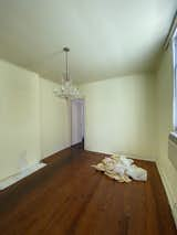
Before: Seamus and Kara McGuire bought a 1910 double shotgun home in New Orleans and collaborated on a breakneck, six-month remodel to turn its two units into one family home. They merged historic features (like the six fireplaces and original flooring) with color and custom millwork.
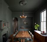
In the dining room, Seamus removed the dropped ceiling, refinished the heart pine floors, and relocated the windows from elsewhere in the house. "I wanted a place that was inviting, but with a muted warmth," says Kara. They covered the entire space—including the walls, ceiling, cabinetry, and fireplace (with a relocated mantel)—in Farrow & Ball’s Green Smoke.

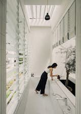
Before: A family of four architects maximized light and space in this "cave-like," 650-square-foot Madrid flat.

Modular furniture, internal windows (even in the shower), and a kitchen behind a folding door are just a few of the solutions that gave this Madrid apartment a new lease on life.
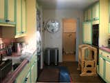
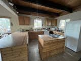
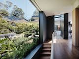
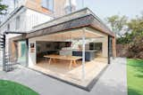
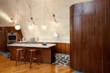
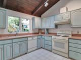
Before: Los Angeles firm Chet Architecture took inspiration from urban sociologist Ray Oldenburg’s 1989 bestselling book The Great Good Place (and a nearby Intelligentsia coffee bar in Silver Lake) to remodel this 1960 home, which had a cramped kitchen.
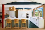
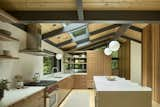
The new kitchen caters to family life and entertaining with a two-sided counter and its spacious layout. The space features Villa Lagoon concrete floor tiles, Heath Ceramics tiles on the island, Schoolhouse Electric pendant lights, and Design Within Reach Valencia stools.
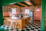
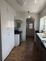
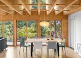
Before: Caroline Hwang and Joel Speasmaker worked with one of their friends—architect Brad Engelsman of the firm Beda—to reorganize the layout of their Pasadena home. As a food and beverage stylist, Caroline needed to rework the small kitchen into a space where she could workshop ideas.

The team installed plenty of counter space, a deep sink to fill pots, a six-burner stove, and a skylight for more natural light. The ceilings are painted Benjamin Moore Black Tar for contrast. The 17-inch Ray pendant is from Schoolhouse, and the K65 high chairs are by Alvar Aalto for Artek. The island is inspired by the couple’s trip to Marfa, and their admiration for the work of Donald Judd.

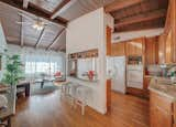
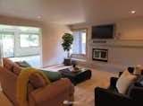
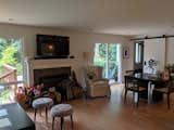
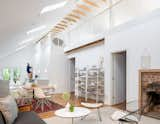
Before: Kirsten Adams and Paul Midgen tapped Seattle’s SHED Architecture and Design to renovate a 1958 home by local legend Al Bumgardner. SHED reworked the vestiges of a 2005 remodel to create a better layout, custom storage, and more personalized decor.
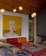
"The living room wanted to be low," says Kirsten, drawing comparisons to a hookah den. SHED started the design with the colorful Roche Bobois sofa, and added the Vitis 5 chandelier from RBW. The couple commissioned artist Anne Siems for the painting, which has meaningful symbols to reference their daughter and family pet.
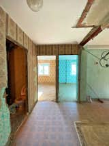
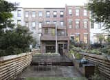
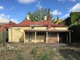
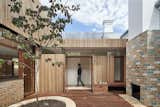
Before: Ezekiel J. Emanuel, who goes by Zeke, and his partner, Teasel, bought this crumbling Washington D.C. home in 2019. The remodel kept the front facade largely intact while giving the interior, including the kitchen, a dramatic makeover.
Fowlkes Studio added 557 square feet to the back of the house, incorporating the original basement and first floor into a double-height, open living space anchored by library shelves that hold 3,500 books.
Before: For their first DIY renovation, Whimsy Soul cofounders Kara Harms and Robin Berenson infuse a woodsy California getaway with vintage vibes, big color, and wallpaper galore, all while sticking to a $120K budget.
In the kitchen, the couple topped the existing floor with custom, green vinyl floor tiles from Etsy shop Marzipan Days. The wallpaper, bought on sale from Anthropologie, is the exact pattern that Kara admired in a Quebec City coffee shop two years ago.
Before: Spanish designer Ismael Medina Manzano took an experimental approach to this 816-square-foot apartment in San Sebastián, Spain. "I’m always wondering, can we conceptualize the domestic space as something less fixed and more flexible?" asks Manzano.
The new design introduces a more open plan with curved walls, a mirrored kitchen, and splashes of primary color.
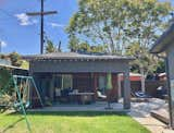
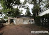
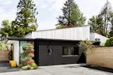
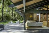
Before: Designer Ben Warwas developed his aesthetic sensibility building backyard skate ramps before going to design school. He helped an L.A. couple convert their basic garage into a multifunctional ADU.
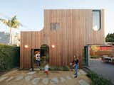
"Ben suggested we look at the ADU as an art piece or a sculpture, which we were very taken with," says homeowner Courtney Wilk-Mandel. An Ipe rainscreen emphasizes the soft edges of the new building, which now has extra living space, a second-story office/bedroom, and a roof deck.

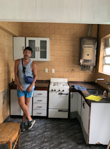
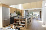
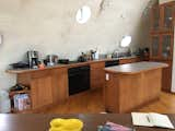
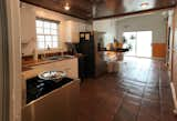
Before: What started as a kitchen remodel evolved into a whole-house intervention for this 1,360-square-foot bungalow in Oakland, California.

Architect Sky Lanigan gave the home a "weird, but right" makeover with a terrazzo island, pegboard storage, Kelly-green pantry "cube," strike-through shelving, and even a built-in cat cubby. "It’s really a kitchen with a house around it," says Lanigan.
The Most Shocking Before & After Renovations of 2023
10. With a Little Help From Friends, an Architect Couple DIY Their Bilbao Apartment

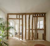
Before: This 1,076-square-foot apartment, located in a 1901 building in Bilbao, Spain, had previously been part of a 10-bedroom boarding house dominated by a long hallway. In 2020, an architect couple, Jon Irigoyen and Amaia Guibert, bought it and set about opening up the interior
Doing much of the finish work alongside two friends, the couple crafted an earthy interior with weathered wood, lime plaster, and glints of polished steel—and there are only two doors in the whole house.

Before: When Bonnie and Antonie Basson bought this midcentury home in the Higgovale neighborhood of Cape Town, South Africa, she thought it was a "lost cause." The rear facade had few windows, and didn’t take advantage of the site’s views, which include City Bowl and the harbor, as well as Lion’s Head and Signal Hill mountains.

The couple teamed up with Jenine Bruce of interior design firm Lacuna, Werner Lotz of Hours Clear Architects, and Josephine Noyce Landscape Design on the ensuing transformation. The new pool acts as an "organizing spine" that moves from the outside in, with lots of built-in nooks for seating both inside and out.

New windows now capture views galore.

Before: Rather than go bigger, architect Merritt Amanti Palminteri and her husband, Rogers Hawley reconfigured their 1,700-square-foot, three-bedroom 1950 ranch house in Monterey, California. One change converted the former laundry room into a breakfast nook.
Located off the kitchen, the red-painted nook has a built-in booth, shelves, and storage, and it’s become a popular spot for everyone to convene in the home.
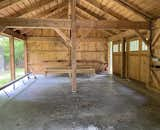
Before: Katya Potkin and Bart Stein bought a 20-plus-acre property in Ancramdale, a small hamlet about two hours north of New York City, and decided to convert the bare-bones barn into a guesthouse.
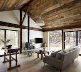
Barlis Wedlick Architects turned the existing structure into a solar-powered getaway, incorporating many of the barn’s elements into the finished design—including the rolling doors, exterior siding, and roof. Exterior shutters can close it up when not in use.
Before: When Geoffrey and Powell MacDougall first saw this 1815 farmhouse in the Catskills, it was listed as a teardown—but they couldn’t bring themselves to raze it. "We fell in love, and it became a restoration effort," says Geoffrey.
During the DIY remodel the family of four kept original features (like the hardwood floors) and introduced whimsical accents (including the built-in reading seat painted Glidden’s Velvet Slipper, and Elli Popp’s A Forest-Into the Trees wallpaper). Twelve-year-old Audrey assembled the living room fireplace hearth using stones from the property.
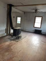
Before: Plum Projects helped a Mercer Island family reinvent their ’90s-era home, which was rife with diagonal walls, weird door placements, and a disconnected, half-finished basement (seen here).
The breakthrough for the new design came when the designers proposed punching a hole through the center of the plan and connecting the three levels of the home, creating spaces for every member of a multigenerational family.
At the top of the stairs is a new multipurpose office and pantry. "It’s a private space, but it feels open," says architect Drew Daly. "Traditionally in Japan, the doors are made using rice paper, but we did an architectural play on that using a slatted wall that creates translucency."
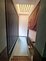
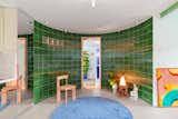
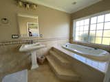
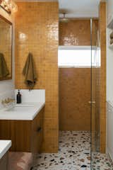
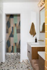
Before: The renovation of this historic shophouse in Singapore by the firm Asolidplan included the reinvention of the upper-level primary bathroom.
An existing water feature became a planter for an olive tree that provides privacy from the kitchen below.
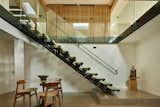
Before: Clément and Eleonora bought a 1700s-era farmhouse in New Jersey with plans to better fit the upper two floors to their lifestyle. They hired Fuller/Overby Architecture to reconfigure the floor plan and introduce more flow to the existing tight, cluttered layout.
A perforated metal staircase in a 1700s farmhouse—why not? The new design feature allowed Fuller/Overby Architecture to introduce more light into the home, and showcase the timber beams revealed in the remodel.

Before: Blaine Architects were tasked with adding a 545-square-foot addition to this run-of-the-mill 1959 Eichler in Sunnyvale, California. "The client wanted something that was recognizable and distinct," says Megan Blaine. "The design challenge there is, how do you do that when every third or fourth house is exactly the same?"
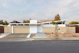
Blaine Architects capped the front addition to this Eichler home with a shed roof that mimics the slope of traditional Eichlers, but slants in the opposite direction. The wood screen is made from Accoya.
Before: Edward Brooke worked with La Firme to reimagine his Old Montreal apartment in a heritage building dating back to 1865.
The new design ethos was to deliberately embrace the apartment’s dark and light zones, and create a compression and release effect through starkly contrasting material choices. There’s no slow fade here—but rather, sharp lines between dark and light. Case in point: The primary bedroom has oak accents, while its connecting bathroom is ensconced in dark tile.
The Most Shocking Before & After Renovations of 2022
10. In Buenos Aires, a Crumbling Home Gets a Major Refresh With a Rooftop Pool
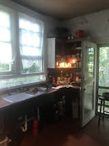
Before: A couple spruced up this dilapidated dwelling an industrial area of Buenos Aires, Argentina, with a living roof, emerald tile, and plants, plants, plants. The crumbling original kitchen (shown here) needed some love.

Architect Alejandro Yañez Ayala of the firm Maya Estudio tore out walls and added a plethora of new windows and doors. "We don’t turn on lamps until sunset," says Alejandro. "There’s a constant connection to light."

Before: A previous remodel had already reformed the rear of this existing bungalow in San Francisco. The owners needed more space for their family, including out-of-country relatives that stay for longer periods, but didn’t want to change the front exterior or lose any yard. A previous remodel (shown here) had already reshaped the rear of the home.
The new addition features a sliding glass door that brings in much more natural light and creates easy flow between inside and out. The owners especially appreciate how the new deck is at grade with the exterior door for a seamless transition, making the kitchen feel like "a part of the garden," says the homeowner.
Before: Architect Colleen Healey created a colorful and spacious home from a dilapidated carriage house in Bethesda, Maryland. The architect preserved and reimagined the circular portal window. "If you already have those openings and you can work around them, it makes a lot of sense," Healey says.
While the new facade is swathed in black stucco, it maintains elements of the original carriage house. Two white volumes rise from behind the stucco base—a move by Healey to tease the idea that more exists beyond the entry.
Before: Hub of the House Studio added color, texture, and storage to this Burbank midcentury home, starting with the primary bathroom.
Built-in teak seating is now flanked by custom vanities, with Marmoreal flooring and marigold zellige shower tile.
Inspired by the home’s California ranch setting and the natural brush of the surrounding foothills, Hub of the House Studio papered one of the walls in the primary bathroom with a geometric wall covering designed by Kelly Wearstler for Kravet.
While the rooms in the main volume at the front of the home had reasonable areas and floor-to-ceiling heights, the back of the existing house featured a stacking of smaller volumes typical to the period—and made the house unsuitable for contemporary family life.
Pashenko Works revives a dilapidated London residence with a green roof, a large atrium, and a garden studio for visiting grandparents.
Before: Fischer Architecture nearly started from scratch in this complete overhaul of a midcentury Oakland residence. They kept the general layout, but just about everything else changed, including the exterior facade, material palette, and glazing. A dark passageway (shown here) once connected the choppy rooms.
Large openings like this one in the hallway bring in more natural light and views of the beautiful landscaping. "We try to find the straightest line between two points," explains architect Andrew Fischer. "We always want to edit down, and be efficient with space."
Before: Nova Tayona Architects converted the third story of a 100-year-old Parkdale home into a soothing retreat with a dramatic, curving wardrobe that also acts as a room divider.
The former guest bedroom/office became the new primary suite. "The window millwork allows for a window seat and camouflages a hot water radiator below," says architect Nova Tayona. "This area is the perfect spot for the clients’ various plants, which are thriving in the sunlight."

Removing the partition wall between the bedroom and the former closet opened the master bedroom up to what would become the bathing area, extending the sense of space and making the room feel larger and brighter. Tayona raised the ceiling beam to extend the feeling of spaciousness.
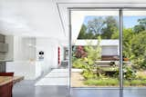
Before: During the remodel of a 1,109-square-foot apartment in the 11th arrondissement of Paris, architect Olivier Lekien discovered a series of wood columns and beams that separated the kitchen/dining area from the living room—and decided to showcase the framework in the new design.
Exposing the wood supports created a more open feel—and now the spaces are filled with natural light. "The kitchen looks out over the courtyard, which acts as a light well and provides ventilation," Lekien says.
Before: Architect Talbot McLanahan transformed this California beach bungalow into a cozy family retreat that better connects with its surroundings.
The entire home is wrapped in tongue-and-groove pine, which matches the original finish on the ceiling.

Before: Sogno Design Group reimagined a small 1930s home on an unusually large lot to make room for three generations of a family. "I felt like it was in a park setting," says designer Kathryn Rogers of the boulder-strewn setting. "I don’t think I’ve ever worked on a site this beautiful before in the East Bay—it’s very unusual to have these kinds of features in such a large site."

The original home was converted into a bedroom level, and Rogers introduced a second-story addition and roof deck. The dark exterior color—a charcoal-eggplant hue—lets the landscape colors stand out in contrast. "The existing house roof became the roof deck," says Rogers. "And then I just shifted over the addition so that it floated over the landscape."
The Most Shocking Before & After Renovations of 2021
10. A Brooklyn Brownstone’s Dreary Basement Becomes an Urban Oasis
Before: The newest owners of this 1885 Prospect Heights brownstone sought to convert it into a duplex in a 2020 remodel. "This neighborhood has extra deep lots that allow you to do amazing things with extensions," says architect Daniel Kaplan of Bowerbird Architects.
Kaplan added onto the rear facade and redesigned the backyard for better indoor/outdoor flow. He also raised the ceilings in the basement to create light-filled living spaces.
Before: Loader Monteith Architects improved a London fixer-upper with a light and airy rear addition with custom sliding glass doors.
The doors measure two meters wide, and one is on a three-track and the other on a two-track, so that the glass can be stacked to open up the corner of the room to the backyard.
Before: Architect Susan Nwankpa Gillespie of Nwankpa Design gently expanded this 1924 storybook-style cottage in L.A. by 400 square feet by pushing the walls out on all sides and reorganizing the floor plan. The kitchen was a narrow galley separated from the rest of the living spaces with a vestibule that contained the refrigerator, the laundry, and a door to the yard.
The architect vaulted the ceilings to 17 feet at its highest point, and clad them in white ash, turning those distinct features into a new focal point.
Before: One of the major challenges in renovating this century-old bungalow involved replacing the decaying log-pile foundation with 40 new concrete piers while maintaining the integrity of the overall structure.
Architect Miguel Rivera, principal at Miró Rivera Architects, helped the owners restore the front in meticulous details, then added a U-shaped extension at the rear that connects to five unique outdoor spaces.
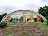
This dome-shaped home in a small town in the Catskills was originally designed in 1996 by architect Seymour Rutkin as his own residence. The newest owners worked with architect Elyse Agnello, of the Chicago-based design firm DAAM, to modernize the interior.
Before: The original kitchen was custom-designed for the space, but modest. Its wood veneer cabinets, black appliances, and neutral-colored laminate countertop played second fiddle to the curved walls.
The new design navigates the unique curved walls, ensuring head clearance, more storage, and a streamlined layout that places components within easy reach. The walnut cabinetry contrasts with the off-white walls, and the tile, hardware, and lighting selections play off the geometric forms.
Before: As described by architect Steffen Welsch, this rear extension to an Edwardian weatherboard house in an inner-city suburb of Melbourne, "stretched the building over the entire length of the site, rotated it 45 degrees, and pulled it apart. A somewhat unexpected move, this generated an interesting sequence of interconnected spaces and an experience of gradual revelation as you move through the house."
The house has a front door, but it’s actually not the main entrance: That’s found around the side, via a soothing, wood-lined courtyard. It’s a natural space for outdoor entertaining, too, thanks to the built-in fireplace and bench.
Before: Georgina Verza had been running her yoga and massage studio out of her remodeled Seattle-area basement for years. She tapped Robert Hutchison Architecture for a more graceful expansion of the home that included additional outdoor spaces. Previously, Georgina and Diego had knocked down interior walls to create an open-plan living room, dining room, and kitchen, but the fireplace prevented the space from feeling connected to the deck.
A main goal of the renovation was to better connect the home with its forested lot. "One of the things that convinced me to buy the house was the fact that when you open the front door, you see all of this green coming in through the backyard," says Georgina. Hutchison enhanced that with a wall of sliding glass doors and clerestory windows on the rear wall.
Before: Risa Boyer Architecture revitalized a 1955 Portland home by extending the roof over an outdoor patio to give it cover and ensure that it’s a comfortable space on both hot, sunny days, and in the rainy spring, or fall. The pink and blue scheme in the kitchen, an ’80s update, didn’t harmonize with the midcentury bones of the home.
New custom walnut cabinetry syncs with the rest of the built-ins throughout the home, to create a pleasing rhythm in the open plan. The backsplash is Heath Ceramics tile, and the counter is Pental Quartz. Open shelves at the rear overlook a cozy den, and allow sight lines out the new windows at the front of the home.
Boyer removed walls in the main living spaces to connect them together, installed more glazing and skylights, including sliding glass doors that now open to the yard. The exposed rafters were carried into the exterior areas, including the covered patio.
Before: Architect Adam Ruffin cleverly expanded this 1920 bungalow in Atlanta without changing the footprint, by rebuilding the roof and vaulting the interior ceiling to create a lofted living space above the bedroom core.
The new loft runs the entire expanse of the house. "These Craftsman bungalows are everywhere in Atlanta," says Ruffin. "To have this complete reimagining of the interiors is really surprising. It’s bright and big, which is not how most of those houses ever feel."
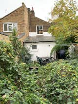
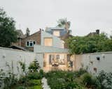
Before: Architect Mat Barnes, founder of CAN, transformed his Edwardian home in South London in a spirit of exploration and play with a unique addition.
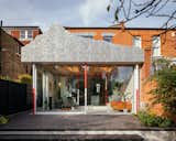
Inspired by the Matterhorn ride at Disneyland, the extension features a mountain-shaped roof over a glass box."Typically in modern design, you’ve got white walls and add artwork to it," says Mat. "The idea here was to have the architecture be the character."
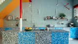
The kitchen cabinets are fashioned from recycled milk bottle tops, manufactured by Smile Plastics in Wales. Artworks (like these red arrows "piercing" the wall—a sculpture by Liam Fallon) mix with a riot of primary colors throughout the home.
Read more Before & After stories here.
Published
Last Updated
Get the Dwell Newsletter
Be the first to see our latest home tours, design news, and more.