17 Kitchens That Go Bold With Pastels
If you've ever done any renovations in your own home, you were probably drawn to neutrals: white walls, white tile, and, of course, white kitchen cabinets. And while white might be considered the go-to color, we love a new trend we're seeing: pastel kitchen cabinets that infuse spaces with character without being overwhelming.
Colorful kitchens have a long history, beginning in the 1920s when the Arts & Crafts movement influenced ceramic tile manufacturers to produce tile in a range of colors beyond the then-traditional white. Glossy black became a common color for tile alongside light-colored cabinets, soon followed by pastels like pink, light green, and pale blue. Cabinets in similar colorways followed suit, with schemes like jade green with pale yellow and baby blue with a creamy off-white.
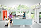
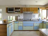
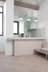
A 1950s home in California undergoes a renovation that retains the essence of the vintage home. The kitchen was relocated to its designated place and reinstalled as per the building specs of the original architect, Walter S. White. A stainless-steel counter and sink, powder-coated cabinets, and sliding panels in pastels replicate the original 1955 version while contemporary updates include Vola faucets, Heath Ceramics tiles, sliding freezer drawers, an induction range, and a refrigerator by Jennair.
But by the 1950s and 1960s, bolder colors like fire engine red or avocado green became more popular, and with the 1970s and 1980s came lots of laminate cabinets in duller colors, sometimes in combination with shiny natural wood. Since then, all-white kitchens with white cabinetry and minimalist detailing have taken their turn in the limelight, but we're sensing the turning of that tide as colored cabinets and funky marble countertops that make a statement become more and more popular.
So why pick pastels for your kitchen? Surprisingly, even though pastels are known to be soft colors, when used as kitchen cabinets, they lend a sense of personality, fun, and lightness to a space. But because of their lighter tones, they still reflect light better than dark colors, managing to be soft and airy while still imbuing color. What's more, they pair well with neutrals like white, gray, or black. So we've gone ahead and gathered some of our favorites below — take a look and see what inspires you!
This Winning Renovation Takes Cues From 1930s Cruise Ship Design
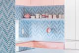
At a home in South Australia, the homeowner's love of Art Deco and 1930s P&O architecture led to a kitchen designed with curves and color. An elongated, pink terrazzo kitchen island accommodates larger gatherings; it extends all the way into the dining area. Powder-blue cabinets provide a cool contrast.
In the kitchen area of Berlin-based architect Ester Bruzkus's apartment, dusty pink cabinets are topped with a terrazzo counter and backsplash with integrated shelf. Gold accents, via the canisters, flatware, and faucet, lend a little glam.
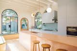
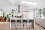
Though this kitchen, with its light blue island, fits in with its period surroundings, a few tweaks keep it current. "It’s functional in a way that doesn’t feel like the kitchen is in the living room," says architect Rick Black. He explains, "One of the goals was to make the islands more like furniture than like heavy objects that go all the way to the floor."
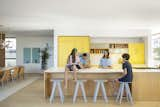
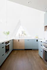
Drawing from Nordic, midcentury modern, and beach house traditions, this California family home is serene yet playful.The home’s HenryBuilt kitchen is a focal point. The yellow hues of its cabinetry are softened by white oak finishes on the floors and the kitchen island.
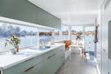
The design of this Australian houseboat features a soft, modern color palette. Here, light sage laminate kitchen cabinets are paired with leather recessed pulls.
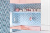
In Tokyo’s busy Nagatcho district, designer and artist Adam Nathaniel Furman completed the interior fit-out and design of a 160-square-meter (roughly 1,700-square-foot) apartment full of harmonic contrasts that emphasize the visual and sensual experience. The kitchen design features pale pink cabinets, contrasting the two-tone herringbone pattern of the backsplash.
After a strategic remodel by SHED Architecture & Design, this kitchen is now filled with natural light. The cabinets, created and installed by Kerf Design, feature multi-colored FSC-certified plywood cabinets, which give the kitchen a bright and cheery feel.
In an apartment of only about 350 square feet, Madrid–based architectural firm elii has designed a functional layout with a bright palette that emphasizes light and views to the streetscape outside. The light green cabinetry keeps the apartment feeling bright, while the wood gives texture and a natural feeling to the space.
A colorful, light blue kitchen is offset with brushed aluminum recessed hardware at this 530-square-foot retreat designed for artist Allison Paschke.The kitchen, writing desk, and sleeping area are recessed into the walls—a key move that unclutters the interior.
In the kitchen of a renovated London apartment building, bespoke plywood panels wrap IKEA cabinet inserts for a high-end feel on a budget. "The kitchen is a collection of very intricate details," says Astrain, who fitted the space down to the last available millimeter. The space benefits from two windows now, thanks to the relocated dining area.
Designer Sergio Bonaque reversed years of neglect to transform Lucía Flors and Carlos Leiva’s gloomy Valencia flat into a light-filled apartment. "We uncovered walls and pillars made of handmade clay brick and traces of green and pink that we would later use in our color scheme," explains Bonaque. A Muuto light illuminates the newly opened kitchen.
Located on a picturesque lakefront setting in the Berkshire town of Becket, Massachusetts, this 2,567 square-foot building has been revamped into an ideal holiday home for a Boston couple and their friends and family. The extensive kitchen remodel included custom cabinetry in a soft blue hue picks up the gray wash of the bamboo accents, which also balance the wood floors.
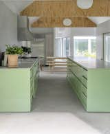
Michael and Hilary knew they would design their own rural residence ever since they cofounded architecture studio MOS in 2008. Michael explains that the couple felt a career obligation to experience their design skills firsthand, "to know what we’re offering to clients." In their kitchen, they used mint green cabinetry that connects the space to the outdoors.
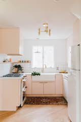
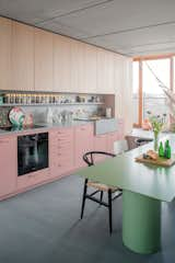
When a husband-and-wife duo renovated their tired 1950s home, the existing orange kitchen countertops were swapped for custom concrete countertops. The cabinets were painted Pink Ground by Farrow & Ball and paired with Build.com hardware. The kitchen sink and faucet are from Amazon, while the tile is from Lowes.
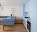
When architecture and interior design studio idea:list renovated an apartment in Slovenia's capital, Ljubljana, they opted for light, feminine finishes including a powder blue wall of cabinets that are balanced by a darker, moodier deep blue island.
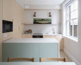
After a year of searching, San Francisco transplants Liz Armistead and Bill Broome found their dream home—a 1,400-square-foot ranch house in Austin’s Travis Heights neighborhood. The kitchen's existing layout remained as-is, but the architects added cabinetry, extended the island, redid the counters, and stripped and painted the existing cabinetry a delicate, etherial pink in Setting Plaster by Farrow and Ball.
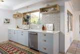
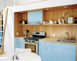
Designer Tony Wei has long had an interest in fixing up interiors, and now works as an interior stylist with a soft spot for run-down homes. At this 1951 ranch in Monterey Hills, she enlivened the kitchen with pastel blue cabinetry with leather pulls.
Fill up on the Latest in Kitchen Design
Discover inspired kitchens and get design advice for the heart of your home.