13 “Before & After” Remodels That Take Loft Design to the Next Level
A carriage house in Barcelona, a cigarette packing facility in NYC, and a car shop in San Francisco—lofts come in different shapes and sizes all around the world. We’ve rounded up a few of our favorite projects where designers pushed industrial spaces to new heights with stylish—and often surprising—results.
A Gut Reno Restores Gatsby Glamour to This Art Deco Brooklyn Loft
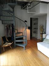
Before: The bedroom contained a spiral staircase that led up to the main living areas on the upper level.
After a leak caused water damage to this top-floor apartment in downtown Brooklyn, FIG Interior Design and JAM Architecture were brought in for an overhaul. Although the unit is located in a landmark 1929 building, the apartment had none of the period’s stylistic flair. "The clients loved the fact that it’s an Art Deco building, so they were quite eager to have the redesign reflect that," says interior designer Nina Garbiras. "At the same time, they didn’t want to do vintage Deco—they wanted to do a more modern, contemporary Deco."

"The bones of the original stair are in there," says McGuier. "We just sawed off the bottom half, put a new straight portion of stair onto the spiral stair, then covered the whole thing in sheet metal and painted it." Vintage slipper chairs in mohair sit on either side of a vintage Art Deco parchment table.
Garbiras and architect Joseph McGuier redid the layout, instituting a palette of lush colors and finishes, underscored by sweeping curves everywhere. A serendipitous discovery made it possible to lower the floor level in the main living room, and install a showstopping staircase that sums up that entire approach.

The main entry flows into the living room, which now accesses the outdoor terrace via the door to the left.

Before: A sliding glass door with a white aluminum frame separated the guest room from the kitchen.
Picture a loft, and what probably comes to mind is a cavernous space rife with industrial elements. This 1,620-square-foot loft in a former Nabisco factory in L.A. was no different, until architect Amanda Gunawan of OWIU Design initiated a 2019 remodel. Gunawan introduced a Japanese-inflected material palette to complement the industrial edge, including wide-plank wood floors, a sculptural staircase and built-ins made of birch plywood, and a room for tea ceremonies inspired by Japanese ryokans (traditional inns).

"Most of the carpentry built-ins were done out of plywood with birch veneer, chosen for its very raw finish and inexpensiveness," says Amanda. "For more structural items, like the adaptable bed platform, we used Baltic birch for its superior structure and planarity."
"Given the typically brute nature of exposed beams and heavy structural elements, one would not usually correlate an industrial building with the minimalist and non-imposing nature of a Japanese-styled home to create a harmonious look," says Gunawan.
A TV Writer’s Chelsea Loft Is Saved From a Hodgepodge of Outdated Remodels
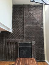
Before: Two fireplaces brought a lot of character to the apartment. "They’re both working fireplaces with this super interesting, almost Victorian-patterned brickwork that we thought was really unique—and we wanted to keep it as a defining feature in those spaces," says the architect.
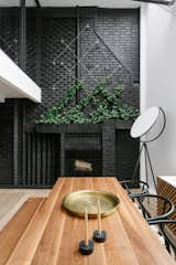
Despite there being not one, but two, double-height living rooms in this Chelsea loft, the home still managed to feel cramped and dated due to a series of remodels from different owners and eras. Enter the Brooklyn-based firm E.G. Projects, who were tasked with creating a unique live/work space for the loft’s newest owner, a TV writer.
The main bedroom upstairs now has a view into the dining room, thanks to a window that replaced a solid wall.
The firm opened up the mezzanine level and turned it into a chic office overlooking the living areas below it. The design team also embraced the "compressed space" of the kitchen by outfitting it with dark colors and steel elements, and they introduced a sense of "urban nature" throughout.

E.G. Projects worked with Greenery NYC to install plantings in strategic spots. The floors throughout are bleached oak.
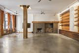
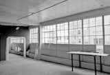
Before: The 2,700-square-foot loft had a sizable living room with enviable features, including exposed brick walls and timber structural beams.
"It had beautiful brick walls and piers and beams—it was just an iconic old New York loft space," says architect Evan Watts of this West Chelsea property. "But it was also immediately apparent that it was dated. And it wasn’t really optimized in terms of a layout. We knew very quickly that some simple moves could really make the space into a beautiful home."

Raj and Watts extended the fireplace column to the ceiling to highlight the room’s expansive scale, and they coated it in concrete plaster. It was important to retain the wood-burning fireplace—a rarity in the city—but "we wanted to reclad it in a material that also spoke to the industrial past of the building," says Raj.
Watts, a partner at D&A Companies, and architect Ravi Raj, who leads RARARA, teamed up to help out the owners, who are friends of theirs, on a remodel. Now, bleached walnut and concrete plaster soften the industrial vibe of the exposed brick and scarred wood structural framework, and a new layout adds space for an additional bedroom and bathroom.
A Light-Catching Glass Box Brightens Up a Tribeca Loft

Before: An awkward wall blocked sunlight coming from the loft’s southwest-facing windows.
While redoing her Tribeca loft, interior designer Nina Blair came up with a striking solution to the lack of natural light. Blair removed several walls and installed a glass box in the Southwest corner. Not only did this liberate two windows, but the process also revealed several original Corinthian columns hidden in the walls. The renovation deftly merges a new living space—one that leans into flexible use, as the glass room has been used as a bedroom and office—with the building’s history.

Now, a glass box in the corner defines the living space and allows light to flow through. The glass walls enable transparency, but can also foster privacy when needed. Blair has used the space as an office, and when surrounded in curtains, a kid’s room.

Before: The heritage commission required that the fluted cast-iron columns topped with floriate capitals be left exposed.
In remodeling this former heritage site in Barcelona, not only did architect Kirsten Schwalgien have to wrest control of the design from a condo developer, but the architect also had to get approval from the city’s heritage department for every move. "They didn’t like the fact that some rich expats were going to come and live in it, so it was a bit challenging to get them to agree to things," Schwalgien says. "But after a while, they saw that the renovation went very well, and they got very excited about it."

In the main bedroom, the parquet floor is stained gray and cut in irregular polygonal shapes. The color softens the exposed brick at the wall. An atrium can be glimpsed through the floor-to-ceiling black-framed windows.
Schwalgien inserted dark-framed glass walls to offset the preserved and painted cast-iron columns, tempered the exposed brick and concrete floors with warm wood cabinetry and built-ins, and installed a verdant atrium for a burst of greenery.
An Outdated ’80s Loft Is Rescued From a Flashy Color Palette

Before: The loft was stuck in the ’80s, with flashy red accents bejeweling the fireplace.
Three words can sum up the "before" state of this New York loft in a former garment factory built in 1890: black, red, and silver. In addition to the dated ’80s finishes, including silver brick and jarring red accents, there was a lot of wasted space. Brooklyn-based firm Isaac-Rae overhauled the layout to incorporate more bedrooms and bathrooms, and then instilled a distinctly unfussy aesthetic throughout.

In the living room, the team raised the firebox, clad the hearth in a tactile plaster finish, and installed a floating limestone bench that wraps the column. On the left (unseen) is integrated firewood storage, and a cozy reading nook sits on the right. "The bench was designed to serve as a social space/lounge, and is well-used," says Coffey. The wood beams and red brick were scraped and stripped many times to remove the silver paint and reclaim a natural state.
"Once the place was gutted, we could simplify detail and let the space breathe," says Clay Coffey, founder of Isaac-Rae. "Even small hidden details, such as latches flush to the door instead of visible door pulls, made a difference in simplicity. By selecting better—and fewer—materials, we made the space feel united."

The new lounge space connects to the living room via a sliding steel-and-glass door, and accommodates the homeowner’s gardening hobby via a striking green wall.
Before: The garage’s condition was such that only its concrete walls and beams could be salvaged. It would take five years to transform the 9,000-square-foot, two-level structure.
Converting this auto repair garage located in San Francisco’s SoMa neighborhood into the ultimate live/work space was not an undertaking for the faint of heart. Making the two-story, 9,000-square-foot structure habitable was a five-year process that involved jacking up one side of the building, redoing the foundation, and even sprucing up the plaster cupids on the 1923 facade.

Wood beams and concrete walls emerge from cutaways in the drywall, revealing the building’s industrial skeleton. The custom steel-and-oak dining table is by Ohio Design.
Now the building features an art gallery and studio at the street level, a three-bedroom loft above, and a 20-by-20-foot internal courtyard for bringing in more light.
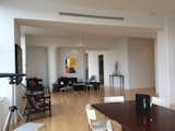
A Dark Austin Loft Becomes a Light-Filled Haven

Before: One of the loft’s best features is its floor-to-ceiling windows with downtown views—but the original design did little to accentuate them. Chioco and Francis lightened up the rust-orange cement flooring and worked with the couple to get their sense of style and how they lived.
To make this South Austin loft feel more cohesive, Chioco Design installed a collection of cabinetry in multiple rooms—from the kitchen and living room to the office and principal bathroom. The goal, says the homeowner, was for the 1,800-square-foot warehouse-style loft to feel "curated and orchestrated, much like a tailored suit."

The team worked with Elmwood Fine Cabinetry in New Haven to finish the kitchen, living room, office, and master bath. The home’s first floor measures approximately 1,000 square feet. The dining area features a 60-inch round table from Design Within Reach and Eames molded plywood dining chairs from Workplace Resource.

Before: The loft’s interior felt disjointed, and the kitchen crowded the entry.
At 2,250 square feet, this loft high above Chicago’s Michigan Avenue felt both cavernous and disjointed, and there was little in the way of practical storage. Vladimir Radutny Architects reorganized the floor plan and introduced a refined palette with sculptural accents that play in perfect contrast with the home’s industrial bones.

After: Vladimir Radutney Architects pushed the kitchen away from the entry and introduced a wood-clad utility zone for practical storage. The wood through line continues in the main space with a raised platform that wraps the perimeter of the room. The platform surrounds the living and dining area, and runs beneath the sleeping zone and stair landing.
Before: The loft’s wraparound views were obscured by a wall enclosing the master bedroom.
This Brooklyn loft had a rarified perch when architects Max Worrell and Jejon Yeung first visited it, as they could see all the way to Manhattan. However, some strange layout decisions by the developer made it difficult to fully enjoy the view. The pair reorganized the floor plan and relocated a main bedroom to give the living spaces windows on three sides.

After: The firm relocated the bedroom and removed the wall in order to cluster all the living areas together. Black-framed windows emphasize the stunning views.

Before: The renovation was a chance to create a singular, cohesive vision for the unit.
When Pam Williams, a former public library director in Portland, Oregon, decided to remodel her 1,075-square-foot loft with local firm Jessica Helgerson Interior Design, she fully committed to the process—she only gave a few directives, and she got rid of all her furniture so the firm would have a blank slate.

The contractors working on the project started referring to the bathroom as a "jewel box" because of the meticulous attention required to piece it together. "The one-by-one-inch Japanese porcelain tiles were laid out in a grid that aligns with every element in the bathroom," says Eng-Goetz. "For example, the bathroom sink aligns with the adjacent grout lines, as do the inset cabinet doors below." The cabinetry is whitewashed red oak, and the vanity lights are by Anastassiades.
"She described the kind of home she’d like to live in along with a thoughtful note about her experience working with professionals and learning that the creative process really shines with trust," explains senior designer Mira Eng-Goetz. "We were really moved by this simple gesture." The team completely reimagined the home, weaving in plush textures, a serene, pink-hued palette, clever built-ins, and statement-making tile to update the industrial space.
!["[The tiling] was all very intentional and painstakingly difficult to execute—the tiler, Jennifer Ferrante, is truly a tile goddess," says Eng-Goetz. "She individually mitered all of the tiles that make up every single outside corner that you see in the bathroom and the kitchen."](https://images2.dwell.com/photos/6133553759298379776/6564203711078088704/original.jpg?auto=format&q=35&w=160)
"[The tiling] was all very intentional and painstakingly difficult to execute—the tiler, Jennifer Ferrante, is truly a tile goddess," says Eng-Goetz. "She individually mitered all of the tiles that make up every single outside corner that you see in the bathroom and the kitchen."

Before: The owner wanted to eke more function out of the kitchen layout.
While this unit in a former See’s Candy factory had a stunning wall of windows, the kitchen and storage situation were not much to get excited about. Síol Studios stepped in with a new plan, plenty of storage, and a material palette that underscores the industrial nature of the existing board-formed concrete ceiling and aforementioned windows.

After: The team swapped the kitchen and eating area. Honed Caesarstone Calacatta Nuvo wraps the new island and tops the white cabinets. A wall of tall storage now occupies the former eating area—including an appliance garage with a roll-up door for hiding clutter.
"The client wanted to bring in as much light as possible, so the palette went toward light woods, light stone, and light floors," says designer Jessica Weigley. "Obviously, we were going to be working with that existing rough textured ceiling, and we really wanted that to sing as well."

After: The firm preserved many key features of the 1,100-square-foot loft, including the classic windows and the beautifully textured ceiling.
Published
Get the Dwell Newsletter
Be the first to see our latest home tours, design news, and more.