Designer Rebecca Atwood Wants You to Master the Art of Using Color
Rebecca Atwood would probably rethink the all-white kitchen. She has nothing against it, or neutrals in general, but this in-vogue shade usually says nothing about an individual's personality. And when it comes to design, Atwood thinks a room should be a clear reflection of those who live their lives in it.
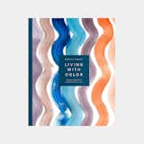
In 2016, Atwood published Living With Pattern, a best-seller that drew upon her experience as a textile designer to explain and encourage the use of this namesake design element. And this past August, she released a follow up book, Living With Color, which provides easy guidelines on how to paint a home with more than just white. Mixing home tours and color how-to advice, Living With Color helps readers find the shades that perfectly embody their tastes, recall their happiest memories, and give their homes a truly personal touch.
Read on to learn how Atwood advocates for thinking and feeling through color, and how Living With Color can help you create or renovate a home that's an experience in itself.
Most people tend to think of modern design as being stark and neutral. How do you define color's place in the realm of modern design?
I do think that people are coming around to color in order to personalize their space. I always say that color is a way to tell your story, and I think people are seeking color out as a chance to do that. We've seen a lot of whites and neutrals in design, and they're beautiful and still relevant. When people ask themselves, "How do I make this place mine?" that's when color and pattern really come in. As people continue to crave personalization, color is going to be playing a bigger part in design.
It's true that more people are seeing their homes as a reflection of their personalities. It's a place to eat, sleep, and also connect.
There's been a lot of talk about how people want to spend their money on experiences in recent years, and I think that idea extends to how people want to experience their homes. So, essentially, people are asking themselves, "how does my home promote my well-being?" They're using their personality and experiences to express themselves more in their homes.
"When you're thinking about how to make a space your own, that's where color and pattern come into play," Atwood says. She thinks more people are embracing color as part of their design palette, but may not be sure about finding shades that best reflect their personalities. Her new book, "Living With Color" aims to help.
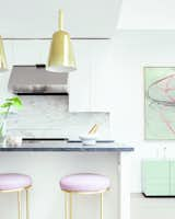
Definitely. But in the case of kitchens, perhaps whites and neutrals still reign. How can people experiment with more color in this room?
So, choosing things that are more permanent, like tiles and cabinetry, you can't do much to change those unless you are undertaking a renovation. But if you're working with a neutral backdrop, a kitchen is a great place to experiment with color. It's where you can bring in collections and put items on display. So, answer this type of question: What do you like to collect, and what colors are present there?
It's common to collect dishes and glassware, so those can be put on open shelving, for instance. From there you can see what colors speak to you, and how they make you feel, because these pieces can be interchangeable. Perhaps you'll notice that you like a particular green in a dish, or the shade of lemons in a bowl.
You can also look at the dishes you like to cook. What ingredients and spices do you gravitate toward? And when you set a table, what color linens do you normally grab? When you pay attention to these smaller decisions, you can see how you respond to different colors on a daily basis. That can help you figure out if you want to make a more permanent color decision down the line.
As for bathrooms, is this still a space where you can be more daring with color?
Yes, you can take more risks in a bathroom. Unlike other rooms in a home, like the kitchen, you're not spending hours in here—well, unless you're trying to recreate a day at the spa. But generally speaking, because we spend a short amount of time in a bathroom, it's possible to use more color either with bright paint or a bold wallpaper.
My aunt painted her bathroom an orange-coral color when I was young, and it's still something I remember and gravitate toward because it was very vibrant and unexpected. The rest of her home was more traditional, but the bathroom had this pop of color that was very joyful.
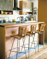
Not sure about which colors work best in your kitchen? Atwood says to pay attention to the colors in your favorite meals, as well as the linens you turn to again and again.
The thing that I liked about Living With Color was how much you advocate for reflection—there's a lot of thought that goes into choosing the "right" shade. Why do you think it's so important?
I hope people take the time to feel a color, and see how they personally respond to it. It's not so much about following trends as it is about being drawn to a color that speaks to you. After you figure out the colors that you respond to, it's easier to decide which ones are best for different rooms in your home.
I think there's such a thing as "color" memory, or colors that remind you of places where you felt at ease or happy, depending on what mood you're going for—those are the feelings I want to feel at home, and I think most people do, too. When you tap into those memories, you can use them to develop color palettes.
Part of the appeal in choosing neutrals is that it takes the guessing game out of picking and living with bolder colors. So spending time to really consider personalized shades helps to make what you call in the book a "color story."
Yeah. No one wants their home to be described as "stark" or "cold." So thinking about what resonates with you—a certain place, being out in nature, or a happy color from your past—that's what makes a home feel warm. That, ultimately, is what I think everyone wants.
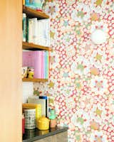
Don't be afraid to use bold wallpaper in a kitchen or bathroom, Atwood says, especially when you can use neutrals to balance out its effect.
How can someone create a flow between the colors they choose for a kitchen and the ones they pick for a bathroom?
If rooms are going to connect, they need to share similar colors. In Living With Color, there's a section where readers can make their own color wheel and learn about complementing colors. From there, they can decide whether the considerations they outlined for their home work together or not. It avoids a scenario where you paint your kitchen green and your bathroom red, but it ultimately doesn't work together.
Let's say that people still feel intimidated by color even after they really think about which ones work for them. What advice do you have to make them more comfortable?
I would highly suggest doing some experiments and testing things out on a low-cost scale to see which colors you like in a space, especially in a kitchen or bathroom. Paint is usually the best budget-friendly option. Once you're feeling more confident about a color, then you can move on to pricer details like tiling.
Start with colors that feel like neutrals. Instead of using black, use a blue. Instead of gray, see about green. Instead of beige, try blush. What happens when you take a neutral and turn the saturation up? It usually becomes a much richer color. Some grays turn green, others turn blue, others turn purple. Find something that falls between neutral and saturated, because those in-between colors can be really beautiful.
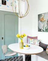
Atwood thinks a home should feel calm and happy, which is why shades of blue and pops of yellow are so popular in design.
Published
Get the Dwell Newsletter
Be the first to see our latest home tours, design news, and more.