7 Paint Colors That Nail the Midcentury-Modern Look
From the cheerful hues of the 1950s to the softer, earthier shades that were popular in the 1960s, these paint colors will give your home the perfect splash of midcentury magic.
Whether you gravitate towards fun citrus tones or more mellow neutrals, midcentury-modern colors can jazz up any room in your home—even if it wasn't built in the ’50s or ’60s. We've rounded up some of the most popular shades of the era that still look current today—read on for our top picks!
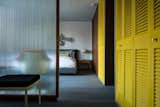
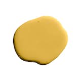
Golden Yellow
In this midcentury prefab, bright closet doors provide storage space and a healthy dose of color.
Deep yellows can warm up any space. PPG Pittsburgh Paints' Wright Mustard (FLLW321) and Glidden’s Wheat Stalk (30YY 52/515) are two paint colors that complement contemporary midcentury-inspired interiors.
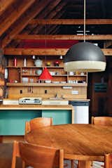
In the late Jens Risom's family retreat in Rhode Island, a no-frills kitchen features wooden shelves that mimic the home's beams. The kitchen island is finished with an aqua-painted section.
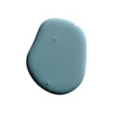
This shade has a levity about it that works well with both muted neutrals and darker colors. Benjamin Moore’s Blue Seafoam (2056-60) is a good example of a relaxing blue paint color that works well for interior and exterior walls.
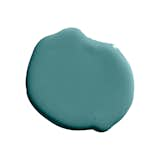
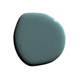
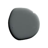
Dark blue-gray with a hint of green undertones. Depending the light, this color can skew blue or green. Our premium interior water-based paint in Standard Finish is a highly desirable low-sheen, durable semi-matte.
This shade works well with burnt orange, gold, or dark brown and can add extra character to foyers, lounge areas, accent walls, or children’s playrooms.
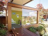
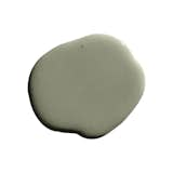
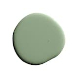
Deep, earthy greens like olive and wasabi were popular during the 1960s. Relentless Olive (SW 6425) from Sherwin Williams and Green Root (8334) from Jotun capture these shades well.
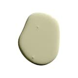
Fresh, light green with a hint of yellow. Our premium interior water-based paint in Standard Finish is a highly desirable low-sheen, durable semi-matte.
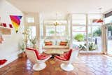
This rejuvenated Austin hotel celebrates midcentury design with pops of red scattered throughout.
Reds are great for designers and homeowners who want to be courageous with color. In fact, Frank Lloyd Wright's favorite shade was Cherokee Red. He used it throughout his residential projects, often covering entire floors with it.
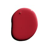
Bright, rich, classic red. Perfect for an accent wall or your boldest mood. Our premium interior water-based paint in Standard Finish is a highly desirable low-sheen, durable semi-matte.
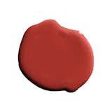
Red with a hint of orange. Perfect for an accent wall or a small space. Our premium interior water-based paint in Standard Finish is a highly desirable low-sheen, durable semi-matte.
This door with space-age knobs is painted with Behr's Flaming Torch. The brass wall hanging above the landing is by C. Jeré.
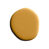
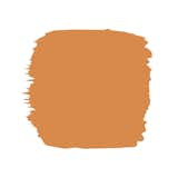
Tangerine and ochre were a popular choice for many midcentury architects and interior designers. Those who want to make a bold design statement will love midcentury oranges shades such as Sherwin Williams’ Carnival (SW 6892) or Orange Fruit (2011-1) by Valspar. If you’re looking for a warm and fun—but more muted—orange, try Wright Ochre (FLLW325) from PPG Pittsburgh Paints.
This energizing orange can create a popping fresh feeling in your home, perfect for use as an accent on bookshelves and furniture Photo Courtesy of Build.com
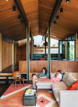
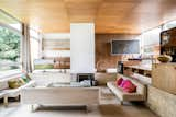
In this updated 1950s Portland home, a light gray Neo sofa by Bensen harmonizes with warm wooden walls, ceilings, and floors, as well as a red-and-mustard-yellow vintage rug.
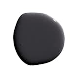
To balance out bright reds, oranges, or yellows, try pewter grays, which can add a cooling touch to warmer color schemes. If you’re thinking of gray for your walls or ceilings, Wright Soft Grey (FLLW872) from PPG Pittsburgh Paints is a versatile option.
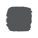
A soft charcoal black. After Hours is a shade lighter than Dark Arts. Our premium interior water-based paint in Standard Finish is a highly desirable low-sheen, durable semi-matte.
Perfect dark gray with mild cool undertones. Our premium interior water-based paint in Standard Finish is a highly desirable low-sheen, durable semi-matte.
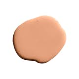
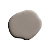
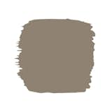
Different shades of brown can bring a calm, earthy feel to living rooms and studies.
Warm, wood-toned shades of brown give spaces a grounded feel. Try Behr's Cocoa Shell (HDC-AC-05) or Wright Oak Bark (FLLW623) from PPG Pittsburgh Paints.
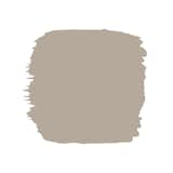
Warm taupe with earthy and lilac undertones. Our premium interior water-based paint in Standard Finish is a highly desirable low-sheen, durable semi-matte.
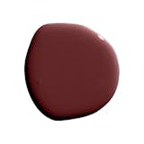
This vintage brown will transport you to the boulevards of London, Paris, and Rome, perfect for use in dining rooms or master bedrooms. Photo Courtesy of Build.com