Mack Scogin on OSU's Knowlton Hall
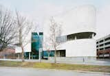
A decade ago, the Ohio State University Austin E. Knowlton School of Architecture called upon Mack Scogin Merrill Elam Architects to accomplish a formidable task: create the consummate teaching tool by designing its new building. The structure was completed in 2004 and christened Knowlton Hall. In December, we sent photographer Ian Allen to Ohio to capture the building and its occupants in the midst of final reviews (the resulting images are featured in our May 2011 Photo Issue). Here, we share our extended interview with architect Mack Scogin on the design process, the donor's mandate to use marble, and Scogin's favorite space in the grand structure.
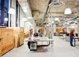
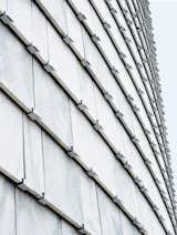
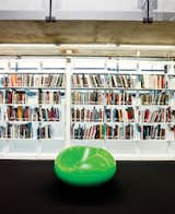
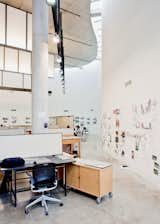
Why did this project interest you?It was fascinating to try to design something that was going to pick up on emerging trends in architecture education. We wanted to have that reflected in the building and have it be something that would be enduring over time.What kinds of trends were you looking at?One was that the school had had three different departments in different locations on campus and they had been operating fairly autonomously. The school wanted to bring these disciplines together in a much more collective way so that they would influence one another by proximity and pedagogy. Another emerging thing was the way in which technology was beginning to affect the way people produce design—how it's affecting the work station, the way in which a teacher could observe the process. We had the idea of at once smaller desks but more collective spaces as well as more pinup spaces. We wanted to react to the relationship between architecture and technology and interdisciplinary work. Lastly was the idea that the building feel extraverted without compromising its function. The school and donor wanted it to be somewhere where anyone could come in and be welcomed and challenged by it.So what was the brief?That was really interesting. In addition to the programming they wanted, it was to renovate the existing building and add an addition. We looked at that for about a year and began to realize that a huge part of the budget would have gone into renovating the building to get it where they wanted it to be, which compromised the new part. We said, if you just started over and built a new building, it might cost a marginal amount more but you’d have a chance to meet the expectations of the programming.The school and donor eventually went with the plan to build anew. What then presented the biggest challenge?One thing that came out of all the meetings and became the primary goal was the idea that the building should instruct, that it should help the students imagine what the possibilities of architecture should be. How do you make a piece of architecture about architecture? That’s a really heavy-duty objective, to say the least. What makes up architecture? When you strip away time and technology, what is left? The budget was also stripped away so we could only have one or two finishes, and we had to have an extremely efficient structure and plan. We could have argued that there was no room to move within the budget but it forced us to get back to the basics of what architecture is all about, which is materiality and structure. Rather than 40 different finishes, it's an example of how you do it with three.One of those main materials was marble. How was that to work with?The donor specified white Georgia marble be used, saying that if it was good enough for the Lincoln Memorial, it was good enough for the school. It makes no sense in today’s economy and with today’s technology to build like that. So we said, if you were going to do a building in marble today, how would you do it. We came up with the idea of marble shingles as a rain screen. We put them on the building in a way that they can be easily replaced, and they are all individual tiles so that we didn’t have to use any caulk, because that’s where marble always fails. It’s not even a real rain screen—there’s another, fully functioning rain screen behind it. In contrast to the heavy-looking marble siding is the glass-enclosed library.It’s a glowing box at the top of the building. It’s a destination point and up high so we could take advantage of a roof garden and have this enclosed, secure, exterior space. A glassed-in space seems an odd solution for a library, where the purpose is to house books, which can deteriorate in direct sunlight.Librarians don’t always see books as precious items. They want the books to be used; they want them to be worn out. They’re used to replacing books that aren’t of great value so it’s not an added expense nor extra task to be done. The glass does have UV protection, and there’s a rare books collection in the middle of the library that has its own protected room.The library has received a lot of praise, but what’s your favorite space in the building?I don’t know if I have a favorite space but more of a favorite effect, which most people do not pick up on. The studios are divided into four quadrants and diagonally they line up at different elevations. [The northwest and southeast sections sit seven feet higher than the northeast and southwest quadrants.] One giant floor would destroy this building. It’d no longer be studio spaces but a factory.Is there anything you’d change about the space?It would have been nice to have a couple moments of really fine materials and a few details that were more refined. It also would have been nice to have had more color to push, shrink, pull, and manipulate the space—not to decorate but to demonstrate.