The Story Behind Over 125 Stunning Poster Designs
The exhibition is divided into 14 sections based on visual strategies poster designers use to grab attention. How did you arrive at the categories?
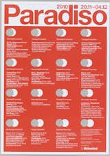
Experimental Jetset (Amsterdam, Netherlands): Erwin Brinkers (Dutch, b. 1973), Marieke Stolk (Dutch, b. 1967), and Danny van den Dungen (Dutch, b. 1971) for Paradiso (Amsterdam, Netherlands). Paradiso 2010, 2010. Diecut, offset lithographs. 59.4 × 42 cm (23 3/8 × 16 9/16 in.). Gift of Experimental Jetset, 2014-40-3, -5/-7. Photo by Matt Flynn.
We spent many hours looking at favorite posters, looking a posters that we've never exhibited for, and discovering "finds" in our collection that are fresh or weird or different. The categories emerged as we looked for patterns and ideas that recur among different designers working in different contexts. It was important to me that some of the design strategies that we celebrate contradict each other. In the very first gallery, we present a clash between "Focus the eye" and "Overwhelm the eye." Some designs work hard to show the viewer exactly where to look, where others take the eye on restless journey.
Which of the graphic design tools catches your eye the most?
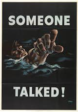
I love our section on storytelling. It is fascinating to see how designers present dramatic action and emotional tension with just a single image. We have a chilling poster promoting U.S. War Bonds during World War II in which a young boy is standing in his yard with his younger siblings. A giant shadow of a swastika is cast over them. The young boy sees the danger, while the younger kids are oblivious to it. Only he knows what might be coming... All this is conveyed in a single image.
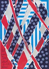
Mark Gowing (Australian, b. 1970) for Sherman Contemporary Art Foundation (Paddington, Australia). Jonathan Jones: untitled (the tyranny of distance), 2008. Screenprint. 84 × 51.6 cm (33 1/16 × 20 5/16 in.). Collection Cooper Hewitt, Smithsonian Design Museum, Gift of Mark Gowing, 2014-32-2. Photo: Matt Flynn
Do you have a personal preference for posters that use a particular element strongly, for example: color vs typography vs symbolism?
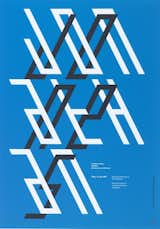
I do love typographic posters. We are showing many posters in the exhibition that have no images at all, but convey their messages entirely through type. Big letters, transparent letters, hand-drawn letters, 3D letters, scattered, scratchy, random-looking type—It's all there!
What is the anatomy of a "good" poster?
Typically, we expect a poster to convey a clear message and to use the elements of composition to direct the viewers to that message quickly and efficiently. Although many posters in our exhibition meet that standard definition, others take a very different route, providing the viewer with a complex and intellectually or optically challenging experience.
Which era do you think was the strongest in terms of poster design and why?
Our modern ideas about simple, direct poster design come from the early twentieth century, when designers like Lucian Bernhard created simple posters that highlight a single object. Perhaps the strongest poster designs, however, come from periods and situations of urgency, from war propaganda to activist posters for the Paris uprisings of 1968 to AIDS activism.
When curators in 50 years are looking back on poster designs from today, what do you think they’ll identify in terms of strengths, trends, and influences?
I think they will see designers struggling to define the relevance of print in an increasingly digital age. Posters, like books, are a place where designers express their passions and create artifacts of lasting value in an ephemeral culture.
Today, everyone has access to an astounding amount of images and we’re constantly inundated with them. How does this influence the way people today—graphic designers as well as non-experts—engage with posters? How does this impact poster design?
Today's visual onslaught has made people into more visually adept viewers. People today are uses to seeing good design online as well as in packaging, store environments, and in film and television graphics. Many posters today circulate online through through blogs and portfolio sites. Our exhibition gives people a chance to see "the real thing," but we are also showing some animated digital versions of posters to indicate this other life the image.
Not to play favorites, but which poster resonates with you most?
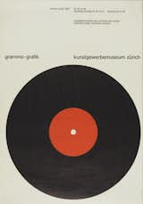
Gottlieb Soland's 1957 poster "Grammo-Grafik" (Recorded Music Graphics), which has a giant flat LP album smack in the middle, represented with pure flat colors in the classic "Swiss style" that shook the world in the post-war period. The poster is very clever, choosing to represent the idea of music graphics by showing a naked album reduced to its most elementary state.
Do you remember the first poster you ever bought?
I bought a book of Milton Glaser's posters when I was in high school. The book is large-scale and designed so that you can take the posters out and put them on your wall. I still have that book, and I'm glad I never cut it up!
How Posters Work is on view at the Cooper Hewitt, Smithsonian Design Museum, from May 8–November 15, 2015. Visit cooperewitt.org for more.
Published
Last Updated
Get the Dwell Newsletter
Be the first to see our latest home tours, design news, and more.
