

40 more photos
Credits
From ESQVTA | interior design & architecture
A concept. Two spaces. The same language. The same decorative elements.
Different colour codes.
Part of the client's request is the creation of a repeatable concept for several
stores for a new fast-food brand to be implemented in the market: hot dogs and
other simple, quickly prepared, and low-cost foods. Much of the food is grilled,
so the entire organization of the space revolves around this area.
The first two spaces have different locations, areas, and configurations: an
exercise in unfolding typologies, forms, and codes.
The first is located in Matosinhos, in a store with wide windows to the outside,
facing a square, with ample natural lighting and close proximity to the sea.
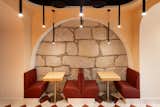
The second is located in the historic center of Porto, in a store with a completely
opposite configuration to the previous one, with a tunnel configuration, a smaller
area, almost enclosed to the outside, nestled in one of the winding streets of
downtown Porto, and with a strong apparent presence of traditional materials
of Porto's architecture.
In the imaginary realm was the American diner, a concept that Hollywood so
well publicized:
well-groomed boys with pomade at the wheel of Cadillacs and girls with
milkshakes, while humming Elvis Presley songs.
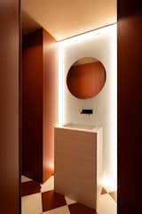
With this concept and the careful and refined study of the relationship between
materials and forms, a contemporary and colorful identity was defined as key
elements of the projects.
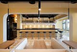
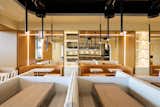
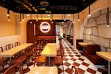
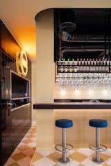
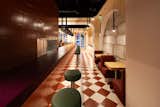
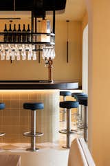
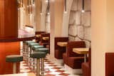
The backbone of the space organization is the long counter with fixed bar stools,
directly linked to the food preparation area, and whose process is visible from
the outside through a large opening framed with steel.
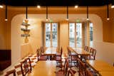
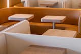
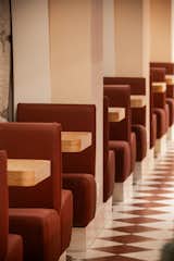
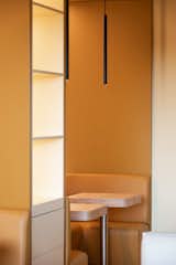
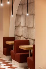
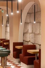
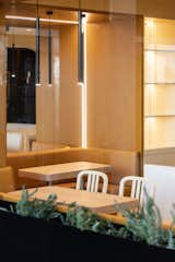
The remaining public area unfolds from this and arranges rows of booths, with
sofas and tables, against the wall or in the center of the space.
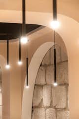
The main lines of decoration draw inspiration from diners from the 1920s to the
1950s.
References to decorative elements of Streamline Moderne were drawn from the
1920s to 1940s. In both projects, curved lines that eliminate edges are
emphasized, and long horizontal lines are reinforced.
References to graphic or finishing elements were taken from the 1950s: color
blocking, stainless steel panels, tiled floors, use of tiles, and neon lights.
When a client seeks ESQVTA's work, they know that bold dreaming happens
there, that creative expression is a dominant note, and that developing a new
project always opens up unlimited possibilities - all of this was gathered here, and
a little more was done: starting from simple food, to embark on a detailed journey
of shapes and colors.