Collection by Ralston O'Neill
coolcapitals Cool Case Finalists
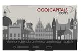
coolcapitals.com and Dwell teamed up for the second year in a row to bring you a "cool" design competition! We asked for smart-phone cover designs that represent and fuse the unique cultures of the coolcapitals cities of Amsterdam, Antwerp, Valencia, Vienna and Zürich - and boy did you deliver! Here's a slideshow of the top ten finalists. Our judges have a tough decision ahead of them!
Check back on September 1st to find out who won the grand prize—two round-trip tickets to the cool capital of their choice!
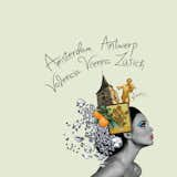
Five Capitals
Submitted by Palina Klimava
Designer's Statement:
"The inspiration for this design was architecture in the five European capitals: Amsterdam, Antwerp, Valencia, Vienna and Zurich. There is nothing more relaxing and inspiring than a walk in a little street, along a canal, river or a crowded plaza in a European capital. The architecture is full of little details, stories and soul and gives each city its unique atmosphere and beauty. Each capital has its own flavor and character, which always leads to rich memories, new experiences and excitement."
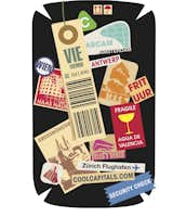
Frequent Flyer Badges
Submitted by Francis Dempster
Designer's Statement:
"My inspiration was the design of luggage tags and shipping stickers, especially vintage labels. I felt that the variety of stickers allowed me to reference each city, in addition to the process of traveling itself. Considering the shape of an iPhone or Blackberry, I felt that it would be very exciting to recreate the look of a traveler's bag as it made it through the 5 cool capitals. This design will really come to life as it wraps around a phone."
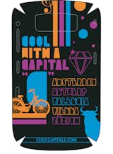
Cool with a Capital "C"
Submitted by Giuseppe Saltarelli
Designer's Statement:
"The slogan “Cool with a Capital C” and my custom made font illustration dictated the style of the design. After that the challenge was to take something from each Capital and make it work together. For Amsterdam I went with their signature bicycle, for Antwerp it was the diamonds they are famous for, Valencia, I chose to go with the Bull, for Vienna where Mozart came from and is the music capital of the World I went with the Treble Clef and finally for Zürich I decided to add circle spots which represents the Swiss cheese holes and/or pieces of chocolate. The choice of colour was another challenge where I wanted to go with a feminine colour that men would not be embarrassed with. I think it worked."
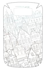
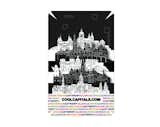
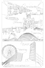
Coolcapitals Skyline
Submitted by Diane Lee
Designer's Statement:
"Each of the 5 cities have such unique and rich cultural histories. I was inspired to create a "CoolCapitals Skyline" consisting of famous buildings from each capital. I carefully chose buildings that represent not only the city's architecture but also its history, arts, music and religion: Rijksmuseum--Amsterdam, The Grote Markt--Antwerp, Escola Pia--Valencia, Burgtheater--Vienna, Fraumünster--Zürich. The skyline of these beautiful and historic buildings are contrasted with simple, clean lines and text. My goal was to convey a complementary combination of old world and modern design elements."
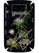
Capital Line
Submitted by Jen Silbert
Designer's Statement:
"I was inspired by the transit maps of each city, specifically how each map is without scale. When comparing city subway maps, you cannot tell which is bigger or grander, or further in distance. I put all of the city transit maps together to make one large intertwining map, still maintaining the reference points of the central stations. you could theoretically find your way on this map from the hauptbahnhof in zurich to the central station in antwerp. Each building has a unique architectural style.The stars represent our shared sky, and are also reference points for direction and travel. I wanted to convey a sense of the modern traveler, both literally within the urban symbol of the subway, and figuratively connecting all of the cities closely together, as our modern communication (iphone / blackberry) encourages."
Modern Noir
Submitted by Richard Chritz
Designer's statement:
"I love the style of graphic novels. I think they are an important part of modern day art, so initially I was going for a high contrast black & white design. Nothing to me is more iconic of a city as it's skyline. So I stuck to a simple imitation of each city. Afterwards I saw it needed the city names still and some color, so I went with a colorful "branding" in the bottom. I feel overall it fits a European vibe."
The City Is...
Submitted by Marek Hosek
Designer's Statement:
"My inspiration was to take some elements of what each city has to offer and make a typographic design. Each city has it's own sentence which is repeated on the case in it's own defined color. Example, Vienna is...... Zurich is.... From afar, the names of each city are easily recognized, as the viewer gets closer, they realize they can read about some interesting points of each city. The case works not only as a design element but an informational piece. The description of each city can be easily altered to be an interesting point about any city, or an informational description. Design is shown in colors, but can easily work in Black, white and gray for a more masculine look."
Eurofashionista
Submitted by Mario Valverde
Designer's Statement:
"Design, architecture, fashion, Europe, music, friends, family, food - you name it and I am inspired by it."
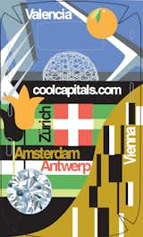
I Cover the World
Submitted by Anne Herlihy
Designer's Statement:
"My design encompasses Santiago Calatrava, Gustav Klimt, Tulips, diamonds and the Swiss flag as visual reference points for each of the 5 cities."
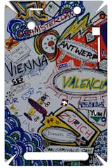
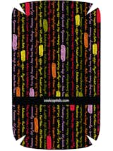
Enjoy Fun
Submitted by Melinda Rector
Designer's Statement:
"My design reflects the what pops into your head when your thinking about your travels and making scribble artwork about them. For example, waiting for the train you think about that cup of coffee in Vienna or should I really make my Holiday a month or not? Or don't forget I have that Dinner planned in Zurich and to meet my friend Gab at 1:15pm in Amsterdam...I also hear Diamonds are everywhere in Antwerp and the tapas are top notch in Valencia."