Collection by Diana Budds

Casa H, Brussels

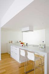
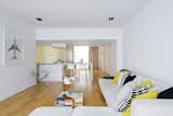
When it came time for Hernan Rios to renovate his apartment inside a 1968 Louis Herman De Koninck building, he reached out to Matteo Colombo and Andrea Serboli's Barcelona-based firm CaSA. Located in the center of Brussels, Belgium, the Brutalist structure is now the home of a newly bright and crisp interior inspired by the über-clean simplicity of European hotels. A graphic designer by trade, Rios traded embellishment for sparcity and though his environment may not be meant for everyone, it's tailormade for him. "I'm a maniacal perfectionist, and we were shooting for smooth walls, near-zero moldings, ceiling reveals along the window walls and different volumes that all had to measure up perfectly. Every line had to be straight, aligned with other components, and cleanly executed," he says. "Additionally, we suffer from rather grim winters, so considerable attention was given to finding solutions that would allow the maximum amount of light to penetrate as deeply into the interiors as possible." No part of the Spartan, 1,055-square-foot apartment is left without natural light, which the architects accomplished by using glazed glass partitions with varying opacities and privacy curtains in lieu of standard walls. In our slideshow, tour the residence.

"Minimalism in general holds great appeal—to me that means clean spaces and simple materials with as little visual interruption as possible (including very little in the way of furnishings), so the eye travels easily around the space, giving a sense of expansiveness," says Rios.
Resident Hernan Rios reclines on his sofa.
A drop ceiling defines kitchen and dining area and also provides storage. "It’s the basement we never had, hidden right in plain sight," says Rios. "The other thing that’s worked well about the dropped ceiling is that it creates a sense of intimacy when we’re sitting at the table, which is a really nice feature when you are in fact floating in the midst of a much larger space."
The kitchen is a mix of custom and off-the-shelf items. "Because of the budgetary restraints, we planned the kitchen around Ikea's options, with the exception of the big table/work top, which we designed, sourced the laminate for, and then had our contractor build on site. We would have loved natural stone or concrete, but the budget just wouldn't allow for that," says Rios. "All in, we were able to get the multi-purpose table—prep surface, cooktop, dining table—created for 1,000 euros, exactly how we wanted it. Using an Ikea surface—with which we wouldn’t have been able to achieve the same degree of customization—would have cost double."
The budget for the renovation was tight, but the architects splurged on a few elements, like the glass partition show here. "We concentrated investment in a few space-changing, expensive elements, like the glass walls we placed to divide spaces and bring the light in. We kept the budget low on almost everything else," says architect Matteo Colombo. "This is generally our philosophy: to concentrate resources in elements that make the project special, and keep the rest simple and affordable."
In an unconventional twist, the bathroom is separated into two rooms: a glass-walled shower/sink area shown here and a more private room for the toilet.
The bathroom leads to the bedroom.
"One of Matteo’s biggest contributions was in suggesting the glass hallway as a way to get access to the WC without having to go through a bedroom, yet without sacrificing any of the light penetration that was a primary goal of the whole design," says Rios.
"We get direct sun, when there is any, both morning and evening. A wonderful old tree out back in our neighbor’s garden creates beautiful plays of light, and the branches—bare in winter and leafy in summer—are framed by the window wall in such a way that it really feels like the tree is part of our home. It’s wonderful to lie in bed and contemplate the branches," says Rios.
Here's a conceptual drawing of the apartment, showing the flow of light through the space.
The floor plan.
The floor plan.