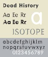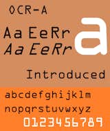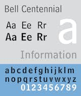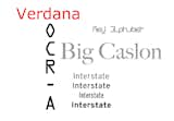
Carmody Talks Typefaces
When it comes to museums, we often hear about their blockbuster exhibitions, the thousands of people who crowd their galleries to see those exhibitions, or the latest architecture firm selected to design their new wings. But how do works come to be on display? Objects in a museum's permanent collection go through a rigorous vetting process that takes many months—and often years—to complete. On January 24th, the Museum of Modern Art announced the accession of 23 digital typefaces into their permanent collection. Kate Carmody—a curatorial assistant in the Department of Architecture & Design who worked on the acquisition—answered a few questions about the process, shedding some light on how museums build their collections. "This type of collecting allows us to distinguish great design anywhere we see it," says Carmody, an expert in the history of design and decorative arts. "We are now able to draw attention to the process of graphic design as well as its finished product."
How long has MoMA been working on acquiring these 23 typefaces?It started back in 2006 (before I began work at MoMA) when [Senior Curator] Paola Antonelli held a symposium on the future of the graphic design collection—it was and still is mostly posters, and Paola along with then Curatorial Assistant Christian Larsen assembled a panel of experts to discuss the potential of collecting other types of graphic design, and typefaces were brought up then, along with a preliminary list of fonts to consider. We began working in earnest on this particular acquisition last spring. They were then proposed officially in September. Why is it important for MoMA to collect these typefaces?It is an important step in expanding our graphic design collection. Of course, typefaces are the building blocks of graphic design itself—but this acquisition allows us to acknowledge the fonts not just as materials used by graphic designers but as designs in and of themselves. What were some of the initial concerns when the idea of acquiring these typefaces was first proposed? There was a lot of discussion about how these fonts would “live” at the museum, how we would archive them, store them, and display them. Paola, Paul Galloway, our Architecture and Design Study Center Supervisor, and I worked with Sam Sherman in the Department of Graphic Design here at MoMA, along with Glenn Wharton in the Department of Conservation to come up with a plan that would preserve the fonts for posterity as well as allow us to display them as part of the collection.Did you encounter resistance from the acquisitions committee?For our acquisitions committee, digital acquisitions are not new—there was a bulk of them made after Design and the Elastic Mind in 2008. We also laid the groundwork back in March [of 2010] when we acquired the "@" symbol. It is always a little more interesting when there is not an object per se—but typefaces, often designed to be invisible, had to be made present and obvious—and that was the challenge.Acquiring the "@" symbol seemed to open new doors and new conversations in museum collecting. How have these typefaces impacted future acquisitions?This type of collecting allows us to distinguish great design anywhere we see it—even if it doesn’t fit in a gallery in the traditional way. In the case of the typefaces, we are now able to draw attention to the process of graphic design as well as its finished product. What were the some of the unique issues that presented themselves in acquiring the typefaces?The primary question was how do we collect these dynamic works? We have digital works in the collection so that wasn’t the issue; it was about the work itself—what is it? Do we collect the font file? A printout of every character? In what format? The format it was originally created in? If so, in many cases that would make it useless to us in terms of showing it in the galleries, but would meet the criteria of preserving it for posterity, so we needed both the original and current file. The dual mission of the museum—to preserve and protect as well as exhibit—had to be considered in a new light.How will these typefaces be represented in the collection?We are collecting the digital files, as well as the historical font formats in some cases.What was the criteria used in selecting the typefaces?We consulted with various experts—designers, historians and typographers to winnow down a list of significant typefaces that were important both technically and aesthetically. As with all of our acquisitions, form and function are important but so is meaning. We are always looking at designs that communicate values that go well beyond their formal–and functional—presence, starting from the designer’s idea and intention. Of course we also take into account innovation--good designers take scientific and technological revolutions and transform them into things that anybody can use, which is especially true of digital typefaces. We also consider the cultural impact of a design--MoMA has always privileged objects that have the power to influence and touch the greatest number of people. Their impact can be either direct, or built up over time through the inspiration they give to other designers.Of the 23 typefaces recently acquired, which do you feel are the most influential to the digital typography movement?All of them! That is why we acquired these specific 23. We started with historical fonts—typefaces created right at the dawn of the computer age, and moved our way forwards. We had to start with these as a foundation—each one is important because of its aesthetic quality but also in the way it relates to the technology available at the time it was made.What are some fonts that didn't make the cut?We looked a lot of fonts, and will be acquiring more in the future—so the ones that didn’t make this initial cut will be revisited.