Collection by abigail doan | studio
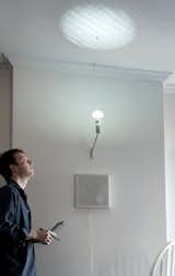
AiryLight by Annelie Berner
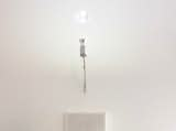
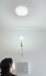
Modern living conditions that render the invisible visible takes on new meaning with designer Annelie Berner's AiryLight. This illuminating and interactive project expresses realtime local air quality data through a custom-design lamp's changing light patterns and shadow projections on the ceiling above. Created by Berner as her thesis for New York University's Interactive Telecommunications Program, the AiryLight creates soft ambiance indoors, while also consistently informing you about the outdoor environment. The dynamic display of information is meant to be visually informative as well as playfully inviting for viewers and home dwellers to discuss, track, and share what they learn about changes in their day-to-day surroundings.
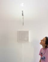
AiryLight's light passes through a moving lens that gives varying size and clarity to the projected light pattern. The smallest, simplest light patterns represent the best air quality, focused patterns the midway point between good and unhealthy states, and the haziest patterns the worst air quality. Berner intended this interior visualization to provoke curiosity about air quality as a broader environmental issue. At the end of each month, air quality readings play back through the light, showing the change in values during the past month in a time-based light show.
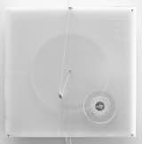
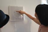
While AiryLight's pattern represents an abstract view of the data, the etched gears that control the overhead movement display more detailed information. Tiny changes in particulate matter outside are mapped to the subtle changes in the form of the light pattern. The designer chose to make subtle labels for the gears and their box because she did not want the lettering to shout at you from across the room. Instead she wanted full attention on the pattern on the ceiling, where the gears add information when you look at them more closely.
Berner comments, "During my research, I considered what environmental data might be relevant to our daily life and in turn lend itself to a physical display. After looking into various possibilities, I narrowed in on air quality as an issue that is both regionally relevant as well as internationally impactful. I studied datasets from the Environmental Protection Agency of air quality from 1998 to 2012 and discovered interesting fluctuations, though within an overall range for New York City of 0 to 100 PM2.5 (Particulate matter below 2.5 diameter). Furthermore, differences in air quality can be categorized into specific states - good, moderate, bad, – suggesting that I could map these states and their in-betweens via consistent visual outputs."
Berner envisions AiryLight being available to individuals who are interested in installing it in their homes to monitor environmental conditions as well as using it as a way to teach themselves and their families more about the issue of air quality over time. The designer anticipates further refining her design as the first users and institutions start to install AiryLight permanently.
All images of AiryLight are courtesy of designer, Annelie Berner.