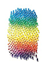
The Pantone Choice: Top 10 Colors for Spring 2017
Take a look at Pantone's top 10 colors for spring 2017 and how other design enthusiasts have implemented them in their homes. We hope this inspires you to add a pop of color to your home this spring.
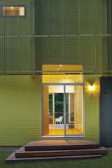
1. Primrose Yellow
"By contrast, Primrose Yellow sparkles with heat and vitality. Inviting us into its instant warmth, this joyful yellow shade takes us to a destination marked by enthusiasm, good cheer and sunny days" (PANTONE).
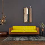
Inspired by her experience growing up in the 1970s as the daughter of an interior decorator, designer Lindsey Adelman created the Tardi Sofa—smartly named because "it took a damn long time." The sensible silhouette is punctuated by the sofa’s playful colorway, evoking an element of surprise and irreverence while adding visual intrigue to any decor.
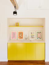
In the office, existing track lighting illuminates cabinetry covered in Lemon Bar by Miller Paint.
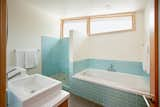
2. Pale Dogwood
"Continuing the tranquil mood, Pale Dogwood is a quiet and peaceful pink shade that engenders an aura of innocence and purity. The unobtrusive Pale Dogwood is a subtle pink whose soft touch infuses a healthy glow" (PANTONE).
Elements:
Grey corian bench, Japanese industrial tile plinth and pink 2-Pac door and reveal
Photo: Haydn Cattach
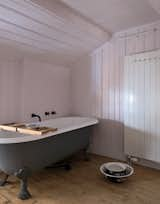
For the pink bathroom, the couple chose enamelware and a claw-foot tub.
3. Hazelnut
"Hazelnut, a key neutral for spring. This shade brings to mind a natural earthiness. Unpretentious and with an inherent warmth, Hazelnut is a transitional color that effortlessly connects the seasons" (PANTONE).
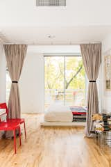
The sleeping space is set off with curtains instead of a door to foster an open feel on the ground floor. Bedding from West Elm and a quilt made by Magill’s mother sit atop a platform bed, also from West Elm. The red chairs, originally from Ikea, were another inexpensive secondhand acquisition. The deck chairs feature reversible canvas slings by the fashion designer Julie Brown.
Bemz Loose Fit Urban bed skirt in Sage Brown Rosendal Pure Washed Linen.
4. Island Paradise
"Island Paradise is a refreshing aqua that calls to mind a change of scenery. A cool blue green shade that speaks to our dream of the great escape, Island Paradise is emblematic of tropical settings and our desire to unwind" (PANTONE).
The budget was nearly as tight as the space in this cheerful renovation of a 516-square-foot flat in Bratislava. The centerpiece of Lukáš Kordík’s new kitchen is the cabinetry surrounding the sink, a feat he managed by altering the facing and pulls of an off-the-rack Ikea system. The laminate offers a good punch of blue, and in modernist fashion, Kordík forwent door handles in favor of cutouts. "I wanted the kitchen to be one simple block of color without any additional design," he says.
Modwalls Lush 3x6 glass subway tile in Vapor pale blue.
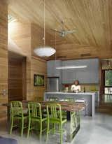
5. Greenery
"Bringing forth a refreshing take, Greenery is a tangy yellow-green that speaks to our need to explore, experiment and reinvent. Illustrative of flourishing foliage, the fertile attributes of Greenery signals one to take a deep breath, oxygenate and reinvigorate" (PANTONE).
In Hillsborough, North Carolina, local firm Tonic completed a modern home at a modest $155 per square foot. Its in-house team of skilled builders constructed the house and crafted the custom touches without subcontracing—a costly and common undertaking. They also reined in expenses by using readily available materials, like oak and steel. Though the home is nearly 800 square feet larger than their previous residence, the residents’ energy bills average 30 percent cheaper thanks to spray foam insulation, tightly sealed ducts to reduce drafts, low-e glazed windows, and Energy Star appliances. Photo by Richard Leo Johnson.
Material continuity speaks to both minimalist modernism and to simplifying costs: Cedar was used throughout, on the interior walls and ceilings, on the roof, and as exterior cladding. Photo by Shai Gil.
6. Flame
"A red-based orange, Flame, is gregarious and fun loving. Flamboyant and vivacious, this wonderfully theatrical shade adds fiery heat to the spring 2017 palette" (PANTONE).
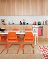
In this custom-built London guesthouse kitchen designed by Studiomama, lustrous vertically clad cabinetry achieves additional depth with the addition of the chairs, which were picked up for $15 each at a local market and powder coated in bright orange.
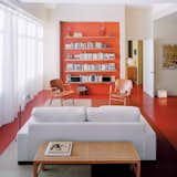
Architect Grant explains that the recessed orange wall with built-in storage shelving is a counterpoint to the view of Boston in the opposite direction.
7. Pink Yarrow
"Tropical and festive, Pink Yarrow is a whimsical, unignorable hue that tempts and tantalizes. Bold, attention getting and tempestuous, the lively Pink Yarrow is a captivating and stimulating color that lifts spirits and gets the adrenaline going" (PANTONE).
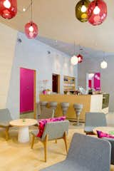
As you can see from the bright accents of powder blue and Barbie pink, the interior is meant to elicit a strong response. According to Note, owner Michael Toutoungi said that he wanted a space that "people either love or hate and that nobody is indifferent to." The aesthetic is definitely stronger and more playful than most cafe's I've visited.
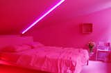
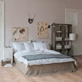
Here, Lissoni's new Neve chair is shown inside a pink bedroom configuration.
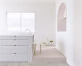
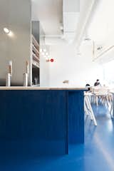
8. Niagara
"Comfortable and dependable, Niagara leads the PANTONE Fashion Color Report as the most prevalent color for spring 2017. Niagara is a classic denim-like blue that speaks to our desire for ease and relaxation" (PANTONE).
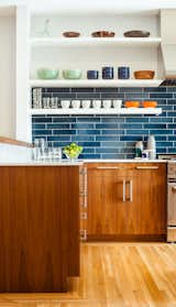
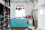
The residents have a particularly strong sense of color and love to cook with their son, so no-fuss finishes likes these blue tiles from Heath Ceramics were an ideal choice. The tiles combine with colorful tableware and custom walnut cabinetry to make a vibrant inteiror.
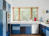
Kirkpatrick also constructed the laminate kitchen cabinets topped with Corian in Glacier White. Appliances are by Thermador; the satin nickel door hardware is by Mockett.
9. Kale
"Evocative of the great outdoors and a healthy lifestyle, Kale is another foliage-based green that conjures up our desire to connect to nature, similar to the more vivacious Greenery. And, just as we see in nature, this lush and fertile natural green shade provides the perfect complementary background to the more vibrant tones in the palette" (PANTONE).
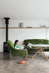
A late-1950s set of sofa and chairs inherited from Gaffney’s granny warm up the living room, as do the stove from Charnwood and the coffee table the couple bought from Habitat for their first flat.
Benjamin Moore's Vintage Vogue paint coats the exterior.
10. Lapis Blue
"Conveying even more energy is Lapis Blue. Strong and confident, this intense blue shade is imbued with an inner radiance" (PANTONE).
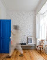
The blue entry door packs a punch in the neutral living area, which is sparsely furnished with inexpensive pieces — some from local Portuguese companies, others self-made or purchased in flea markets.
Color is deployed to grand effect in the space. The achieve the cerulean hue, the architects specified commercial acrylic paint and developed a hand-rubbing technique to control the opacity. "We're interested in common materials and creating space which is familiar and develops character and life with age," David says. "We look forward to the blue wash and soaped surfaces wearing in and the painted floor being reapplied and thickened."
Pantone on Fashion: A Century of Color in Design, by Leatrice Eiseman and E. P. Cutler (Chronicle Books, September 2014). Shop here.
Published
Last Updated
Get the Dwell Newsletter
Be the first to see our latest home tours, design news, and more.