The Pantone Choice: Top 10 Colors for Spring 2017
14 of 21
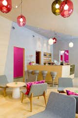
As you can see from the bright accents of powder blue and Barbie pink, the interior is meant to elicit a strong response. According to Note, owner Michael Toutoungi said that he wanted a space that "people either love or hate and that nobody is indifferent to." The aesthetic is definitely stronger and more playful than most cafe's I've visited.