San Francisco's New Aesop Shop
Can you start by outlining how you think about Aesop's design sense as a brand?
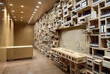
Aesop in San Francisco, California
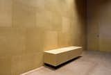
We recently got the chance to pop into the new Aesop shop in San Francisco, a charming little boutique that opened December 20th. Located on the shopper's paradise of Fillmore Street in Pacific Heights, the cork-and-pine shop cuts an understated figure when compared to flashy retail outlets like Jonathan Adler or Marc Jacobs down the block.
Imagine if Dieter Rams were half-German and half-Moroccan how his design signature would change. I very much like the rigor of Rams’ work for Braun in their heyday, however, I think we live in a time where design ought to exhibit more humanistic flaws and softer qualities. People, places, products function best with a little contradiction and tension. Our equation is two parts order, one part chaos. It’s the chaos that delivers the X-factor and this is something that can’t be focus-grouped, it requires a switched on and evolved creative team to work through the obstacles and solutions.
In some ways the generic quality of the packaging on your bottles is in direct opposition to the one-off brand of cool you bring to the retail spaces. Can you talk about that tension?
It’s the order-chaos dichotomy. From a design perspective I would like to think our products only end up gracing the bathrooms of sensitive and intelligent people who will know exactly how to use and position these for maximum visual and sensory pleasure. This however is something we do not control and therefore by implementing tight typographical and visual boundaries around our packaging we can assume that in most contexts we will still present well. Our stores allow for a freer yet Aesop-controlled environment and act more like a wardrobe of options that belong to a single person.
Which architects or interior designers do you find yourself attracted to? You've done a fair bit with March Studio? To what degree do the firms you work with again and again help set the aesthetic tone for Aesop?
Rodney Eggleston, the principal at March Studio, has made a meaningful contribution to more than ten Aesop stores. He’s a visually literate architect that can see beyond the theory and building monuments to his own greatness. Ilse Crawford at Studio Ilse in London has also had a profound impact on Aesop design-wise but, more importantly, philosophically. We see the world through a similar lens so the communication is both inspiring and constructive. More recently, we’ve worked with a young Paris-based firm called Cigüe and Hugo Haas, one of the six principals there, is incredibly inspiring.
The interiors for your shops tend to be dominated by a particular material, yet the final product can be so dynamic. Far more dynamic than you might think considering the palette. Tell me about this minimal maximalism.
To some degree this is influenced by the great Australian architect, Robin Boyd, who believed that there needed to be an overriding "umbrella theme" within which a design was sheltered or hooked. Architectural interiors are an emotional and often pathological expression of the client’s unresolved conflict and aspirations. It is better to express fewer ideas more fluently and to make these strong and clear. Taking one element and exaggerating this can be visually powerful, and also liberating in a design sense as often the sheer volume of material speaks for itself.
Which was the first Aesop store? Where is it, when did it open?
The first store opened here in Melbourne nine years ago.
Did this way of designing retail spaces emerge fully formed, or is this something that has developed over the course of your career?
One store led to the next. The back end infrastructure of the stores is consistent worldwide and well-considered at a functional and operational level. All stores need storage, a rest area for our retail team, basins to demonstrate the product to customers, category segmentation and a transaction area. When we look at potential new locations we immediately need to think about how we can locate these areas within the space. The design always begins from a practical consideration of the specific site we’re working on. Once we have this we consider and explore tactility and materiality specific to the space.
Would you say that there's a defined aesthetic for the shops, or maybe it's more a way of working?
There’s certainly a signature that links the stores together. Sometimes we think of these as different rooms that belong to the same house. Maybe what we do is a kind of exaggerated minimalism in that we minimize the number of materials, colors and overall gestures, and exaggerate those that we retain. It’s an unconventional approach to retail design, however it's one that works very comfortably for Aesop. We believe that you should sense, hear, feel, and smell an Aesop store before you actually see that it is one. All of the compound aesthetic gestures matter and must work together.
Got any architects you're anxious to tap for shops in the future?
It would be very nice to work with in Paris on a project, and we haven’t given up on the idea of convincing Peter Zumthor to do something with us.
Are there any other stores that you looked to, or maybe inspired you when you were laying out how Aesop shops should look and feel?
Produce markets have always been a great source of inspiration for the creative team at Aesop. In particular, the markets at San Lorenzo in Florence, Columbia Road in London, and the Victoria Market in Melbourne. A committed green grocer understands more about the value of high quality visual merchandising, product layout and customer interaction than many retail experts. For us, the best ideas have always come from outside the industry and food has been a consistent source of inspiration. It’s not for us to do all white stores, however I think what Margiela does is clever and well-considered.
Many of your stores are quite small. Do you tend toward tiny spaces?
We rely on a level of intimacy in terms of the conversation we share with our customers. The size of our product is easy to hold with one hand and so even when these units are multiplied there is a finite amount of space we need. Smaller stores generally feel more inviting and comfortable to inhabit. Two of the smaller stores we have (one in Basel and the other in Melbourne’s Armadale) function as happily as our larger stores. It helps when there is height, light, and something redeeming within the existing structure, for example, an original store facade.
Published
Last Updated
Get the Dwell Newsletter
Be the first to see our latest home tours, design news, and more.


