The creative team at Dwell pins all manner of online discoveries daily on the Dwell Pinterest page, from prefab architecture to shipping container homes to kitchens to typography. Today, Pinterest asked us if we'd like to preview their new design, where pins are larger. We like this new interface as even minimalist pins in the aggregate can begin to look cluttered.
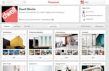
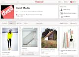
The homepage board presentation has now been cleaned up with a box grid design and some usability improvements. The original is shown above; here's the new version. It's subtle, but a definite improvement.
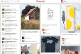
Where one really notices the impact is in viewing individual boards or clicking on all Pins in the navigation. From this:
To this!
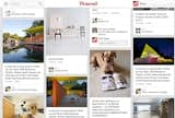
And, all of Dwell's recent pins this morning are looking big and bright. (Don't mind Honey; she's just catching up on the latest issue.)
If you're into the Pin, be sure to follow us there!
Main image credit: Zoha Nve via Flickr
Published
Last Updated
Get the Dwell Newsletter
Be the first to see our latest home tours, design news, and more.


