Less is...
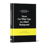
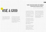
Though at first glance, the book appears a bit kitschy (in a way breaking Rule 29: Dress to Impress, aka make a good first impression), it proves a fun, occassionally thought-provoking read. Each rule is accompanied by a series of quotes from designers, architects, illustrators, authors, and their ilk. Some groups of commenters rise in general support of the rule: The snippets for Rule 17: Use a Grid all read along the lines of writer, curator, and graphic designer Ellen Lupton's words of wisdom: "To say a grid is limiting is to say that language is limiting, or typography is limiting. It is up to us to use these media critically or passively." Others, like Mies van der Rohe's motto, listed as Rule 44: Less is More, present a more mixed bag.
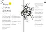
For some rules, the editors offer a brief history of the dictum. For Rule 21: Form Follows Function, the phrase is explained as commonly attributed to Louis Sullivan, one of the first modern-skyscraper designers, but first coined by American sculptor Horatio Greenough, who likely got the idea from the theories and writings of 18th-century Italian Jesuit monk Carlo Lodoli. While this may be true, it's hard to believe that Sullivan, Greenough, and Lodoli were the only three people to think up the idea. Perhaps it'd be better to attribute the popularization of the phrase to the trio rather than credit them with its original invention.
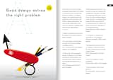
The final rule, rather predictably, is Rule 51: Break the Rules. Dwell being an office of dog-loversl, Rule 47 rings as one of our favorites: "If your images does not work, put a dog in it." The phrase is based on a comment once made by iconic American illustrator Norman Rockwell: "If a picture wasn't going very well, I'd put a puppy in it." Though Never Use White Type on a Black Background is an entertaining read and its inside spreads are visually interesting (featuring the works of international illustrators and photographers) the cover could certainly use a little more bite. As Will Rogers is quoted in the book as saying, you never get a second chance to make a first impression.
Published
Last Updated
Get the Dwell Newsletter
Be the first to see our latest home tours, design news, and more.


