
If Your Monochromic Room Feels Flat, Here’s How to Fix It
A recent trip to a bar decorated completely in various shades of purple left me feeling underwhelmed by the execution. Despite being saturated by various delicious shades of purple-ish, reddish hues, the room lacked the cohesion and visual impact I’d expect from such a choice. This particular space could’ve been an absolute moment—but the subtly clashing hues threw the design off entirely and something about the draped LED chandelier lights made the colors feel flat and one-dimensional. While these were obvious faux pas to my barely trained eye, I wondered what could’ve been done to remedy these issues (or avoid them in the first place).
As it turns out, monochromatic doesn’t always mean just one color–including a different color might’ve breathed more life into this aesthetic. And judging by the aforementioned monochromatic mishap, there’s more to this process than saturating a room in a single color and calling it a day.
This isn’t quite color drenching, but something a bit more nuanced. We spoke with Kasandra Rafter, founder/designer of Canyon Creative Design and Andrea DeRosa, co-founder and CEO of Avenue Interior Design for all the ins and outs of properly tackling a monochrome palette.
The perks of a single-shade palette
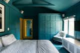
Painting an entire bedroom a calming cerulean creates visual impact without being busy.
In DeRosa’s opinion, monochromatic palettes are a rare occurrence in interior design and the impact it makes serves as one of its strongest advantages. Opinions vary on whether monochrome decor skews too cold but those who love the trend have described it as "calming," lauding its ability to create a coziness caused by the intentional focus on a sole color.
"Monochromatic interiors have an allure and mystery to them—they are undeniably powerful, almost drawing you in," DeRosa says. "They are also more curious, complex and almost confident in nature."
Finding the perfect monochromatic color and room placement
In a world where beige and grey interiors reign supreme, a fascination with the creative application of colors almost feels radical—but the best monochromatic palette designs require a bit of outside-the-box thinking. If not, you run the risk of creating something boring, which Rafter says can be avoided by paying attention to undertones and using an accent in the room as the foundation for the color palette.

In this room designed for the homeowner’s cat, pink suffuses the space with warmth, while the Pandomo surface adds texture.
"If the undertones don’t align, the entire space can feel off," Rafter explains. "Start with a single anchor—whether it’s the perfect sofa fabric, a rug, or a piece of art—and then build the palette around it by layering in varying tones of that color."
Before you take the paintbrush to your tiny bathroom, bedroom, or entryway, a word of caution. The monochrome technique works best in specific spaces. According to DeRosa, the room size and ceiling height could make or break the design.
"If you have a very small space, a space without natural light or an abundance of ambient lighting, or if you have a low ceiling height, the space tends to feel confined when limited to a single color."
On the other hand, Rafter recommends the tonal approach for bedrooms and living rooms for a space that soothes the senses.
‘We love using monochromatic palettes in formal living rooms and serene bedrooms. In a living room, deeper tonal ranges—like inky blues or charcoals—can instantly elevate the space and give it a rich, refined feel," she says. "In bedrooms, soft tonal palettes can create a sense of calm and quiet—think layers of ivory, oatmeal, and putty. It’s a look that’s both restrained and deeply intentional."
Make it multi-dimensional
So you’ve selected your color and decided which room will get the all-beige-everything treatment. But by the time you’re done decorating, the design falls flat. That stylish cream sectional practically melts into the cream backdrop, plus you can hardly tell where the drapes begin and the complementary lamp shades end. It could be that you overlooked tones and textures, a key to creating the perfect monochromatic look, Rafter says.
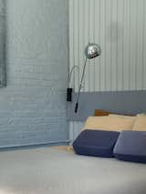
The texture of painted brick plays well against the headboard, painted in a complementary but darker shade of blue.
"The trick is to play within the same color family, paying close attention to whether those tones are warm or cool, and allowing depth to emerge through contrast and layering," she says.
Now is not the time to be shy. "Confidence, and a deep understanding of color is a must. It’s imperative that you commit to a single hue and then modify shade, tone and color intensity to create a sense of depth and interest," Rafter says. And don’t neglect the feel of a space: "Texture is paramount when designing a monochromatic interior as it further defines the space and is crucial in defining individual design elements."
Maximizing the monochrome effect without doing too much (or too little)
If you’re worried that your attempt at one color may miss the mark, DeRosa and Rafter suggest using furniture to create balance and visual interest. This ensures the space maintains its simplicity while giving the eye something to focus on.
"Add in some natural elements—like metal finishes—though we strongly suggest, like the hue, that you select a single finish and commit fully to that finish," DeRosa says. "Do make sure your furnishings have some visual interest—maybe its fringe at the bottom of a lounge chair, a scalloped edge on a pillow or a pleated, fabric lamp shade. Doing so puts the monochromatic color palette into motion and creates a layer of complexity that can exist when the color palette is not competing with the furniture design."
While the beauty of a monochrome palette lies in its uniformity, be careful not to go too matchy-matchy with materials and fabrics, Rafter says. Don’t be afraid to pair boucle and velvet or wicker and leather suede for an effective, layered aesthetic.
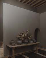
Shades of neutral earth are offset by the weathered texture of the wooden table and the pottery.
"For example, we’d never place a white linen sofa next to cream linen chairs in the exact same weave—it flattens the room," Rafter explains. "Instead, we’d pair that sofa with a tonal chair in a chunky boucle or something with visual texture. That interplay is what makes the space feel curated, not cookie-cutter."
If you can’t commit, don’t force it
Before deep-diving into the intricacies of how to execute a monochromatic palette, I (incorrectly) assumed that painting a room in a single color was a technique best reserved for people who are far more decisive than I will ever be. Pick one color?! Impossible. Although DeRosa says a single shade holds the most impact in a monochromatic interior, there’s room for other tones.

When your monochromatic design features warm wood and natural tones, you can afford to include a little color, too.
"Generally speaking, adding color to a monochromatic design is a bit subjective—if you want high impact, go for a complimentary color or punches of black or white. For a more subtle look, weave in an analogous color in shades or tones that are similar to the original monochromatic color. If you are going for an all white or cream interior, incorporating natural wood finishes adds visual interest and doesn’t deter from the peaceful, monochromatic sensibility."
As for the purple bar that fell just short of its full monochromatic potential, it’s even more obvious that executing the technique involves more moving parts than just choosing a color. With extra attention to accents, more versatile materials, and textures that break up the single color palette, the velvety tones could easily go from one-note to full, layered, and multi-dimensional.
Top photo originally found in This Yucca Valley Retreat Packed With Tile and DIY Hacks Is Pure Desert Magic
Published
Topics
Interior DesignGet the Pro Newsletter
What’s new in the design world? Stay up to date with our essential dispatches for design professionals.