Domestic Data Streamers: Infographics You Can Touch
In a world that’s increasingly run on algorithms, where the work of Nicholas Felton and the teachings of Edward Tufte are revered, information science has become increasingly complex and revealing. But how do you make statistics really speak to the public? According to Spanish data and design collective Domestic Data Streamers, it’s all about finding the human story and giving people ways to interact and compare themselves to the data, and as that answer evolves, it may have increasingly important implications for site-specific designs and installation.
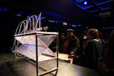
Data Furniture
This interactive voting system showcased the race for best film at the Haikurts: Festival de Micrometratges in Barcelona.
"We try to not make infographics, but to make an experience in some way," says member and designer Pau Garcia. "How can we explain what data means? Helping people understand helps them make different connections."

Light Strings
A visual representation of age versus time spent online, this brightly lit display at the TICdate festival produced a visual metaphor for data consumption.
The group, which started working together last September, was catalyzed by a simple question: how is everybody feeling? Polling passersby in a Barcelona square produced a data set and display they called Yes vs. No, a series of circles that formed what they called a "real-time" infographic. Garcia, then working as a painter, saw how the work of Domestic Data Streamers suddenly turned a relatively solitary pursuit of art into a collective project that involved more than 1,000 strangers.

Golden Age
This poll about people’s perceptions of their ideal age revealed that “most people are very happy with their current age,” according to Domestic Data Streamers member Pau Garcia.
Since then, the group has turned simple polls or questions (ratings on Behance, do you like spoons or forks?) into interactive displays. Golden Age, a grid of wooden discs slyly referencing tree rings and the passing of time, collated people’s conceptions about the ideal age. Data Furniture, an interactive system utilized at the Haikurts: Festival de Micrometratges in Barcelona, utilized a cross-hatched grid of liquid displays to visualize the vote for best film. Light Strings asked participants to provide their age and how much time they spend in front of the computer. The result, a grid of illuminated strings laced inside a shipping container, was like a physical metaphor for data traveling through a server.
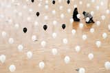
Lifeline
This innocent-looking grid of balloons communicates a much darker truth, the age at which people do want to die (represented by black).
The group’s latest project, Data Falls, now on display at the Centre de Cultura Contemporània de Barcelona museum, utilizes video monitors to track how much time visitors spend in front of certain pieces of art, information that will be represented in hourglass-like displays, and as Garcia suggests, potentially used to reformat the layout of the museum. While we expect data to alter a Venn diagram or move the line of best fit, the work of Garcia and his team suggest well-designed data systems can in fact become evolving pieces of art.
Published
Last Updated
Get the Dwell Newsletter
Be the first to see our latest home tours, design news, and more.