The Deep Dive: A Serpentine Shower

As any issue of Dwell proves, the choice of material or joinery method can transform a good project into a design for the ages. The Deep Dive is a forum where design and building pros can obsess over those details. Here we ask expert colleagues to share the inspiration behind house elements that delight clients—as well as the nitty-gritty information with which they strategized the solution.
Art Where You Least Expect It
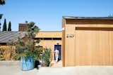
If you flip through the images of the story, A Los Angeles Musician's Shed-Roofed Home Gets a Pitch-Perfect Renovation, from Dwell’s September/October issue too quickly, you might think that Drew Straus is an overenthusiastic bather.
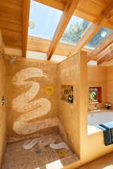
In the L.A. musician’s primary bath, the shower’s sand-colored zellige tile sports a streak of semi-transparent white as if Straus had tagged the surface, Zorro-like, with a giant bar of soap. As feature writer Jessica Dailey learned, the serpentine mark is in fact the primary gesture of an artwork by Straus’s dear friend Sara Bright. In this edition of The Deep Dive, Straus and Bright joined L.A.–based architect Rachel Bullock—whose studio LAUN oversaw the overall renovation of Straus’s 1936 house in Silver Lake—to explain the origins of this unexpectedly site-specific piece.
Straus and Bright’s relationship spans multiple chapters of the friends’ lives. Among other things, it predates Straus’s 2013 move from San Francisco to L.A. to study music, which launched his career as the recording artist Onsen. Very quickly after meeting, Straus became an admirer of Bright’s work, as well. "I think Sara is a multidisciplinary genius, and it’s always such a pleasure to bounce creative ideas off of her," he says.
One of those ideas was born at Bright’s now-former home and studio at the edge of Topanga State Park. For a remodel that began there in 2015, the artist had decided to paint the tile surfaces of three separate bathrooms with ceramic glaze. "When I saw those beautiful bathrooms and how much joy they bring you, we started talking about our love of bathing spaces," Straus remembers. He and Bright flirted with the idea of her creating a fountain for his own home, but as the Silver Lake renovation came into sharper focus, they honed their attention on shower tile. "Having done these projects and understanding firsthand what it feels like to walk into a space and live with this brushwork, I was super excited about the prospect," Bright says of settling on a bath commission.
The prospect also included challenges that Bright hadn’t yet confronted. Zellige tiles are low-fired, soft, and pitted, and their bodies include different reactive minerals. "They’re a really unusual choice to add glaze to," Bright explains. In addition to choosing this material for Bright’s canvas, Straus encouraged his friend to eschew small figures and center the artwork on a calligraphic gesture so large that it could be interpreted as an abstract landscape. "This would be the first time I’d done a giant, single brushstroke, and I was very hopeful that the size could relate to the body and transmit a kind of joyful and uplifting energy."
Bright tested glazes and kiln temperatures over a period of months, filling multiple notebook pages about different glazes’ appearance as well as the zellige tiles’ durability. Simultaneously she tried various compositions and color schemes that corresponded with the tiles and chrome Santec fixtures Straus and Bullock had locked in. Bright conducted these tests using a foamcore maquette in which interchangeable painted slips of paper represented the tiled walls, and architect and client vetted options via photographs of the model. The artist ultimately arrived at a commercial glaze mixed with underglaze, silica, and mason stain, as well as the proper low kiln temperature, and the team landed on semi-transparent white as the primary color. The secondary hue is a yellow that corresponds to sunshiny, 1970s-era Spinardo Milano pulls sourced for the bathroom drawers.
Bullock explains that the shower did not require special assembly in light of the site-specific artwork. Before the tiles could be applied to underlying layers of structure, waterproofing, and mortar, however, they first had to be arrayed in Bright’s studio according to their in-situ layout and individually numbered. Bright painted and fired the glaze, and she and Straus periodically checked in on installation to confirm the numbering. For the grouting between tiles, "Going a hair darker with color allows the grout to read like shadow," Bullock says, whereas a bright color would show how the surface comprises components. "With modern houses, it’s best to not notice those lines."
The architect adds that the finished product "is a great distillation of what’s happening in the house in general. There are natural materials, warmth, and a lot of Japanese influence, but also a bit of whimsy in the pops of color."
For Straus, regular interactions with the shower have yielded more nuanced observations. "Some of my appreciation for Sara’s work was very immediate. A massive single brushstroke could only be done once; Sara had only one chance. You can recognize the power and immediacy of an artistic risk like that," Straus says. He continues: "The landscape quality of the artwork has become more palpable over time. The brushstrokes are like a river flowing through mountains. As I watch sun flowing through the skylight and striking the bathroom in a slightly different way every day, I’m reminded of the natural beauty behind Sara’s piece, and I get special pleasure with it existing in a private realm."
We welcome your thoughts and illustrative projects. Reach out to pro@dwell.com.
Published
Last Updated
Topics
The Deep DiveGet the Pro Newsletter
What’s new in the design world? Stay up to date with our essential dispatches for design professionals.