Data Dishware
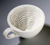
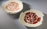
The One Month dish set shows the results of the designer's blood tests, depicted as what she calls a "cake graph" (presumably the same as a "pie chart"), while the One Week mug uses a chiseled interior to demonstrate how much coffee she consumes in a 7-day period. This dishware would be appealing on its own without the added layer of information delivery, but the use of the medium as a means of communication makes it that much more interesting.
Further clicking through Infosthetics yields a project by Nadeem Haidary, which draws a more direct connection between the object's functionality and the information behind it.
The In-Formed fork has tines of four different lengths, each representing the per capita calorie consumption of a single nation (US being the longest tine and Bangladesh being the shortest).

The data visualization faucet puts water use in plain view of the user by filling a clear chamber with water is it flows from the tap. Plenty more from this collection, along with sketches demonstrating the concept and its development can be found here.

Published
Last Updated
Get the Dwell Newsletter
Be the first to see our latest home tours, design news, and more.