
Coal Linen: Behind the Design + Styling Tips
What’s the key to its success? We asked our Product team to qualify what makes our Linen Bedding stand out from the rest. They describe the creative process and how it’s made – plus offer some styling tips – so you can get in touch with your dark side, too.
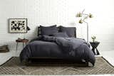
Coal on Coal shows the depth of color in our newest Linen hue; Source: Nicole LaMotte/Parachute
Describe the Coal Linen design process.
Meghan, Product Development Manager: This focus was on nailing the color since we have an established Linen Bedding Collection. So we focused on iterating and perfecting the hue.
What are some of the unique features of our Linen?
Meghan: It’s light and airy, casually elegant, but best of all is the feel of our Linen fabric, created by garment washing. We also garment dye each piece in small batches.
What does it mean to "garment dye" in "small batches"?
Meghan: It means our Bedding is dyed after it’s sewn. Our manufacturers make our Bedding slightly oversized then soak a small lot of sewn pieces in a vat of dye. Garment dying allows the Bedding to shrink to the correct size since it’s already sewn together, and washing in small batches results in slight variations of color between each batch. It’s as if these small lots are getting individual color treatments.
How did you choose the name?
Amy, Creative Director: It was just Coal, no question. We didn’t have to meet about it or think about it like we normally would…we just knew it was the perfect name when we finalized the color.

Blush and Coal Linen, when paired, evoke a romantic feel that’s perfectly on trend; Source: Nicole LaMotte/Parachute
Why did you decide to introduce a darker hue to the Linen Collection?
Amy: There was an obvious open space in our Linen palette – we were really light on the spectrum. Coal is something deep and grounding that we knew would work well with our existing colors and fabrics. When we were first looking into a darker color, we were both inspired by hints of Coal in our surroundings.
Meghan: A dark, rich color appeals to those wanting a sophisticated update for their bedroom, creating depth and dimension in our collection. This addition plays well with other colors. It would be too harsh for us to do a black black, which is why we wanted to do Coal – a softer, more welcoming choice for those wanting a darker option.
Amy: Coal doesn’t feel too weighed down – the texture of Linen and the garment washing process soften the look so it’s not a total blackout.
Why is Coal Linen great for winter? How would you style it for this season?
Amy: Coal creates a moody feel in the bedroom. The existing Linen Collection – White, Fog and Blush – is breezy and reminds me of open windows, but Coal makes me want to crawl in bed and go to sleep for six months – winter hibernation.
How would you style Coal Linen for the warmer months?
Meghan: By taking advantage of our Bedding Separates, you can easily transition Coal into summer. Changing out your Pillowcases or Euro Shams for something light makes the whole room feel brighter. When it’s extra warm outside, ditch the Duvet and use the Coal Top Sheet with an Essential Quilt.

Make your Bedding pop with White and Coal Linen; Source: Nicole LaMotte/Parachute
How did you conceptualize this shoot? What were some of your sources of inspiration?
Amy: It was important to us to not only maintain consistent styling with the rest of the Linen Collection shoots but to also keep the look light yet sophisticated. To do this, we incorporated graphic rugs and art for a lofty vibe.
What style do each of the fabric and color pairings evoke?
Coal + Coal = Moody and contemporary
Coal + White = Classic, sharp and crisp
Coal + Blush = Trendy and romantic
Coal + Fog = Casual
Coal + Quilts = Cozy
What is your personal favorite color and fabric pairing?
Amy: I love pairing Coal with the White Essential Quilt and Coal, but I was also surprised by how much I like Coal and Blush. It’s the trendiest combination, but it softens the Coal in a very subtle way.
Meghan: Coal looks good with everything! I just ordered a Venice Set in Coal for my bedroom and am excited to pair it with my Percale Pillowcases in White.
Nicole, Photographer: I’m partial to darker hues, and the Coal with Coal shows its rich and beautiful color. I just ordered my own Coal Linen Duvet Cover and my animals won’t be able get it dirty – or not visibly, at least!
How do the designers, photographer and stylist work together?
Nicole: With this a shoot like this, it’s about the relationships – the team. I love working with Parachute because it’s an ongoing relationship. There are a lot of things that we’ve already hammered out on past shoots! I love the days this team is together, because when you’re working with the right people it doesn’t matter where you are or what you’re doing.
How do you approach shooting with such high contrast (Coal Bedding and white background)?
Nicole: It requires flagging – blocking light from spilling onto things we don’t want lit – because you never know how a certain object is going to absorb or reflect light. Trying to control those things before the shot makes a huge difference.
What’s your recommendation for lighting a bedroom?
Nicole: I am honestly – in my photography and in my real life – really into natural light. Anything is always going to look better with natural light, including your bedroom. That’s what we do in photography – try to mimic natural light.
How do you make Parachute Bedding look its best in a shoot?
Nicole: It depends on the texture of the Bedding. Linen looks good with a cross light to capture the texture while Sateen and Percale require more directional light. Most of that detail is seen when we do the side shots of the beds – they give you a closer sense of texture, touch and feel – while the front-facing shots set an aspirational tone.
How is photographing Linen different than photographing other fabrics, like Percale or Sateen?
Nicole: The nice thing about having Amy, the actual product designer, on set is that she can say, "We’re not seeing this. We need to see more of that. We don’t want to enhance that." I don’t always know those things, so having Amy on set is amazing!
How do you prep for a shot?
Nicole: That’s where Scott Horne, Parachute’s prop stylist extraordinaire, comes in. He is absolutely amazing. He does it all so effortlessly.
How do you know when you got "the shot"?
Nicole: Once we decide compositionally, "Okay, this is working," we have take into account if there’s going to be type laid over this shot or if it will be used for multiple crops. Once that is dialed in, Amy, Scott and I come to a mutual agreement that we’re pleased with how it looks.
Visit the Parachute Blog for more stories that enhance your sleep and inspire your waking moments. Take me there >>
Published
Last Updated
Get the Dwell Newsletter
Be the first to see our latest home tours, design news, and more.