Q&A: Architect Barbara Bestor Shares the Secret to Creating Coziness with Color
The pop of blue on this two-story home in Venice, California, may be your first hint that architect Barbara Bestor is a fan of color. But let it be known that her passion for a great palette runs the full spectrum—as excited as she gets about hyper-saturated hues, she’s just as dedicated to selecting that perfect shade of white to capture or refract living room light.

Barbara Bestor
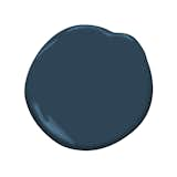
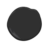
This contemporary villa—designed for homeowner Melina Polly, cofounder of fragrance company Henry Rose—is a study in contrasts. A bright and airy living and dining area in Benjamin Moore Atrium White OC-145 leads into a cozy library nook, where the ceiling and walls are saturated with Benjamin Moore Gentleman’s Gray 2062-20. Outside, the stoic charcoal facade is playfully punctured by that electric blue (the stucco is painted with a weatherproof roofing finish).
We spoke with Bestor to learn more about her use of color in the Superba House, featured in the September/October 2020 issue of Dwell.
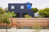
A pop of blue draws the eye in through the cutouts of the Superba House’s stucco facade, painted Benjamin Moore Black 2131-10.
What was your process for developing a color palette for this home?
The house itself is actually quite tiny, and the color moments are supposed to be immersive. For instance, it’s an open floor plan—but there’s a library corner that’s finished with a dark blue (Gentleman’s Gray 2062-20) and wood. It’s a very different atmosphere compared to the open kitchen and dining room. There isn’t a door…but the use of color and material changes the mood.
In general, it has a very neutral palette that’s light throughout the ground floor, which really helps us make it indoor/outdoor. To me, the primary color is actually the green of all the plants that are visible through the window.
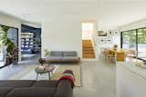
Though it doesn’t have a door, the library nook feels separate and cozy, thanks to a wall-and-ceiling paint job in Gentleman’s Gray 2062-20.
Shop the Look
Why the pop of blue?
Given what’s been getting built in that area—a lot of mega mansions and urban farmhouses—we wanted to have a high visual impact. That blue volume is covered in an elastomeric waterproof material, and the roof and walls are the same thing. It’s a little bit shiny. Because the open deck is receded, it gets lit independently, a little like a jewel in a box. The color catches your eye from the street—you do a double take.
How did you land on this color for the exterior?
There is certainly no shortage of dark-painted houses in this neighborhood. I wanted it to be earthy; if it was white, it would be too stark. I’d been in Mexico City right before I worked on this one, and the facades there don’t give everything away—they are mellow and continuous with the street, and they have some surprising stuff behind them. That idea really appealed to me. We tested it out a bit to get the right shade—not too dark—and we landed on Benjamin Moore Black 2132-10. It’ll age nicely and fade. Everything in Venice fades because it’s close to the ocean, so you want it to look good for a long time, and have some resilience beyond five minutes.
Do you have any rules for working with saturated colors?
The hardest part is getting saturated colors. You have to find products that have that richness. Sometimes it’s tile, or custom-color roofing products…and then, there’s the world of paint. There are really radically different qualities of paint. People will try to do a fun front door color, but if you use cheap paint, it’ll fade. It has to do with pigments. It’s worth the investment to get something that will actually last.
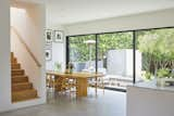
The main floor looks bright and fresh in Atrium White. Add credit
What makes a great white paint?
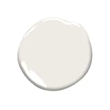
If it’s an interior, I think the best white paints have a little flesh tone. They’re much warmer. I usually use Atrium White OC-145—it’s my go-to. It always looks good. The really white-whites are not so great for humans. They’re too harsh, and they sometimes look cheap.
How important is testing color before you commit?
For interiors, we do a lot of samples before we choose. I have palettes that I like, but they look very different depending on what the light looks like. You have to try out samples in the exact place it’s going to be, after you’ve done your framing, when you can experience the natural light condition. Sometimes something that would be great and vibrant in a light-filled room might not look right in a darker space.
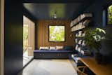
The corner library takes color inspiration from the facade.
Is there a trick to mixing dark spaces and light ones?
It has to do with how people really live—the opposite of "Instagram moments." What are the different modalities of your daytime rhythm? Where do you read? Where do you go to eat? Especially during the pandemic, what do you need from your dining or your Zoom space? I think architects and designers tend to be thinking about the bigger picture, not just about style.
Try out Benjamin Moore colors in your own home with samples shipped right to your door.
Published
Topics
ProfilesGet the Pro Newsletter
What’s new in the design world? Stay up to date with our essential dispatches for design professionals.