Human grace – Regina Maria HQ

Credits
From Andreea Constantin
A title that may not have anything in common with an office space design. Still, in the research phase at the beginning of the project, we came to this realization that everything we do as designers, the spaces we create, should support human life in best way possible. In a way that one can connect with his / hers most gracious form. Hence the human grace as a starting point and…of course, as an outcome.
Yes, we are talking about an office space and this space must fuel productivity, ideas exchange, smart decisions and collaboration. And we started with those important questions: what fuels all of the above? It is definitely a state of belonging to a community that shares the same values with you, it is the feeling of emotional safety, and a combination between calmness and alertness.
And then, all flew naturally: how can we, through design, enhance this emotional states?
The floor area is 950 sqm, consisting in circulation around the central core of the office building, with perimetral office areas disposed towards the curtain glass walls. In its initial form, the space had glass and furniture partitions, that, together with the ceiling, were requested to be integrated as much as possible in the new design, to optimize the budget and minimize waste. That was our main challenge, from the space planning to the general aesthetic.
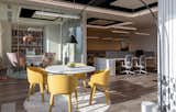
Our client is the major player in the healthcare industry in Romania, and these offices accommodates the headquarters with the most strategic departments, executive offices for the management team, together with meeting rooms either for small groups or for formal board meetings. Majority of the offices are executive, individual ones, with few areas designated for the open plan scheme. Fitting the new plan in the existing one was like a challenging maze, and the final form is a result of many iterations.
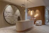
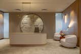
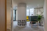
The reception area is rather small, yet treated in an elegant manner. It is a first impression, that greets you in the morning, and stays with you for the whole day, so it is crucial to be a welcoming one, and to convey the cultural values of the company. That’s why the whole aesthetic is simple but precious, with natural warm finishings, few objects, hidden storage and a scenographic light that elevates the materiality of the ensemble. Instead of an obvious branding, our client was daring enough to allow us to take a more subtle approach: elements from the logo were deconstructed and then reconstructed in a new form in a granite wall installation below the reception desk.
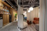
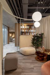
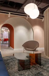
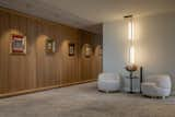
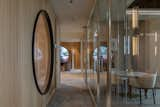
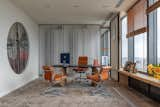
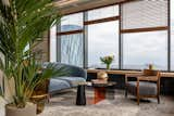
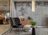
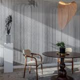
The adjacent corridors are treated as an artistic passageway, displaying pieces of art and history and using wood millwork to counterbalance the ample glass surfaces. Central concept of the communal areas is to facilitate slowing down mode and, where space allows, to create islands for private conversations or ideas exchange. Between the main conference rooms and the cafeteria, the resulting space, lacking natural light, was transformed into a library / lounge, filled with soft textures and bulbous seating, all dipped in more saturated colors.
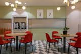
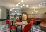
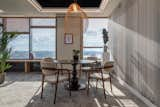
Cafeteria is the most vibrant scene, with accents from the black and white floor and the red chairs. Using the same subtle approach, the main table has a central element with is actually derived from the main visual element of the logo.
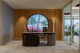
The CEO is passionate about art, and so, naturally, we designed his office in order to accommodate art and be an inspiring and soothing place. The design is subtle, played more with textures and refined details, than with big gestures, from the wallpaper graphic working together with the desk shapes and the rounded corners of the wooden furniture. Since too many curtain windows can give a sense of coldness and over glaring light, we juxtaposed vertical panels with rough plaster, which were perfect passe-partout for art and are making a beautiful dialogue with the horizontals of the wooden blinds.
Another “hot spot” is the small waiting area in front of the top executive offices, having as central piece a bespoke desk (with adjustable height) and an art piece inserted in the wall behind also custom designed by us, which allows the natural light to be filtered and colored in a serene pink. The round piece is a deconstruction and reinterpretation of a painting, assembled from different layers of plexiglass in the depth of the wall.
The whole place is intended to be atmospheric, calming, serene and elegant, with an aristocratic vibe, as the personality of the brand Regina Maria, and we used mostly fluid geometries, simple associations of shapes, and a lot of attention to details and materials that amplify attributes mentioned. One super important aspect is the light, that was designed in an adaptable scenario, according to the intensity and color of the natural light and to the circadian rhythms. All the decisions in the process were taken having in mind the outcome of “wellbeing design”, a place where humans can thrive and manifest the best in them.
Part of the wellbeing through design is also keeping a certain level of visual stimulation that creates a sense of moderate alertness and creative thinking. One detail that builds into this is the custom designed graphic for the massive structural pillars, dressed in a combination of black and white in a combo of art deco and bauhaus elements.
Last but not least, since quiet, solo, restorative spaces are becoming so important in wellbeing at work, as latest science proves, we integrated a small meditation room, imagined as a cocoon that wraps you gently with rounded corners, natural raw textures and dim filtered light.