Typographer Focus: Peter Biľak
Peter Bil’ak is a polymath of a designer. His activities encompass type design, typography, graphic design, Web design, set design and choreography, publishing, writing, and much more that can’t even be categorized.
Born in the former Czechoslovakia, Bil’ak moved to the Netherlands in 1997. His studio is in a converted modernist school in The Hague, near the quiet harbor of Scheveningen—a far cry from the design ghettos of Amsterdam and Rotterdam, the Netherlands’ renowned creative hubs. But this suits his practice, which exudes self-sufficiency. Here, Bil’ak generates much of his work, and his core role as a type designer exists in a rarefied world more typically distinguished by technical expertise than creative flair.

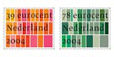
Bil’ak’s designs for the 39- and 78-eurocent stamps were inspired by the patchwork of the Dutch landscape as seen from the air. The width of each letter, set in Bil’ak’s Fedra Serif, determines the width of the surrounding color block, echoing the centuries-old art
of metal typesetting. Bil’ak sees the stamps as an homage to Dutch traditions.
"Type design is formally a printing business," says Bil’ak. "You work in the print industry. I teach type design, and I’m always struck by the technicality of the discussion. You’re almost blocked by the technical aspects of typography from looking at the larger issues."

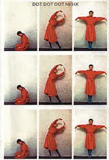
NDT, Due a due
Bil’ak trained at the Academy of Fine Arts and Design in Bratislava, in what is today Slovakia, but his experience there was rounded out by time studying in the United States, England, and Paris. He ended up in the Netherlands after spending two years at the Jan van Eyck Academy in Maastricht, taking a job with the graphic-design firm Studio Dumbar in The Hague.
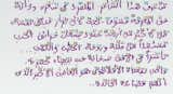
Now running his own type foundry, Typotheque, with his wife and business partner Johanna, Bil’ak has created typefaces that have been used on everything from postage stamps to dictionaries. A specialty of Bil’ak’s work is developing fonts that work in both Latin and non-Latin scripts. He first started working with polytonic Greek and Cyrillic, and is now working on Arabic typefaces, despite the fact that he does not speak the language ("I know about 15 words. And I can count," he says). "When I was in India, people were saying, "You really should work on Hindi scripts," but I don’t know. If you had told me two or three years ago that I would be working on Arabic, I would have laughed." Despite his incomprehension of the words he creates, his fonts use standardized baselines and orientations for letters, to give complementary characteristics to different alphabetical systems.
One of Bil’ak’s most high-profile commissions as a type designer was developing a new font system for Collins dictionaries, with HarperCollins art director Mark Thomson. The new dictionaries, which are available in the United Kingdom, the U.S., South Africa, and Australia, are clear and spacious. Bil’ak and Thompson removed the bells and whistles produced by the marketing mentality of publishers in favor of a calmer attitude that recalls a lineage of great typographers of dictionaries who didn’t have contemporary visual tricks at their disposal. "Mark did a whole research into it," Bil’ak explains. "There’s surprisingly little difference between dictionaries from Samuel Johnson’s era and today, and that was the motivation for the change. If you look at that dictionary from 1755, it worked. It didn’t have the luxury of having different weights of fonts, bold and light; they didn’t exist. They didn’t have small caps. Basically all these layers have since been put on top, and we had to remove some of that." The dictionary uses a single Bil’ak font family, Fedra, in different weights and with italic and bold versions to denote different functions.
Bil’ak’s work is meticulous and often done at the micro scale of an individual descender (the part of a lowercase letter that hangs below the body). But he has a parallel interest in the metanarratives of his métier. He writes regularly, and is coeditor (with British graphic designer Stuart Bailey) of Dot Dot Dot magazine, which he founded in 2000 as a critical journal of theoretical texts accompanied by Bailey’s experimental graphics. His theoretical education took place principally at the Jan van Eyck Academy, where he was initiated into poststructuralist linguistic theory. But isn’t there a contradiction between the craft-oriented, intuitive method of the type designer, and the views of the academic intellectual?
Bil’ak responds: "Printers used to design [fonts], and they’re not really intellectuals who would be able to articulate theories. But you’re talking about the representation of language in form, which is fascinating."
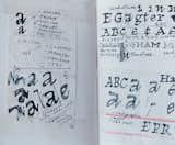
Bil’ak’s fonts start life as sketches of individual letters in notebooks, which are then redrawn on a computer in FontLab, a Russian-made type-design tool. "The computer production process is part of the creative process, too," he says. "The computer is not just digitizing [something already fully formed]. We use it to decide the rules of the typeface. I don’t separate production from creation; before, it was always separated."
He begins in earnest to explain the process of making a typeface work. "An interesting thing about looking at type is that you think that you design a letter ‘e’ and it’s isolated. But if you look at an ‘e’ standing next to an ‘a,’ what you start perceiving visually is not just those forms, but a silhouette between letters." He sketches an abstract shape between the right edge of a letter "e" and the left edge of an "a." "As soon as I have a few letters, you already make tests using different combinations to see what happens when one is followed by a straight character, or if it’s followed by a round or semi-open character." Despite the methodical process, the results of these tests are not objectively measurable.
Bil’ak’s attitude is that the legibility of a font, and therefore its success, cannot be concluded until it is in use. He writes, in an essay ironically titled "In Search of a Comprehensive Type Design Theory," that "type design is not an intellectual activity, but relies on a gesture of the person and his ability to express it formally." In other words, success in this highly technical field still depends on the artist or designer’s ability to make formal gestures of beauty and appropriateness.

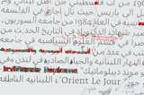
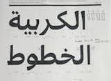
Bil’ak takes a meticulous approach to Arabic type design, although he is unaware of the words’ meaning.

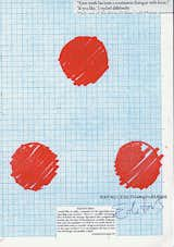
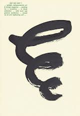
A cover graphically riffs on the magazine’s title, Dot, Dot, Dot.
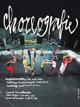
Bil’ak designed the NDT Choreography Workshop poster using dancers to spell out "workshop."

Bil’ak collaborated with Mark Thomson, art director at HarperCollins, on a new set
of dictionaries that exclusively employ the Bil’ak-designed font Fedra.

Bil’ak conceived of the dance performance Due a due, in which what appears
to be a dancer’s shadow is in fact a projection of another dancer.
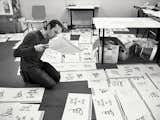
In Bil’ak’s studio, he and his staff assemble and hand-draw the cover for issue #7.
Published
Last Updated
Get the Dwell Newsletter
Be the first to see our latest home tours, design news, and more.