Tour an Insanely Stylish NYC Loft With Major Scandinavian Vibes
When designing small spaces, clutter-free becomes a very necessary design mantra, not just a buzzword. But the beauty of a modest space is the creative challenge it poses, something that NYC-based interior designer Tali Roth gladly took head on when she approached this 1500-square-foot loft in the upmarket Chelsea neighborhood.
Originally built in the 1920s, the single bedroom dwelling with master ensuite and guest bathroom was completely gutted during the renovation. A second bedroom was added before Roth tailored a curated, minimal vibe throughout. Homeowners Sarah Paiji (CMO of M.Gemi and Rockets of Awesome) and her husband, Kenneth Yoo, wanted a mix of super-clean minimal design with a soft Scandinavian influence.
"My amazing clients are true minimalists," explained Roth. "All the spaces they had lived in before were stripped-back and clean. Sarah found me on Instagram and appreciated my aesthetic. I wanted to create a quiet, open, and calm safe haven away from the chaos of Union Square. They both took inspiration from Scandinavian design." Ahead, Roth shares her style notes throughout each room of the house. Get ready for some major interior envy!
This story was written by Sacha Strebe and originally appeared on MyDomaine.
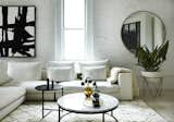
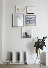
Once you see Roth's own chic-to-death NYC apartment, you'll understand why her minimalism-loving clients tracked her down. This stylish, light-filled living room is a prime example. "My style is clean and linear," she said. "I like 'things,' but they need to be curated and not everywhere. I am a huge fan of the modernist aesthetic with its low lines, yet I like to ensure my spaces are comfortable and inviting and always heavy on the texture."
Celine Ziang Art Extra Large Acrylic Painting On Canvas ($242)
When it came to the color scheme, Roth was set on a neutral theme throughout. "We chose the interior finishes first; the steel door, the light whitewashed oak floors, and a completely white kitchen," she explained. "We painted the existing red brick white as well. The rest was dictated from there. Any color that appears in the space is more neutral and derived from a natural palette."
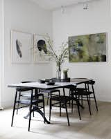
In order to curate the perfect space, each piece was carefully considered over time. Not having to rush meant they could spend time finding the right furniture they truly loved. "I think the greatest and most special piece as a standalone is the dining table," said Roth. "I bought it from a wonderful lady in Boston, Massachusetts. We chose a custom finish and had the edges stained darker than the top. It's a wonderful piece. I absolutely love the dining space. The gorgeous mixture of art with the smoky live-edge table and those delicate chairs is just breathtaking. "
The green textured artwork with graphic prints is also a main feature in this space. The abstract piece really lifts the overall aesthetic out of a stark and cold place into a warm and cozy one. "We ensured that each piece (of art) was meaningful to Sarah and Ken," she explained. "For the dining room, we used a digitized artwork by Australian artist Carol Bachelor. We printed it onto canvas, gallery-wrapped it, and then framed it in a white oak."
Even though they took their time, one of their biggest challenges was finding the "perfect look for the perfect price." Roth adds: "Both Sarah and I are super particular, so we took our time to find the right items and didn't rush. I don't think Sarah and Ken went into the project thinking they would start from scratch furniture wise (which can be overwhelming). However, the end result was a space filled with pieces they love rather than items they were putting up with."
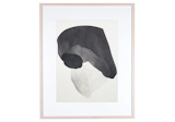
Finding the right artwork for the space was also a slow and steady process. The clients wanted to source unique original pieces while still fitting within their budget. Roth compiled a stunning visual selection from Etsy, Urban Outfitters, and One Kings Lane. "Artwork is the cornerstone of good design," assures Roth. "It's often difficult to source multiple pieces without blowing the budget." We think she nailed it.
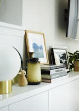
With an open-plan design, defining each space within the one room can be challenging, but Roth found a solution. By positioning a long built-in banquette on one side of the room, which then continues into the media unit, she could define the TV room from the living area without bulk. "It's a nice proportion for the space, and it gave me the perfect stage for styling chic vignettes and pops of personality," she said.
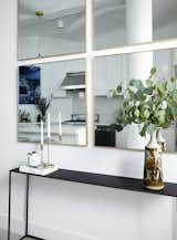
When designing within a minimal theme, there's not much room for clutter, but Roth struck a balance between clean and curated by styling sentimental pieces in chic vignettes along the TV wall unit.
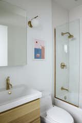
If there's one thing we love more than a light-filled living room, it's a bright white bathroom. Roth maximized this small space with brass hardware and a touch of color. "We wanted the guest bathroom to be fun and light," she said. "And it was the only space we could put a spot of our favorite color: pink!"
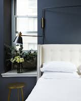
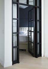
Just like the rest of the house, the bedroom completely remodeled from scratch. The bed was the only existing piece they worked with. "There was a weird platform in the bedroom that we removed and added the floor-to-ceiling industrial steel glass door, which we lined internally with a privacy curtain," said Roth.
If she had to play favorites, it would have to be the bedroom doors. "I love love the doors to the bedroom," she exclaimed. "They conceal the moody, sultry, dark gray bedroom within and bring so much texture into the space." We couldn't agree more.
If you love this minimal Scandinavian design too, then you'll adore this Montréal apartment with monochrome tones and a stripped-back aesthetic.
Published
Last Updated
Get the Dwell Newsletter
Be the first to see our latest home tours, design news, and more.
