This New York Apartment Is What Dreams Are Made Of
While not all have the time to bring their décor visions to life, they always seem to know who to turn to. Such was the case with this luxury rental apartment and its young resident.
With only an unframed Michael Jordan poster as a starting point, interior designer Mara Silber knew she had her work cut out for her to introduce her latest client—a rising star on the finance scene—to the world of décor. Although he was all about numbers at work, the young bachelor in his early 30s had a creative side, an interest in art and literature, and a desire to upgrade his décor to something sleek and sophisticated. When he moved into this two-bedroom, 2.5-bathroom loft on Great Jones Street in the heart of NoHo, he knew it was time to call on the help of an expert designer to help him create a grown-up home.
The MJ poster swiftly vetoed, Silber worked with her client to create a space that felt elegant and could entertaining large crowds yet still felt comfortable and easygoing. The luxury rental, with direct keyed-elevator access, white oak floors, floor-to-ceiling windows, eastern exposure, and 11-foot ceilings already had all the right bones to become a great home—it just needed a discerning eye to turn it from vision to reality. Step into the bachelor pad we'd all want to live in—this home is a lesson in comfort and practicality.
Written by Gabrielle Savoie
"I wanted it to be sophisticated and clean but also appropriately bold for its address—a new luxury building in a neighborhood known for its coveted real estate," explains Silber. "At the same time, maybe because both the client and I grew up in the Midwest, I felt that the design should also be easy and welcoming." The designer kept the color palette restrained to grays and blues—the client's favorites.
"When looking for inspiration, my client was drawn to spaces with dark floors, brick walls, and concrete elements," explains Silber. "Meanwhile, he was starting with a space he referred to as 'a white box'—white ceilings, light floors, white walls. So he had no clue where to begin!"
To help guide him through the many options available to him, the designer started by drawing inspiration from her client's style, as well as the surrounding areas of his neighborhood: "He wanted it to be interesting and unexpected, but look like someone designed it with him specifically in mind. We also made sure that the design captured the energy of being on Great Jones Street, a prestigious address in the heart of NoHo."
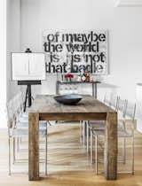
"My client loves to host dinner parties and cocktail parties," says Silber, "so we wanted to be able to seat the maximum number of people that the space allowed. When you step out of the elevator, you have a head-on view of the dining table and bar area. This would be an important vignette for the space, so I wanted it to be graphic." To achieve this, the designer layered the bar cart with handsome accessories from Burkelman and hung complementary art to ensure that guests would be welcomed with a really bold first impression.
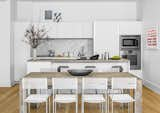
In the kitchen, statement chairs, counter stools, and art complement a Carrara marble backsplash with Gaggenau appliances and custom cabinetry designed by Rexa. The high-end kitchen finishes, selected by design firm Voce Di along with architect Morris Adjmi, are standard in the luxury rental building.
"Comfort was a priority to the client," says Silber. "It was important to him that he could walk around barefoot and feel comfortable lounging on almost any surface of the apartment!"
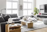
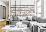
As far as functionally goes, lofts can be tricky—but the designer knew exactly how to position each piece to create distinct living areas. "People don't always know what to do with a particular space," she says. "How many seating areas? What direction should each piece face? Where should the TV go? I wanted the kitchen and living room to flow together as one large entertainment area."
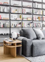
"My client told me that he owned a ton of books and would need somewhere to store them," says Silber. "Open bookshelves felt much more natural for an open, airy loft-like space than adding closed storage. We actually based the living room on an inspiration photo I sent him that had ceiling mounted shelves behind a sofa. He was instantly sold. I was pleasantly surprised when he agreed to place the sofa in front of the bookshelves instead of facing them."
The designer wanted the space to feel like a permanent home for the client—not a rental. The challenge? Rentals don't allow you to physically alter the space. "We got creative," she says. "The tension-rod bookshelves are one example of how we worked within the existing space while creating a considered and custom feel. Layering art on an easel and leaning frames where we could minimized the number of holes we had to put in the walls."
With tension-rod bookcases creating the perfect, easy-to-remove statement for a rental, the designer knew from the start that the bookcase would naturally become a focal point of the space. "I loved that my client was interested in learning about the design process and was very open to pursuing bold ideas."
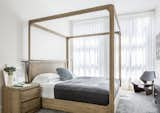
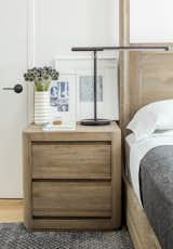
In the bedroom, a modern canopy bed dominates the space: "The client was set on having a king-size bed, so our challenge was to find a piece that could actually make the room feel bigger—not smaller," explains Silber. "We chose a wooden four-poster bed with soft, curved edges. This style felt very natural within the dimensions of the space. People are so wary to fill up a space, usually out of fear that it'll feel overcrowded. But in this case, the bed really accented the high ceilings and kept the bedroom feeling spacious."
The designer was desperate to add some seating that wasn't upholstered to add an extra element but had the client's "maximum comfort" requirement in the back of her mind. "I suggested the GJ chair (a longtime favorite chair of mine) in his bedroom, which is made of molded wood but is deceivingly comfortable enough to relax in."
As far as decorative elements, Silber kept things classic, clean, sophisticated, and timeless. "I'm big on neutrals, and my style tends to lean toward the masculine side," says the designer. "I like clean lines and simplicity but am careful to avoid being cold and unwelcoming. I like a space that feels easy and lived-in. I also believe in always making an investment in staple pieces that can be versatile and withstand trends. You will never regret investing in quality, classic pieces."
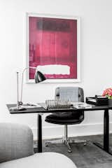
The office space needed to serve double-duty: "The client emphasized that he would actually work there, but he also wanted to be able to convert the office area into a guest bedroom for weekend visitors," says Silber. "Flexibility was key, so built-ins were out of the question. Our goal was to create a functional space that still felt dramatic. When I came across the height-adjustable Q20 desk, I knew he'd fall in love with it. It was classy but also masculine, which ultimately dictated the overall feeling of the office."
To finish off the look, the designer accessorized with bold art and chic desk accessories: "The client was especially excited about the vintage arrow sign featured in the bookcase and the vintage ruler on his desk," says the designer. "Both of those items were sourced across the street at Paula Rubenstein—always one of my first stops. She has amazing found objects and the most perfectly curated store! I also loved the giant silvered bronze brass knuckles that are in the living room and the oversize antique letter holder by French designer Yonel Lebovici from Mantiques."
Between a functional design, lounge-y furniture, plenty of entertaining space and luxe accessories, Silber can comfortably say she's created the perfect bachelor pad for this rising finance star.
Discover more home tours and interior design trends at MyDomaine.
Published
Last Updated
Get the Dwell Newsletter
Be the first to see our latest home tours, design news, and more.

