
The Power of Color and What Each Shade Is Best For
So when it comes to designing your space, it's important to think about how each area will be used, what feeling you want to create, and any issues you want to tackle. In general, the brightness of light colors creates an effect that seems to expand tight spaces. On the contrary, dark, warm colors create a more intimate environment.
Color has an innate psychological value that effects your emotions and alters your experience. To help you select your colors wisely, we've gathered some helpful tips about eight of the main players and examples of them being used effectively in the home.
Yellow
Yellow communicates happiness and creates a sunny effect. This bright example imbues radiant energy that's perfect for the combined dining/living space. The yellow wall echoes the sun that streams in from above and acts as a bright backdrop for the large amount of greenery. It also matches the textiles in the space.
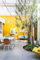
Furnished with vintage Eames chairs, a second-hand sofa, and pendants and tables designed by Nathalie, the space is kept purposefully casual. She painstakingly mixed and tested the paint for the mustard-yellow walls herself—15 times—to match the hue of a Kvadrat textile.
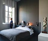
Black
While you may think that black surfaces can bring a space down or make it too dark, it can actually be surprisingly refreshing when done the right way. If you have a space that's already bright and receives good natural light, then black walls can be a soothing contrast to the sunlight that streams in. It makes a bold, modern statement, even in the smallest of applications.
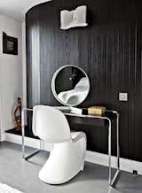
Near the room’s curving wall, a Verner Panton chair joins a K2 B console table by Tecta, topped by a vintage mirror by Robert Welch. The wall light is from Flos. "If I had more space, I’d just fill it with more stuff," says Pearce. The black-and-white palette echoes the home's exterior.
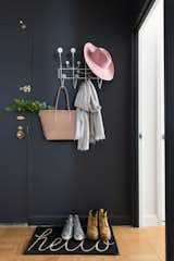
While black walls aren't the first thing you may consider for an inviting foyer, the dark walls are often in soothing contrast to the bright sunlight directly outside. The dramatic color also brings anything bright and colorful into stark relief.
Red
Red is known to get your adrenaline pumping and raise your energy level, which can be a beneficial way to start your day before leaving home base.
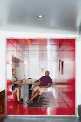
By inserting a tunnel made from 36 reclaimed commercial doors and tearing down a handful of walls, LOT-EK and contractor Andreas Scholtz brought light into the formerly unused dark hallway in Maurice Russell (right) and Jorge Fontanez’s apartment. The glossy Safety Red paint by Benjamin Moore catches the light by day but "becomes a richer, darker, very relaxing red at night," Fontanez says.
Gray
A gray room evokes a sophisticated calmness that's perfect for a library or bedroom. It's a timeless neutral that can be left alone, or enlivened with pops of color or a bright pattern. Its flexibility makes it a popular choice for most rooms—a solid gray denotes strength, while a lighter application creates a softer result.
Wenes and Lens conceptualized a gradation of white to gray hues for the walls of the 1,500-square-foot gallery into the 4,000-square-foot home, culminating in a deep gray for the master bedroom. The room is reserved for meaningful pieces from the couple’s collection, such as a figure they found at a market in Beijing and lamps by artists Wenes represents.
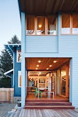
Orange
Orange is also a bold choice, and is known to evoke enthusiasm and excitement. Many residents of modern or midcentury homes choose to paint their front doors in a bright orange hue, and insert a few applications of the color throughout the interior to create a fresh, positive vibe.
![Doonan stands next to the front door. "We have flamboyance, and we’re not inhibited about anything. Gray Organschi gave [the house] that intellectual rigor needed to make it beautiful. We were well matched."—Resident Simon Doonan](https://images2.dwell.com/photos/6063391372700811264/6133456033994792960/original.jpg?auto=format&q=35&w=160)
Doonan stands next to the front door. "We have flamboyance, and we’re not inhibited about anything. Gray Organschi gave [the house] that intellectual rigor needed to make it beautiful. We were well matched."—Resident Simon Doonan
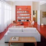
Architect Grant explains that the recessed orange wall with built-in storage shelving is a counterpoint to the view of Boston in the opposite direction.
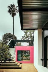
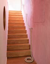
Pink
Pink doesn't just have to be for your pre-teen's bedroom. The playful color works well in living rooms that have abundant natural light. Pairing the vibrant hue with natural or masculine elements creates the perfect balance without feeling too bold or poppy.
When collaborating with the homeowner on this project, Rudin referenced the case study houses of Southern California as well as the eclectic and experimental architecture of the ‘70s and ‘80s. He utilized vertical metal siding and bright colors to define spaces marked by art.
And like those great conversations, the resulting design acquired its own flow, full of colorful narrative, spirited counterpoint, and anecdote. Now, in place of dark, disconnected spaces, outdoor rooms echo luminous indoor ones, and Purdy and her family’s eclectic collections of art and personal artifacts share space with flashes of pattern and interior planes of saffron and pink stucco.
Green
Green is considered one of the most restful colors for the eye. Because of its presence in nature, it inherently goes well with natural wood textures.
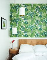
The headboard in Hansen’s bedroom echoes the 2013 sideboard. The wallpaper is from Arte.
Blue
Blue is associated with calmness and dependability. Harking back to memories of the sky or the ocean, it's seen as a color that promotes relaxation.
Since the house is in a historic district, Beebe and Skidmore’s interventions were constrained by local guidelines, including a stipulation that the walls of the addition couldn’t line up with the walls of the existing house. They bumped the walls in by five feet on either side and painted the addition, clad in siding from Capital Lumber, a color complementary to the original building’s deep, bright blue. "A guy from Boise’s preservation office came by and said, ‘This is a perfect example of how we’d like people to build additions,’" says Dana. "We were pretty proud of that"
What colors have you employed in your home and what were the results? Let us know in the comments!
Published
Last Updated
Get the Dwell Newsletter
Be the first to see our latest home tours, design news, and more.