
Sacred Space: an Exploration in Modern Bible Design
* * *
NeuBible for iOS
When you think about downloading a Bible app on your iOS device, the words minimal aesthetics, typographical beauty, or sublime user experience aren't the first words to pop into your mind.
But Yahoo design director Aaron Martin and former Apple-designer Kory Westerhold would have you think otherwise.
Their app is a seminal example of how to execute a masterful and near-perfect reading experience. NeuBible isn't just the best way to read the Bible on a mobile device. It's one of the best ways to read anything. Period.

From the typography choices, to the layout, to the colors, and reading modes optimized for night, no detail has been left out. Even the Colophon, something normally tucked away in a dark corner with little regard for styling is given first-class design treatment by Aaron and Kory.
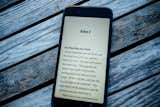
NeuBible's distraction-free experience elevates the content of the Biblical text.
NeuBible's exercise in reduction achieves something rare and great in Bible design. It elevates the importance and focus on the letters, words, sentences, and chapters of the Biblical text. By reducing distractions and focusing on the essential experience of reading and marking verses, this beautifully simple app creates space to read, think, feel, and let the words of Scripture wash over you, without distraction or adornment.

* * *
ESV Reader's Bible (Six-Volume Set)
Crossway has made some serious inroads in the last several years at dramatically increasing the readability, accessibility, and design of printed Bibles and launching the medium into the 21st century.
Several years ago Crossway created a one-volume Reader's Edition without any verses. Versified Bibles have been a thing since the 16th century or so and the goal with chapters and verses was to created a shared taxonomy around referencing various passages of Scripture.
Just last month Crossway dropped an all new envisioning of the Reader's Bible in a stunningly-crafted 6-volume edition, on thick Swedish paper, with attention shown to every last detail.
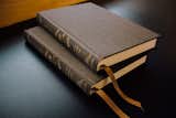
Two New Testament volumes of the new Reader's Bible in rich olive cloth-over-board bindings.
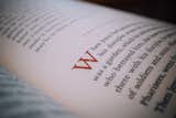
For the type, Crossway selected Trinité No. 2 Roman, set in 12pt. Because they moved the edition to 6 volumes, it allowed them to optimize the character and line spacing. The whole text breathes on the page and creates a truly rich space to read and get lost in the text. The lack of verses or chapters immerses the reader in the text. It feels like reading any well-bound novel or classic piece of literature. And it also helps that they paid rich attention to every detail. Even the paper (which is from Sweden, Arctic's Munken Premium Cream 80 gsm uncoated paper) is creamy and not too white and creates a gentle, relaxing feel for extended sections of reading.
Broad headings (that often span multiple chapters of a given book) help give the reader context but don't distract from the flow of thought and narrative.
Subtle headings help set context without distracting from the broader narrative flow.
I have to admit I was a bit skeptical at first as to whether the experience would feel different than a standard verse-and-chaptered Bible. But reading from Isaiah I found myself lost in the story of Israel's rebellion. Passages I have read by rote time and again were set in deeper context and came alive in fresh ways.
Literally Crossway payed careful to attention to every single detail. From using L.E.G.O. (Legatoria Editoriale Giovanni Olivotto), a binder founded in 1900, to the cold glue process used to ensure a strong hold, or the binding which lays flat at any angle. The execution and attention to detail is second to none.
Again, the end result is not just a beautiful-to-look-at-and-hold product, but one that elevates and gives reverent treatment to the underlying content. The result is also delight to the reader, the scholar, and the everyday person that wants to get lost in a beautiful, ancient text.
The future of books, both digital and printed, is very bright indeed.

Two Reader's Bible volumes rest at an angle on the shelf at the Mt. Angel Abbey Library.
Published
Get the Dwell Newsletter
Be the first to see our latest home tours, design news, and more.