On the Level
These elements can be anything from fake dormers and inoperable shutters to extraneous stonework—whatever the developer who designed and built the house happened to have in his bag of decorative tricks. Inside, the textbook split-level presents a tangle of stairways and a confusion of half stories with awkward ceiling heights. It’s no wonder that when it comes time to renovate these buildings—as is happening with greater frequency as they surpass their 50th anniversaries—homeowners are instead choosing to tear them down and start again from scratch.
This is both a shame and a waste, according to Peter Cardew, the England-born, British Columbia–based architect responsible for the recent makeover of a split-level in a bedroom community northwest of downtown Vancouver. "It’s a pity," he says, "because the split-level is an original type that represents a significant time in the history of North American housing, the postwar building boom." Like Victorian housing before it, much of which was demolished in the 1950s, "the split-level has a cultural value worth preserving," he says, acknowledging that this is unlikely to occur until the split-level acquires widespread cachet, which it currently lacks, or the stock becomes endangered. Right now there is a surplus of cookie-cutter split-levels strewn across the continent. These buildings will continue to come down—which is wasteful, because many of them are structurally sound. "When people talk about sustainability, they are usually referring to new architecture," says Cardew. "But when you figure that most of the energy that goes into a building comes from the one-time act of construction, you are already ahead when you can keep a building rather than demolish it."
Demolition was the furthest thing from the owners’ minds when they hired Cardew—but then, so was sustainability. "This was just a decent house, and we needed someone to help us with a new kitchen and to open things up a bit," says JeanClaude LeBlanc. The
33-year-old real estate developer had been renting the 3,000-square-foot house with his 31-year-old girlfriend, Megan Griffith, when the owner planted a "For Sale" sign on the sprawling lawn out front. LeBlanc responded by purchasing the property and calling in Cardew.
LeBlanc reports that the scope of the project expanded "once we cracked things open and found all kinds of problems—wiring, plumbing, you name it." An acknowledged perfectionist, he realized that whatever alterations he made would be diminished by things left unchanged. "New next to old can work, but it doesn’t always," he says. "I have plenty of friends who can live with design discrepancies and would never have gone as far as I have because of the detail involved; it just doesn’t matter to them. But we wound up gutting the place. I work at home and walk through these rooms 30, maybe 40, times a day. And I didn’t want to have to look at anything left unresolved and think, I could have done something about that."
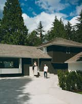
The decision to gut the home paved the way for a truly minimal aesthetic to emerge. "We didn’t do much, but we did a lot, if you know what I mean," Cardew quips, skirting the details. When you compare before and after photographs, you can see that this is true. Where the old façade was standard-issue split-level, busy and cutesy, the new one is handsome and plain. By subtracting a cosmetic dormer and a few other superfluous openings, exchanging complex elements for simpler ones (for example, a mullioned picture window for a single sheet of glass), and adding a light-colored concrete driveway (the perfect foil for a house painted black), Cardew reworked the façade so that it looks better proportioned and draws attention to—celebrates even—the split-level’s iconic form.
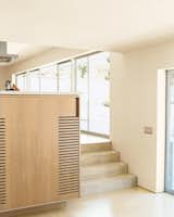
Inside the home Cardew addressed LeBlanc’s shopping list of concerns: the need for a more gracious entry, natural light, and an open feeling throughout the public spaces. By reangling the outside stairs and widening the front door to a welcoming five feet, the architect created an entry that feels both distinctive and generous. By lowering the ceiling height to seven feet in the foyer, he made the adjoining living-area ceiling feel much taller than its conventional eight feet (an old trick from Frank Lloyd Wright’s playbook). By knocking out the walls and doors that separated the living, dining, and kitchen areas, he turned a ’60s layout into an ’00s open plan that reflects the casual way LeBlanc and Griffith like to live.
To take advantage of natural light, Cardew did a few things you might expect, like painting all the walls a light-bouncing white ("We’ve found a tintless white base works best in this gray environment," says project architect David Scott, referring to Vancouver’s notorious overcast), and covering the floors on the main level in hand-troweled reflective concrete ("It’s lighter than machine-troweled," Scott notes). However, most of the home’s light comes from seven seven-foot-wide floor-to-ceiling windows Cardew had installed—four on the main level and three in the den/recreation room, located a half story down from the kitchen.
One of the architect’s biggest challenges was to deal with the most awkward moment in standard split-level architecture: the juncture between the single-story and two-story structures. In this house, the hookup is visible twice: from the foyer and from the no-man’s land between the kitchen and den. In each instance, a section of wall from the second floor drops out of the ceiling on the main level to form a bulkhead. Compounding the problem is the half flight of stairs leading down to the home’s lower level. "Even though you know you are not going to hit your head when you go down the stairs, I am six-foot-three, so I think about it," says LeBlanc. "I could see Peter thinking about what to do about this the first time he came over."
Cardew’s response was to create a gap between the building’s two halves and extend the offending bulkhead wall up to the second-story ceiling, where it now butts against a corner window that has been tucked under the existing soffit. The introduction of the skylight transformed a negative into a positive. Where once there was an obstacle, there is now a grand expanse of wall alive with the play of daylight.
Natural light contributes to the home’s overall calming effect, as does the limited palette of materials—mainly drywall, concrete, and maple—and Cardew’s treatment of rooms not as separate entities but as part of a continuous whole that blends harmoniously with the building’s original character.
"We retained the past to sustain the future," says Cardew. On the other hand, LeBlanc admits that while he is behind the "big idea" of preservation, his motivation for saving this one, and in such a meticulous manner, was personal. "There’s just so much junk being built out there; I didn’t want my renovation to be part of that."
During the renovation, the architect removed a cosmetic dormer, a mullioned picture window, and other superfluous openings, opting instead for a cleaner facade.
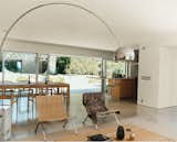
A 14-foot-wide opening at the rear of the house contributes, along with the concrete flooring, to an almost seamless transition from indoors to the patio. A spate of mid-century furnishings includes chairs by Hans Wegner and Poul Kjærholm and an Achille Castiglioni Arco lamp.
Daylight, admitted by way of clerestory windows, brightens the dark zones between the kitchen and the den.
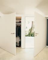
Oversize doors in the front entry create the sense of continuous wall when closed.

Griffith lounges on a Zanotta sofa in the sparely furnished living room.
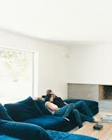
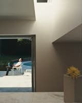
Griffith and LeBlanc cozy up on the Flexform sectional in the den, where one of the home’s two original wood-burning fireplaces has received a new concrete hearth and mantel. The room, which is located a half flight of stairs down from the main living area, feels unusually light and airy because of new, wider sliding doors and and a fresh coat of bright white paint.
Maple flooring was used on the second level.

LeBlanc sits at the western maple dining room table, designed by the architect.
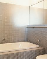
A stainless-steel towel bar runs the length of two walls in the master bathroom.
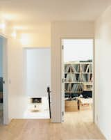
A half flight of stairs connects the main living area and the den.
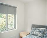
The guest room is furnished with pieces by neighbor and designer Niels Bendtsen.
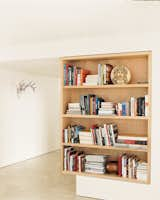
A maple bookcase defines the point between the living room and foyer.
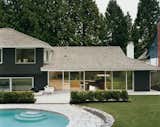
After trying dozens of colors, LeBlanc says, they settled on basic black for the exterior as
a way to best marry the building with its forest surroundings, which include 30-foot-high western red cedar trees. The pool is original; but the deck, once made of concrete, has been reclad in granite to match the old retaining wall.
Published
Last Updated
Get the Dwell Newsletter
Be the first to see our latest home tours, design news, and more.