
Comp Brings Composition Notebooks into the 21st Century
Pentagram is one of the foremost design and branding agencies the world over. Their design work is iconic. A friend texted me this morning a link to Comp, a re-envisioning of the classic composition notebook with a fresh, modern take. Comp has been brought to life by Pentagram designer Aron Fay.
Watching the Kickstarter video, you can see Pentagram founder, Michael Beirut, speak with passion about well-designed products that are made to be used and abused, day in, day out. His love of composition notebooks (in their varied less-than-awesome execution) is no secret.
As you would expect from Pentagram, Comp seems to elevate and give proper attention to every detail and angle, from paper selection, to the lack of roundness on the edge of the paper, to the actual construction of the exterior of the books.
Let's take a look.
* * *
Paper
As with any notebook, book, or printed product, paper selection is of the utmost importance. It should feel thick and solid (without being too thick) and have the right amount of smoothness to ensure that writing, sketch, or ideating is fluid and seamless.
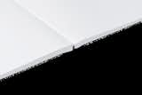
120 gsm ultra white, smooth, uncoated interior paper 155 whiteness (CIE), 96% opacity, 122 brightness (ISO 2470/D65 %), 150 Roughness (Bendtsen, ml/min)
I haven't held the book or felt the paper but I have used many great notebooks that take care in paper selection. I have no doubt that Aron Fay knows what is doing selecting the optimal paper for the job.
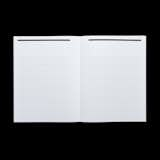
Comp's clean edges and Swiss-inspired headings and lines create mesmerizing symmetry.
Binding
Something that is critical to any printed artifact is the binding. You can have great paper, and a great design, but if your book or notebook doesn't open flat... the execution will likely fall flat.
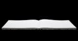
Comp's lay-flat binding is a sublime execution that enables full creativity.
Bindings that open flat are critical because they allow the artifact to open and be usable from any page. There is nothing worse than cracking open a new notebook only to have to wrangle it just to get the first pages to lay open and be usable. Especially when the primary purpose is for streamlined creativity and writing. Comp's binding looks legit.
The Cover
The final detail I will highlight about Comp is its cover. They say you shouldn't judge a book by its cover. But in reality the cover of an artifact should protect the creative assets inside as well as speak to the beauty of its part. It should "summarize" the sum of its parts and invite a person in to read or a creative inside to create.
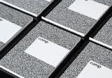
Comp's cover is beautifully marbled, minimal, yet sturdy.
Comp appears to do both. Both in the research and methodology behind the centuries old marble pattern and the execution of the boards, taping, and construction details.
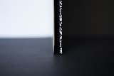
Rigid cardboard gives the Comp its shape.
* * *
I'm not affiliated with Comp or Aron in any way. But I do want to see this beautiful product come to life. There are three ways you can get involved if you feel so inclined:
- Fund Comp on Kickstarter.
- Upvote Comp on Product Hunt.
- Share it on your networks.
Published
Get the Dwell Newsletter
Be the first to see our latest home tours, design news, and more.