Back to the Future
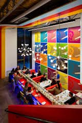
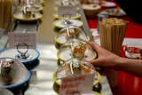
Denver may rest at the epicenter of a landlocked state, but its residents still have a taste for good sushi. The latest addition to an already impressive roster of local purveyors is Sushi Rama, newly opened in the RiNo district. Owned by Jeff Osaka and Ken Wolf, Sushi Rama distinguishes itself in part by the use of kaiten, a conveyor belt-style delivery system that allows patrons to pick whatever bite-size portions they want as dishes pass by. Pricing corresponds to the color of the plate, and each plate is outfitted with a microchip that allows the staff to track and remove any item that’s been through too many rotations.
Sushi Rama was designed by local firm LIVstudio, who handled not only architecture and interiors, but also some of the massive art that adorns the walls. We sat down with husband-and-wife principals Brandon and Tana Anderson, along with Adam Steinbach, to get a peek into the process behind their bold design.
MODERN IN DENVER: NOT MANY RESTAURANTS FEATURE CONVEYOR BELTS RUNNING THROUGH THE MAIN LEVEL. HOW DID THAT COME ABOUT, AND HOW DOES INCORPORATING SUCH A UNIQUE ELEMENT IMPACT THE OVERALL DESIGN?
ADAM STEINBACH: From the beginning, Jeff Osaka wanted to do something different, something that hadn’t been brought to the Denver restaurant scene. The kaiten concept came from him, and given the small footprint of the space, it seemed logical to use that conveyor system to optimize seating and minimize staff. We loved the way the movement of the belt activated the space and encouraged social engagements. The diners’ close proximity and social-centric seating was very intentional.
BRANDON ANDERSON: We really focused on that idea of movement and made efforts to visually move visitors around the restaurant, as well. We have three bands of color that move throughout the interior. Along the ceiling, they follow the conveyor belt, then fold down walls or bend around corners.
MID: MOST SUSHI RESTAURANTS FAVOR A SUBDUED, JAPANESE GARDEN-STYLE AESTHETIC, BUT YOU WENT THE OTHER DIRECTION. WAS THE INTENT ALWAYS TO CREATE SUCH A BOLD ATMOSPHERE? WHAT’S THE STORY YOU WANT TO TELL?
AS: We tried to create a lively atmosphere where people want to come and interact with others while eating. Ken Wolf described his vision as "modern retro," or sort of a modern take on 1960s atomic and Austin Powers decor.
BA: Conveyor belt sushi was developed in the late 1950s, and it really gained popularity for a while in the ‘60s. We definitely wanted to tie into that time period.
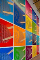
MID: TELL US ABOUT THE WARHOLESQUE SUSHI WALL. IT’S CLEARLY THE FOCAL POINT OF THE ROOM, AND IT BRINGS A VERY SPECIFIC ENERGY TO THE RESTAURANT.
TANA ANDERSON: This was quite a process for the team. Originally, Adam wanted to put a Lichtenstein-esque art installation there, which was very nice. But for all the energy we spent to make it work, it didn’t feel right.
AS: Yeah, it really began with the idea of making a statement. When we first examined the space, we loved the height. At 18 feet, it’s nearly as tall as it is wide, and we knew we had an opportunity to do something impactful as soon as you walk in the door.
BA: We’ve integrated our artwork into several projects in an effort to create memorable spaces that capture the essence of the concept. We liked the idea of an ode to Roy Lichtenstein because of his entertaining use of precise compositions in pop art installations. And after many iterations, it became more of a mixture of Lichtenstein and Warhol.
TA: This truly is a testament to our philosophy, which is, "Listen to the space and it will tell you what is right."
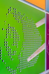
MID: IS THAT A TUNA ROLL? CALIFORNIA ROLL?
BA: It’s actually a Salmon Roll. The fish wrapping the outside of the roll gave us a stronger profile than a typical seaweed wrapped roll.
MID: WE’VE SEEN DIGITAL FABRICATION IN A NUMBER OF LIVSTUDIO’S PROJECTS. WALK US THROUGH THE PROCESS.
AS: The pursuit of new methods of design and fabrication sometimes sparks creativity in new ways we haven’t previously considered. It usually starts with a concept, whether it be a form, an image, a material, or something that inspires us. The digital element is really just another tool to help bridge the gap between conception and construction.
BA: We’ve always been interested in the connection between design and craft, and we love sitting down with craftsmen to work through details. We currently have several relationships with local fabricators, but on our first digital fabrication projects, we built them ourselves. It helped us understand how to produce the digital information we needed.
AS: For the sushi wall, we wanted to create something that paid homage to the graphic work of Warhol and Lichtenstein, but also brings the tangibility of the material to represent the image. Subtle details like the concave carving of the chopstick brought forth different layers of the plywood, adding depth. In much the same way, with the perforations that form the halftone image of the sushi piece, the depth of the material hides certain colors from the viewer until they’re standing directly in front of it. It’s only from that very specific position that the color of both the back and front panels are revealed. We like the way the artwork can become a passive, interactive installation to the observer.
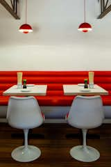
MID: WE LOVE THE LIGHTING FIXTURES, RED BOOTHS, AND SAARINEN TULIP CHAIRS. WHAT WAS YOUR SPECIFIC APPROACH TO DESIGNING THE INTERIORS?
AS: The booths and banquette are intended to evoke the spirit of mid-century modernist furnishings. The curved white base and bright red fabric are meant to complement the Saarinen chairs. And the light fixtures are representative of that retro aesthetic.
TA: Take me back in time while moving me forward at Jetson speed.
MID: THE ART WALL AND CONVEYOR BELT ARE SHOWSTOPPERS, AND THEREFORE BOUND TO GET ALL THE ATTENTION. WHAT ARE A FEW OTHER DESIGN ELEMENTS THAT YOU’RE PROUD OF, BUT WHICH MIGHT GET OVERLOOKED?
TA: Most people stop at the conveyor belt and the lower level, which are great unto themselves, but the transportation doesn’t end there. The upper level has its own culture that is uniquely energized. And one of my favorite spots is the space between—I love the energy you get heading up the stairs, looking down at the movement below while being pulled into the upper level vibe, and then unexpectedly in the middle you look to the left and see the "zen garden" sandbox with the modern, playful, color-changing orbs. It’s delightful.
AS: I think the use of curved corners and laminate banding helps complete the composition of the space. Details like the rounded openings that peer into the kitchen and the curved masses that make up the back of the house help soften the atmosphere and contrast nicely against the industrial context of the shell.
MID: HOW MUCH SUSHI DID YOU EAT DURING AND AFTER THIS PROJECT? ARE YOU OFFICIALLY EXPERTS?
BA: Even though we loved sushi before, we really committed to doing further research to get everything just right. You know, for the sake of the project! Now that the restaurant is open, and just one block from our office, we’re there more than we care to admit. In fact, our daughter, Liv, insisted on having her birthday dinner at Sushi Rama.
Published
Last Updated
Get the Dwell Newsletter
Be the first to see our latest home tours, design news, and more.