A Look Inside Squarespace NYC
A constrained, monochromatic color palette don't have to be boring. As in digital design systems, sometimes having a color constraint allows the personality of surfaces and people ("content" in the digital world) come through. Such is the case with Squarespace's NYC offices.
Sometimes, the restriction of color creates stark lines of contrast. The lack of color can bring things into focus and new and surprising ways.
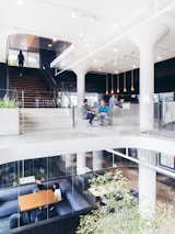
Natural light is ever the friend of any well-executed interior design. It brings warmth and life to spaces that might otherwise be drab.
Another friend to successful spaces is glass. And lots of it. The Squarespace offices seem to have no lack of glass wherever you look.
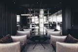
A collusion of dark tones creates a subdued, lounge-like atmosphere to an open space bordered in by steel shelving.
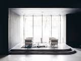
On the contrary, when a room is encased almost entirely in white tones, a space almost begs for creative ideas to start flowing, as if its dormancy is inviting guests in to stay.
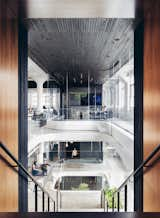
Atrium spaces are great for great harmony between different patterns, textures, and colors. These offices seem to hit this harmony well and create natural transition between different levels of the office.
Diversity is of great value when designing a space for humans. People like to move around and see something new. Casual and outdoor spaces can be a great way to create alternative places for people to connect and coalesce.
:)
Published
Last Updated
Get the Dwell Newsletter
Be the first to see our latest home tours, design news, and more.
