14 “Before & After” Renovations in Portland That’ll Make You Do a Double Take
From murky Craftsman homes crying out for daylight to midcentury dens oblivious to surrounding views, these projects prove that in the right hands, no residence is beyond saving.
In This Portland Tudor, an Irresistibly Quirky Kitchen Steals the Show

Before: The bland white stock cabinetry and track lighting didn’t appeal to the new owners.
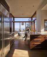
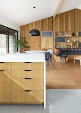
![Hess combined a John Boos butcher-block table with a piece carved by local wood sculptor Vince Skelly to create a sculptural kitchen island. "As soon as [Skelly] brought that in there, [Charlie and Todd's] little daughter hopped up on it and owned it. So, that's where she hangs out in the kitchen," says Hess.](https://images2.dwell.com/photos/6272473203005894656/6715097682740359168/original.jpg?auto=format&q=35&w=160)
Hess combined a John Boos butcher-block table with a piece carved by local wood sculptor Vince Skelly to create a sculptural kitchen island. "As soon as [Skelly] brought that in there, [Charlie and Todd's] little daughter hopped up on it and owned it. So, that's where she hangs out in the kitchen," says Hess.
By combining an array of influences—including boat casework, Greek caves, and the American studio craft movement—interior designer Andee Hess of Osmose Design crafted an organic, bohemian, and entirely unexpected look for a Portland Tudor. Now, a sweeping plaster form encases the fireplace, a breakfast niche boasts a green onyx table and tiered millwork at the ceiling, and the kitchen was outfitted with curving, white oak cabinetry and a sculptural kitchen island by a local sculptor.
A Historic Apartment Building Is Transformed Into a Chic Social Hotel in Portland

Before: Part of the ground floor was a vacant shop when the building was purchased.

After: The remodel created a light-filled lobby with a vintage vibe. It centers around Dóttir, an Icelandic-themed restaurant that is open for three meals a day.
The KEX Portland is a new breed of accommodation—a so-called "social hotel" that acts as a hybrid between a hostel and a boutique hotel. That means it combines the social spaces and local pride of a hostel, with a range of room types from family suites to shared bunk rooms, all with an eye for design.
The KEX, an Icelandic mini-chain, installed its second offering in Portland in a completely restored apartment building originally built in 1912 and previously in severe disrepair. Thanks to a design by by Hálfdan Pedersen, who also worked on KEX Reykjavik, social spaces now boast a moody European sensibility via imported vintage finds and showcase Pacific Northwest materials like the reclaimed Douglas fir from a Fort Vancouver train station that covers the floors of the lobby.
A Midcentury Abode Gets a Gorgeous Upgrade

Before: Aside from the angled profile, the house originally featured flat ceilings that were just under eight feet tall.

After: The first task at hand was to open up and vault the ceilings. The architects added floor-to-ceiling windows, which allowed the home to take full advantage of its amazing views.
This 1958 house in the Mount Tabor neighborhood screamed unrealized potential. Take the front facade: It had a cool angled feature beneath a sharp, eye-catching roofline, looking like the prow of a ship, yet all of that was covered in bland siding. A band of windows didn’t do enough to capture the views. Interior ceiling heights came to a lackluster eight feet.
Fortunately, architect Risa Boyer stepped in for improvements. Boyer inserted new floor-to-ceiling windows, vaulted the ceilings, and added era-appropriate wood finishes and beams. Custom built-ins embrace the home's awkward angles, while new tile and wallpaper punch up the modern mood.
After: The vaulted ceiling adds an expansive airy feel that the original home lacked. Now, the wall of windows perfectly frames the gorgeous overlook.

Before: The 1958 Airstream Land Yacht was in desperate need of an update in order to become a functional and efficient tiny home.

After: The couple spent two years converting the Airstream into cozy rental accommodations in their backyard.
Cynthia Tuan and Shane Beers managed to pack a lot into this tiny Airstream in order to make it a comfortable home base for guests visiting Portland. There’s a reading nook and breakfast bar, a kitchenette with two burners and sink, as well as a full-sized bed and bathroom, the latter finished with a stock tank repurposed as a tub. Thanks to textural accents and the reclaimed wood floors, the scheme feels cozy and lives larger than its petite footprint would suggest.
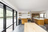
A Midcentury in Portland Is Stunningly Revived

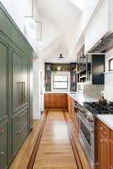
Before: Many of the original kitchen cabinets were kept in place, "as they were beautifully made, and the owners loved them."

Before: However, some of the existing storage was not as functional.

After: Horner replaced the closed storage with custom, open shelving that now connects to the entry, increasing natural light and sight lines throughout the house.
For this remodel of a 1954 home in Portland’s West Hills, "Our approach was to create some standout moments throughout that made the space feel 'more mod than mid,'" says designer Stewart Horner of Penny Black Interiors.
Horner preserved key architectural moments—such as the living room’s Douglas fir paneling, the fireplace, and the kitchen cabinets—and updated "ill-considered" spots like the entry and the bathrooms. Now, the home is a fluid mix of old and new, midcentury character balanced with modern cool.
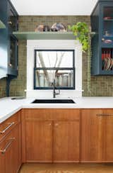
After: The sink was relocated for functionality and new windows installed above it, so the owner can look out over the garden. The perimeter counters are composed of custom-made 15-ply birch with an oak butcher-block style veneer, and the island is topped with Caesarstone. A new bar area with two under-counter fridges and a pop-up TV replaced a pony wall from the '70s.

Before: The footprint of the kitchen remained pretty much the same as the original.
Interior designer Stephanie Dyer outfitted a Portland Craftsman for the present and future by fitting a bespoke kitchen into the same footprint as the old one, and crafting an upstairs principal suite that can later be turned into a caretaker’s quarters.
After: Dyer's renovation features a vaulted ceiling and skylights, as well as wood floors with inlay and an abundance of customized cabinetry.
After: One of the homeowners is a potter, and he is responsible for creating the personalized backsplash tiles. Interior designer Dyer worked closely with him on the module and layout, coordinating to get the tiles to match their perfect shade of green: Sherwin-Williams' Rosemary.

Before: Architect Matt Loosemore remodeled this home to better fit the lifestyle of his wife, two children, and dog.

Before: The original home was around 2,500 square feet with two bedrooms and three bathrooms. The team added 500 square feet during the remodel.

After: The new home sits on the same footprint, but it gained two bedrooms and another bath and a half. One challenge was extending the cantilevers as far as possible to add more square footage.
After 20 years in his Cape Cod–style home, architect Matt Loosemore gave it a top-to-bottom overhaul, keeping only one wall, the subfloor, and the foundation. Not only did the architect add 500 square feet, two bedrooms, and one bathroom, he was able to create a home that exactly fits his family’s lifestyle, including a comfortable backyard space for hanging with the neighbors.
"We designed it to accommodate friends," says Matt. After all, after 20 years in the same spot, "Our neighborhood became our best friends."
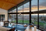
It’s Hard to Believe This Sleek Modernist Sanctuary Started as a 1950s Ranch House

Before: The breakfast nook.
After: After removing the original roof, the architects boosted the ceiling height on the ground floor to accommodate clerestory windows. "We took a fairly heavy roof structure and lifted it up," says Miller. Now the breakfast nook enjoys better light and a wider view on three sides.
Despite having an abundance of views of downtown Portland, Mount Hood, and the Columbia River in the distance, this 1952 ranch house wasn’t doing much to embrace them. A remodel with local firm Bohlin Cywinski Jackson changed that: "We wanted open plans, more transparency, less tiny rooms," says homeowner Greg Hoffman. And the firm was such a good fit for this because, Greg notes, "they specialize in glazing." The ensuing remodel raised the ceiling heights, extended the roof line, added a top floor—and of course, wove in a lot more windows to capture those views.
A Mullet Renovation Fills a Portland "Super Bungalow" With Daylight

Before: The homeowners, Arrow and Jessica Kruse, lived in Los Angeles before they purchased this expansive home at the base of Mt. Tabor. Arrow had grown up in Portland, but after living in L.A., the family craved sunshine.
After: By changing the roofline, Beebe Skidmore introduced light and usable space to the third floor. "It was not a lot of extra space, but we got headroom," explains Beebe.
After: This view shows how the spaces in the great room connect to each other. The architects cut a light well through the center of the home to bring daylight all the way down to the kitchen.
For the remodel of this Southeast Portland "super bungalow," the architects only altered "10 percent of the facade," says Heidi Beebe of the firm Beebe Skidmore. Traditonal features, like its shake siding and decorative brickwork at the chimney, were left intact to mingle with the insertion of a "glassy chunk of architecture."
That chunk does a lot of work for the owners, who are California transplants, including bringing in more daylight, establishing an indoor/outdoor connection at every level of the three-story home, and making it possible to transform the interior.
An Artful Update Streamlines a Portland Midcentury
Before: The family needed more storage than what the original built-in shelving could offer.
After: The wall in the den received variegated cedar planks, as did the living room. Fieldwork redesigned the built-in unit with an open and closed system, fashioned from hemlock and gray matte lacquer. A built-in sofa creates a seamlessly integrated lounge.
Fieldwork Design + Architecture and Annie Wise Design teamed up to tackle the remodel of this 1960 home in Portland’s Southwest Hills. The owners had lived there for several years prior and knew the house’s problems intimately. Lackluster storage and finishes prevented the interior from feeling like one cohesive whole.

After: Variegated Douglas fir planks now surround the living room windows. The sectional is from Dellarobbia, and the leather chair is the Toro Lounge Chair from Blu Dot. Annie Wise sourced the rugs and accent pillows.
The team overhauled the finishes, swapping out white carpeting for cork flooring, and zeroed in on the kitchen and main bathroom. Artful storage solutions finished things off. The goal, says Wise, was "to give a busy, modern family a minimalist design without sacrificing their maximalist lifestyle."
This Portland Loft’s Pink-Hued Makeover Deserves a Standing Ovation
Before: The living room had potential, but the decor was tired and dated, and the hidden storage space wasn't optimized.

After: As a former librarian and true book lover, Williams liked the idea of storing her books in the living room. "At first, the built-in shelving we designed was more open, but the exposed books created too much visual clutter, so we added cabinet doors and kept a few open shelves to house a rotating display of our client's collection of quirky and artful artifacts," says Eng-Goetz.
It’s not many clients that will give a design team carte blanche to reinvent their home of over a decade. But that’s just what Pam Williams, a retired public library director, did when she tapped Jessica Helgerson Interior Design for an overhaul of her 1,075-square-foot, one-bedroom, one-bath loft in the Pearl District.
The design team got to work creating "a welcoming cocoon for [Williams] to live in," says Helgerson. Combining a neutral palette of off-white, light gray, and pale pink with cozy built-ins in every room, the designers created "an environment that aims to be both serene and energizing," says designer Mira Eng-Goetz. "A place where our client can host lively book club get-togethers or sink into the cozy indulgence of watching a movie on her own."
A Dim, Cookie-Cutter Craftsman in Portland Now Basks in Natural Light

Before: The porch was blocking light into the living spaces, say the architects.
After: Now the bright yellow and gray facade is distinguished by oversize windows.

After: The upper floor layout was rejiggered so that the kids' bedroom could be relocated, and now a cantilevered addition at the back of the house hosts a library space with full-height glass capturing a view to the backyard. The built-in shelving has a rich blue laminate, and the tiled wall to the left denotes the light well into the kitchen.
Perhaps it’s not surprising that the remodel of a Southeast Portland Craftsman might get the nickname "Operation Sunlight." "It was kind of a generic house, and it was dark," says architect Heidi Beebe of Beebe Skidmore. "One of their main goals was to make it lighter."
Beebe did so by breaking up the facade with more glazing, opening interior walls, and specifying internal cut-outs to allow light to cascade down from the upper level. Now the homeowners can pick and choose where they might like to enjoy the sun, whether that’s the cozy family nook, standing at the kitchen counter, or lingering in the upstairs library.
An Enchanting Craftsman Home in Portland Is an Ode to Local Flora
Before: The dining room was used as an office space. JHID opened up the space and added natural light by inserting glass sliders.

After: Architectural elements like coffered ceilings and columns were added to the dining room to give the space the charm and character that is usually associated with older homes.
Jessica Helgerson Interior Design led the transformation and addition of this 1907 Craftsman in Northwest Portland. Since the home had undergone several changes in its lifetime, the team started by improving the circulation in the floor plan, then meticulously added era-appropriate details and singular decorative flourishes, like hand-painted tile in the kitchen.
"We layered on architectural elements like coffered ceilings, columns, and ceiling rosettes to dress up the house because it lacked a lot of the charm and character that we typically associate with older homes," says interior designer Mira Eng-Goetz.
A Midcentury Lakeside Home Receives a Stunning New Look
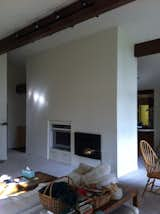
Before: The fireplace covered in drywall.
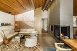
After: The team exposed and painted the brick fireplace and revealed the concrete floors. New wood planks at the ceiling sync with the redesign of the staircase—a contemporary touch that could have just as easily existed in the home's original state. The wood slat screen creates porosity, making the room feel bigger, and is a huge improvement over the sheetrock wall that had previously been there.
Before David Horning of MOA Architecture and interior designer Holly Freres of JHL Design got involved, this 1955 home in Lake Oswego had lost its luster. The kitchen had been given a bland update in the ’80s, while white carpeting, a white fireplace column, and a lot of white paint made the home’s features indistinguishable from each other.
The design team worked to coax the home’s character back out, removing the drywall covering the fireplace to expose the original brick, covering the ceiling in warm cedar boards, and expanding the kitchen with custom Oregon white oak cabinetry.
Related Reading:
9 Impressive "Before & After" Remodels of 20th-Century Homes in Seattle
23 Renovated Eichlers That Epitomize Midcentury California Cool
Published
Get the Dwell Newsletter
Be the first to see our latest home tours, design news, and more.