Q&A with Typeface Designer Matthew Carter
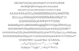
Although unintentional in design, Carter acknowledged there were some similarities between Carter Sans (shown here) and Verdana. He also added that he “must have been the only person on the planet not to receive the Ikea Catalog” when news of their change from Futura to Verdana broke. His reaction? He found it “curious reading some of things people said about how it had been designed – I couldn’t believe it. They were saying things like Verdana was a flat-pack typeface – like when you buy things from Ikea and it comes in a flat box and have to put it together yourself – sort of the indication that’s how Verdana was made. My god if there was any typeface that was built from the ground up it was Verdana – so I was bemused by all this.” Image courtesy Monotype Imaging.