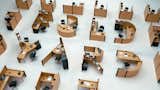
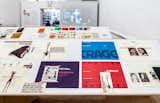
Fold Yard Font by Benoit Challand
The French designer’s new font showcases a new kind of Action Office.
Photo Courtesy of Benoit Challand
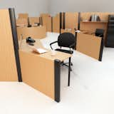
Fold Yard Font by Benoit Challand
“The main inspiration was the work of industrial designer Richard Sapper,” says Challand. “When I saw his work, I immediately thought of how I could make the space more fun and surprising.”
Photo courtesy of Benoit Challand
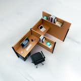
Fold Yard Font by Benoit Challand
The multifaceted illustrator and designer, who’s currently working on a table, has fielded some offer to purchase the font, but he said nobody has asked him to recreate the letters in real life.
Photo courtesy of Benoit Challand

These oak house numerals are the perfect home accessory for modern architecture enthusiasts. The streamlined font is a welcome respite from traditional metal house numbers, and the oak wood will stand out on a painted façade or brick. Created in the FF DIN font, these numbers are a modern improvement of traditional metal house numbers. The FF DIN typeface was designed in 1995 by Dutch typeface designer Albert-Jan Pool, and is characterized by its balanced width.
The other collaboration between Matti Syrjälä and Erik Bertell is the Font Block Set.
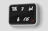
Sebastian Wrong's font clock for Established & Sons symbolizes to a tee the era of design since 2000. We're living in an internet age in which typography has become a part of pop culture no longer relevated to kerning-happy designers. The Font Clock isn't terribly expensive, and it's quirky yet massively appealing.

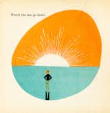
From Adrienne Adams’ What Makes A Shadow, 1960.
Font 6 by CaSA
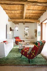
In Marquina and Font’s living room, a pair of kilim-covered chairs by Philippe Xerri, a chest of drawers by Piet Hein Eek, and a handmade Tunisian rug provide bursts of color amidst the overall scheme of white, ecru, and cream.
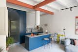
A unit facing Natoma Street looks on to what was once housing for the area's factory workers.
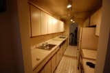
Here's what the kitchen looked like before.
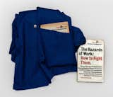
The Hazards of Work, Patrick Kinnersly, 1973, Pluto Press, Book. Design by Richard Hollis.
The font used on this mid-century poster is Venus Bold Extended.
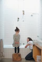
Pepa gets a better view of what Gorman is explaining in the girls’ bathroom from her stump stool.
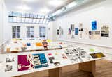
Installation view from Richard Hollis, Artists Space, 2013.
Richard Hollis, material for Whitechapel Art Gallery, 1978 – 1981. Courtesy Richard Hollis.
Little confusion over what this flipper is meant for.
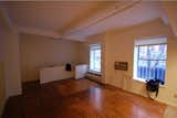
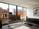
Here's what the living room looked like before.
The simple wood deck features innovative cutouts that allow full-grown Yucca trees to peek through.
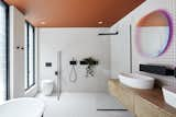
The multidisciplinary team at State of Kin, a Perth-based design studio, wanted to create a uniquely Australian home, one that incorporated a variety of both multicultural and local sources. The idea of such a mix, says director Ari Salomone, "is quite true to the Australian vernacular." <span style="font-family: Theinhardt, -apple-system, BlinkMacSystemFont, "Segoe UI", Roboto, Oxygen-Sans, Ubuntu, Cantarell, "Helvetica Neue", sans-serif;">When choosing what shades would go into the home's color palette, the design team drew heavily on the Western Australian landscape. "We looked to the Pindan red dirt of the Northwest, the luminous white beaches, the dusty eucalyptus greens,
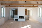
with light-beige walls, pinewood floors and repurposed original wooden beams,
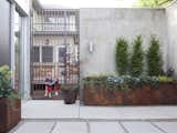
In the entryway, what at first appears to be a rug is actually cut blue glass terazzo designed by Marwan Al-Sayed.
View into the open-plan kitchen and living room in the bungalow's newly built back end. "T
The neighbors get a glimpse of what goes on in the Blauvelt-Winters courtyard.
Top: Richard Hollis, book covers for Penguin Books, 1965 – 1968. Letterpress. Courtesy Richard Hollis
Bottom: Richard Hollis, page layout and picture editing for New Society, 1966 – 1968. Letterpress. Courtesy Richard Hollis.
In order to maximize light, even the upper section of the bathroom walls are transparent, meaning anyone taking a shower can be seen from the living room, but only from the neck up.
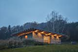
Designed by Atelier Lina Bellovicova, House LO marks the country’s first residential project to use hempcrete, a sustainable and fire-and-mold-resistant materil.

The header imagery gives a glimpse of what's to come at Hyperbole and a Half.
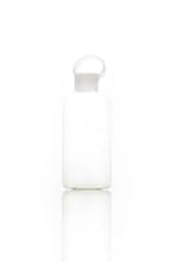
Here's what the glass bottle looks like sans covering.
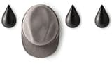
What would you call this teardrop shaped wall hook?
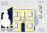
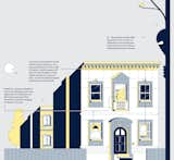
![“For this project, [design director] Kyle [Blue] already had the architectural references for me, so to start, I asked an array of questions: What type of feel do you want? What’s the most important message to convey? What do we need to tell readers with the picture?” Gardner says. “He explained that the illustration needed to bring the structure into the environment and we kicked around ideas about putting a courtyard underneath and having people milling around. We went through two or three different variations.”](https://images2.dwell.com/photos/6063391372700811264/6133483324951040000/original.jpg?auto=format&q=35&w=160)
“For this project, [design director] Kyle [Blue] already had the architectural references for me, so to start, I asked an array of questions: What type of feel do you want? What’s the most important message to convey? What do we need to tell readers with the picture?” Gardner says. “He explained that the illustration needed to bring the structure into the environment and we kicked around ideas about putting a courtyard underneath and having people milling around. We went through two or three different variations.”
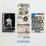
Clockwise from top: Eric Ravilious/Gillian Lowndes, 1987. Crafts Council Gallery, Poster, Four-color offset. Crafts in America, 1985. Crafts Council Gallery, Poster, Four-color offset. The Nicholsons: A Story of Four People and Their Designs, a York City Art Gallery touring exhibition, 1988. City of York Leisure Services, Poster, Four-color offset. John Heartfield, 1992. Barbican Art Gallery, Poster, Three-color offset. All works Richard Hollis, courtesy Richard Hollis.
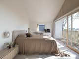
Peekaboo windows continue on the first floor, where an expansive, light-flooded primary bedroom connects to the elements under an angular pitched roof.
3,299 more photos