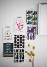
Instead of splurging on expensive framed art, Susanna tapes postcards and images cut from magazines to the wall. They're bright, colorful, and easy to swap out as she likes. Read more about this compact Finnish household here.
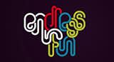
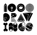
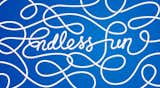
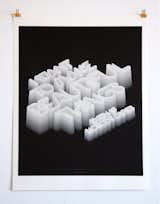
Endless colorful tubular type, part of a "growing collection of projects and experiments centered around typographic illustration."
Alphabet and poster design, with wording form the Bowerbirds song 'Bright Future'.
A closer look at the typography.
Typography is an oft-forgotten but effective tool in facilitating creativity and inspiration. Whether the purpose is to enhance a written message with the right font or be used as a message itself, typography has a firm place in modern design. See more typography by clicking here.
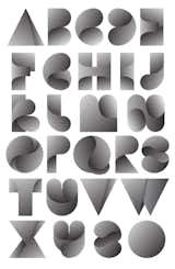
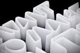
Twelve letters get objectified.
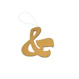
The holiday ornaments from font foundry House Industries are defined by their graphic composition. Crafted from anodized aluminum, each ornament in this limited edition series celebrates a treasured typographic symbol, including ampersands, arrows, and the letter X. These ornaments make treasured keepsakes that can be used year after year.
Available in Arrow, Koi Fish, Double-Dagger, Pen Nib, and X models.
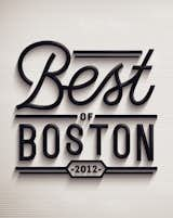
For their 2012 'Best of Boston' issue, Boston Magazine commissioned the designer to create a toolkit, which included various sub-section headers, opening DPS, and lock-up for the table of contents.
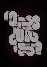
Where does it begin and where does it end?
Details, details.
The back of one of the four photography promos sent to us by Toby Burditt
An experimental type design with wording from Bright Eyes' song 'No Lies, Just Love.'
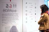
'New Bulgarian Typography' at Vivacom Art Hall highlighted the work of designers Ilya Gruev, Philip Popoff, prominent members of the Art Directors Club of Bulgaria, as well as new typefaces from TypeDept and Ivan Hristov. Photo courtesy of Sofia Design Week.
A limited edition Giclée print based on a quote by graphic designer and filmmaker Saul Bass-"I want to make beautiful things, even if nobody cares." The typography was created using just Illustrator and Photoshop.
The 'New Bulgarian Typography' exhibition at Vivacom Art Hall featured twenty artists from different generations who employ traditional Cyrillic fonts and schooled methods as well as youthful experimentation with calligraphy and bold contemporary typefaces. Photo courtesy of Sofia Design Week.
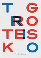
Trio Grotesk's typeface release.
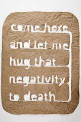
Matthew Hoffman, Come here and let me hug that negativity to death
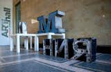
On display at CHGO DSGN
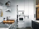
Typography guru Erik Spiekermann and his wife, designer Susanna Dulkinys, hate clutter. That’s why they love the super-sleek Berlin domicile they constructed to have just the right lines—and a host of energy-saving features behind the scenes. The stainless-steel Bulthaup kitchen "cost as much as a small house," said Spiekermann, though he did get a discount: Bulthaup is one of his clients.
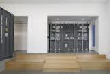
A sliding door crafted from part of a shipping container, with the typography becoming a graphic and defining element within the space.
just a few of my favorite things in one photo... nice typography and concrete. #concrete #typography
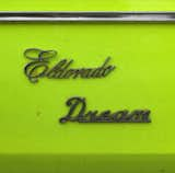
#1973 #Cadillac #typography
Typography, poster by Jan Horcik
The calendar is for lovers of typography and simplistic design.
Clasen says that the proliferation of typography in her home reflects her style, and can often be found in her projects.
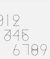
Numbers typography. Via Lyla & Blu
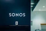
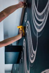
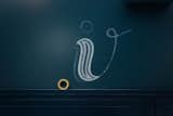
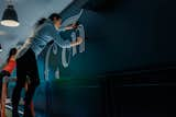
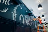
Sonos office wall done in chalk typography.
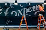
Sonos office wall done in chalk typography.
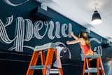
Sonos office wall done in chalk typography.

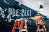
Sonos office wall done in chalk typography.
Sonos office wall done in chalk typography.
Sonos office wall done in chalk typography.
Sonos office wall done in chalk typography.
Sonos office wall done in chalk typography.
Sonos office wall done in chalk typography.

Sonos office wall done in chalk typography.

Sonos office wall done in chalk typography.
115 more photos