16 “Before & After” Kitchen Remodels That Really Cook
The kitchen is the workhorse of the house: a place to prep and eat meals, help the kids with homework, and entertain guests during a party. These 16 makeovers are stellar examples of how architects and designers have spiced up their spaces for better function and flow.
Two Game-Changing Kitchen Renovations by a Seattle Studio

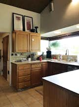
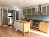
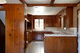
Before: Designed by the respected Seattle architect Ibsen Nelsen, this 1964 residence had exteriors that were in good condition, but a dark and inefficient kitchen.
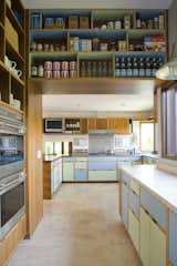
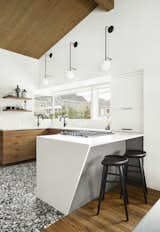
After: SHED Architecture + Design’s new scheme is a playful homage to the home’s midcentury provenance, thanks to multicolored cabinets created by Kerf Design. SHED designated two zones within the existing footprint: The main working elements wrap the walls while a storage corridor with the wall ovens stands nearby. A continuous counter links the spaces.
Before: Amory Wooden, who works in marketing at StreetEasy, took the high-low approach in the remodel of her Brooklyn kitchen, which added more storage and gave it personality beyond its basic finishes.
After: Wooden lined one side of the room with floor-to-ceiling cabinets for a storage powerhouse. The cabinets are Ikea innards paired with Shaker fronts from Scherr’s and painted Farrow & Ball’s Railings. A center island provides additional storage, prep space, and a breakfast bar. At the back, a classic black panel window and patio door lead to the family's outdoor space while bringing much-needed natural light.
After: Wooden carved out a cozy sitting area beneath the back window, and splurged on glazed Moroccan zellige tiles from Cle for the backsplash. The walls are painted with Farrow & Ball's Great White, and the cabinet hardware is from Schoolhouse Electric. The chime on the wall is from The Tienda at Hotel San Cristobal in Baja California.
Before: While the layout for this midcentury kitchen in Portland, Oregon, worked well enough, the homeowners wanted to tweak it for better flow and update the finishes, so they brought in Dyer Studio for an overhaul.

After: Dyer Studio retained the same basic U-shaped layout but relocated the sink and stove. Upper cabinets were removed, as they blocked light from the windows. A section of wall between the kitchen and adjacent living room was also removed to create sight lines. New walnut cabinets provide better storage solutions.
After: Unexpected details—like the angled edge of the quartz countertop that waterfalls to the floor, textured backsplash tile, and large format, terrazzo-like floor tile—add interest.
Before: Interior designer Alex Fawcett bought this 1956 home in Northford, Connecticut, with the goal of remodeling without disturbing too much of its midcentury swagger. The existing kitchen was "tight quarters," with '80s-era finishes to boot, so he removed them and opened up a wall for better flow.

After: Now, rich black soapstone counters wrap matte black Ikea cabinets, and appliances are hidden behind cabinet fronts so the room recedes. Storage now extends under the windows and lines the dining area, where the table and chairs were both Craigslist finds.
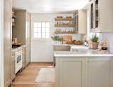
Before: At designer Sarah Sherman Samuel’s Michigan home, the sloped wood ceiling in the kitchen was getting lost against the wood floors, wood cabinetry, and dark walls.
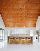
After: Sherman’s remodel emphasizes the wood ceiling as the dramatic focal point that it is. Now, white cabinets, terrazzo floors, a marble slab backsplash, and a quartz counter are mixed with wood and brass accents for better balance. "By bringing in shades of white (while mixing different textures for interest) on mostly everything else, it stands out and is celebrated in its original glory," says Samuel. "The key to making all white not boring is to play up all the textures—and, of course, the pop of metallic really helps."
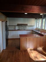
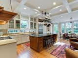
Before: The problems with the kitchen in this Portland home were many, beginning with its cramped layout that encouraged foot traffic through the work zones, and ending with angular cabinets that didn’t provide enough storage.

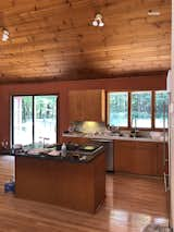
After: The homeowners worked with local outfit His Builders for a fix. The first order of business was to relocate the kitchen to the adjacent dining room and remove the wall between them, which created more usable space. A generous island now protects the cook while they’re working, and the sink is below the window. Custom wood cabinetry and a simple subway tile backsplash makes the new room warm and inviting.
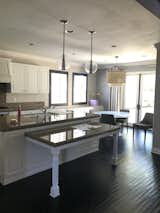
Before: The kitchen had 1980s-style oak cabinets and other dated finishes, and the layout wasn’t functional with a little-used island.
After: The clients wanted to improve the flow, have ample space to cook and bake, and update materials and appliances, so Eskandari added a new island with a hood for better circulation, ample seating, and counter space. Two-toned cabinetry and a colorful backsplash draw the eye forward. "The floor-to-ceiling windows limited cabinet locations, so our solution was the extra-long island, which was designed with much needed storage and seating for seven," says Eskandari.
Before: Interior designer Stephanie Dyer of Dyer Studio was brought in to remodel this kitchen in a 1902 Victorian in Portland, Oregon. The brief was to create a more functional space that matched the scale and style of the original home. "I come from a historic preservation background and ethos," says Dyer, noting that a prior architect that the homeowners consulted suggested blowing out one side with an addition to get the space needed. "It's really important to me to not just come in with a sledgehammer and knock down everything."
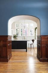
After: Dyer was very strategic about changing the kitchen’s layout in the existing footprint, so as to disturb the home as little as possible. Dyer allocated the new entry to an existing niche in the dining room, saving and reinstalling the woodwork, and putting red oak inlays at the floor to mark the new threshold. The opening frames a beckoning view of the kitchen, as well as the striking new windows over the sink.
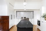
After: The team removed dropped ceilings to gain more height in the room and found unused space behind the walls, which allowed them to maximize storage. The clients requested a white kitchen that contrasted with the colors found in the rest of the house. "I really liked the idea of this bright white space in the kitchen that you would see through the very saturated color of the dining room," says Dyer.
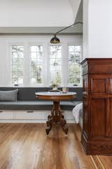
After: By relocating the door to the kitchen and squaring off a bay window to form a bump-out, Dyer made space for a built-in banquette to extend along one wall.
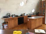
Before: While Amy Kwok’s kitchen in her San Francisco home had been renovated in 1990s, the designer needed it to be just a little more personal.

After: The perimeter cabinetry is a mix of closed and open elements, and the doors are wipeable laminate with an integrated finger pull. The island was inspired by artist Donald Judd after a trip to Marfa, Texas. "Donald Judd’s library table was the inspiration," Kwok says. "We wanted something simple, solid, and durable for family use, and something that would have a nice patina through the passage of time."

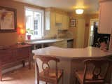
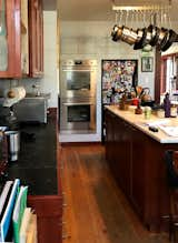
Before: When Bryan and Catherine Williamson, founders of the blog Beginning in the Middle, bought this 1900 home in Columbus, Ohio, they were looking at a "roof to basement" gut. At 12-by-12 feet, the existing kitchen was deemed too small, so the couple opened up walls to expand the footprint and connect it to the living spaces.

After: The Williamsons kept or recreated much of the home’s period detail throughout, including things like doors and woodwork. The new kitchen is composed of Ikea units tucked behind Semihandmade’s simple Shaker door fronts, painted Behr’s Black Sable. By using Semihandmade, the couple were able to customize panels for any gaps, and hide appliances like the refrigerator and dishwasher inside cabinetry. When it was discovered that the marble slab they’d picked wouldn’t fit the entire island, the solution was to mix materials, and finish it with a piece of walnut that also waterfalls to the floor.
Before: The remodel for this San Diego kitchen was less about drama, and more about subtle tweaks. In that vein, designer Katie Gebhardt of Solstice Interiors kept the basic layout, and made tweaks that emphasized key architectural elements, like the high ceilings and the range hood detail. The owners also needed a built-in desk removed, as it only functioned as a clutter magnet.

After: New finishes, like the white oak floors, quartz counters, and white-gray cabinetry, form a neutral base that can be updated over time. Open shelves on either side of the range create more airiness. Storage and counter space is streamlined with the removal of the desk. White oak trim at the range hood and new pendants over the island emphasize the architectural details that were loved.
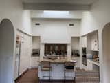
Before: The owners of a unique, dome-shaped Catskills home needed a kitchen wherein they weren’t bumping their heads on the sloped walls. In addition to clearance issues, the finishes were worn, and the layout wasn’t optimal for two cooks to work simultaneously.
After: Architect Elyse Agnello provided a new plan that neatly wraps the kitchen around the home’s sloped concrete shell. The architect relocated appliances for fluid movement between them, increased storage, and widened the counter depth to ensure head clearance. For materials, the team opted for walnut cabinetry with a visible grain pattern, tempered by quartz counters. The circular motif on the floor tile references the home’s curves.
Before: The goal for designer Jenni Kayne’s remodel of the kitchen in her Lake Arrowhead, California, home was to give it a "mountain-like feel" without going as literal as what was there before. The designer removed the existing elements, like the ornate, dark wood cabinetry and tile counters.
After: Kayne swapped in custom cabinetry painted Farrow & Ball’s Light Gray and marble counters. Chicken-wire fronts and open shelves made of reclaimed wood help to keep the new space feeling airy.
"It was a dark space with limited natural light," designer Becki Owens remembers of this existing kitchen in a San Clemente, California, home. "My goal was to transform it from its dark and dated feel into an open kitchen with clean lines. We wanted to maximize the available natural light and make it feel bigger and more inviting."

The answer was an all-white design that would bounce around the California sun. Owens made sure to bring in texture and layers so as to create a welcoming space, rather than a sterile one. To that end, new wood floors and wood accents in the shelves and at the range hood warm up the scheme, as do the brass sconces and faucet. Statement lighting pieces over the island and bistro table bring a sculptural element.
Before: "The kitchen had been remodeled by the previous owners, and it was definitely a Pottery Barn or Crate and Barrel–style catalog kitchen, which wasn’t necessarily us," says Shondi Nickell. Nickell and husband Jake wanted more color, art, and texture in the redesign.

After: The couple hired Shumaker Design + Build Associates for the remodel. The firm lightly reorganized the layout for better function and flow and added a built-in eating area. Due to the home’s neighbors, accessing natural light was tricky. The designers solved that issue with glass-backed cabinets on the north wall, which admit light without prioritizing the views.
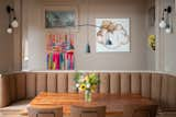
After: The Shumakers opened up the wall to the stairwell behind the banquette, which makes space to display the family’s art collection and spreads light around. This side of the room— painted Farrow & Ball's Dead Salmon—complements the rich blues and greens across from it.

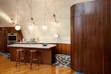
Before: Such a utilitarian kitchen wouldn’t work for the owners of this Portland, Oregon Tudor, so they worked with interior designer Andee Hess of Osmose Design on a makeover. Hess drew on a diverse assortment of influences for the redesign, which included boat casework, Greek caves, and the American studio craft movement.

After: Hess wrapped the kitchen in curving, white oak cabinetry with rounded integrated hardware, topped with handmade Fireclay tile from California, a move that was inspired by the American studio craft movement. The sweeping plaster form of the hood vent echoes the Tudor architecture. Local wood sculptor Vince Skelly creates a wood sculpture to complement the butcher-block island.
![After: When Hess learned that Charlie and Todd had spent a few years living on a boat, she decided to take cues from nautical casework for the cabinet design. "[It] has to be so considered and exacting and very utilitarian," says Hess of boatbuilding tradition. A silver travertine border and toe kick define the base of the kitchen cabinetry.](https://images2.dwell.com/photos/6272473203005894656/6715097695393021952/original.jpg?auto=format&q=35&w=160)
After: When Hess learned that Charlie and Todd had spent a few years living on a boat, she decided to take cues from nautical casework for the cabinet design. "[It] has to be so considered and exacting and very utilitarian," says Hess of boatbuilding tradition. A silver travertine border and toe kick define the base of the kitchen cabinetry.
Published
Get the Renovations Newsletter
From warehouse conversions to rehabbed midcentury gems, to expert advice and budget breakdowns, the renovation newsletter serves up the inspiration you need to tackle your next project.