Who Said Colorful Bathrooms Are Kitsch?
If you walked into a bathroom and saw a green sink, what would be your first reaction? For some, it might evoke the nostalgia of a 1970s sitcom set, but with the right approach, a green sink can feel decidedly modern and moody. Like any bold design choice, it’s all about balance and context—a principle that applies to all areas of home decor, from colorful couches to beige interiors.
So, whose ideas were colored fixtures anyway? In the 1920s, technology led homeowners away from all-white options, which gave rise to to the sort of colorful bathrooms you might find in a ’20s-era Los Angeles apartment. Midcentury bathrooms featured colorful tile (and the fixtures to match), and the trend surged in popularity during the ’80s. Today, however, colored fixtures have shed their retro stigma and are finding their place in contemporary design, with more and more homeowners leaning toward anything but white or neutrals to liven up functional spaces.
For advice on how to successfully transform your bathroom into a colorful haven that doesn’t skew too retro, we asked Jessica Maros of Maros Designs and Courtnay Elias of Creative Tonic Design for some advice.
What colors to choose?
Elias, who featured an Aspen Green Kohler sink in Dallas’ Kips Bay Decorator Show House, asks a simple yet provocative question: "Who said toilets have to be white? And who said sinks have to be stainless steel?"
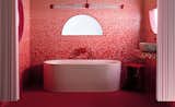
A blue sink set into a tiled wall of the same color is an accent that’s quiet but still impactful.
Elias’s love for color stems from her ’80s upbringing, an era marked by the bold color choices of Memphis design. But she cautions against going too over the top. "There’s such a fine line between what’s classic and what feels ‘out there,’" she says. She recommends sticking to tones that mimic nature—like brown sinks paired with brown marble or black toilets for a more formal look. The aforementioned neutral tones appear earthy and unique, while still maintaining elegance than some of the more in-your-face hues like yellows or bright reds.
"I generally avoid red fixtures in bathrooms because red pairs best with glossy white finishes, which can feel too stark for a bathroom," says Maros. "Bathrooms benefit more from warmer tones that evoke comfort and relaxation, making red a challenging choice to coordinate effectively."
Among her own favorite color combinations: "A walnut wood vanity paired with a cobalt blue faucet creates a striking look," she says. "The rich, dark tones of walnut provide a beautiful contrast that allows the cobalt blue to pop. Plum or mahogany fixtures paired with limestone or concrete walls in a matching tone offer a monochromatic, moody aesthetic."
How to start
When designing a bathroom, Elias advises looking at the surrounding elements first. "What’s attached to the room? That dictates where you go with the fixtures," she explains. Consider the wallpaper, tiles, or other dominant features. Then ask yourself: "Where can I have a pop? Where can I have fun?"
Like Elias, Maros emphasizes the importance of simplicity in the surrounding space: "Prioritize clean lines and smooth surfaces to ensure the fixture remains the focal point," she says." Avoid multicolored tiling or overly complex patterns that compete with the fixture. Incorporate a single wood element or large-format tiles to complement the color while maintaining simplicity."
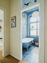
A cast-iron tub gets a coat of blue that matches the ceiling and the floors, making for a calming environment that’s still colorful.
Colored fixtures can easily veer into kitsch if overdone, Elias warns. "There’s a fine line between integrating color and making it look homogenous." In a commercial project, such as the SheSpace coworking space in Houston, she used three Jaclo faucets in different colors for a playful yet polished effect. For residential spaces, however, she suggests a more measured approach. "Bright fixtures might work well in a kids’ bathroom or a pool house, but in a principal bathroom or kitchen, it’s better to stick with muted tones that feel timeless."
Elias shares some favorite colors for fixtures: emerald green for bars, Aspen green for baths and kitchens, and earthy browns paired with natural stone. "Companies like Kast are also leading the way with concrete sinks in muted shades that balance modernity and tradition," she says. "These colors look more classic and less industrial than stainless steel," Elias adds, noting that they often evoke a "British traditional vibe."
What not to do
For a basic roundup of do’s and don’ts, Maros seconds the suggestion to start small with faucets or vanities to test your comfort level. She also recommends avoiding going too bright on fixtures in spaces that are meant to feel zen and relaxing, like a principal bathroom. Ensure that your color of choice doesn’t overwhelm the space. "Don’t overdo it," she says. "Remember that color should accent, not overwhelm."
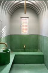
This concrete sink and matching tub, in a fetching shade of almost-Victorian green, creates harmony and adds personality to this space.
Ultimately, think of choosing colored fixtures as a way of embracing individuality and infusing predominantly functional personal spaces with personality and warmth. And even if you make a choice that you end up hating, there’s still hope.
"Balance it by introducing materials like wood, chrome, or concrete in the surrounding elements," says Maros. "These can help tone down the color and create a more cohesive design. By framing the fixture with a material you love, you may find yourself appreciating the overall space."
Related Reading:
Published
Topics
Interior DesignGet the Pro Newsletter
What’s new in the design world? Stay up to date with our essential dispatches for design professionals.