Search “qa-with-established-sons-sebastian-wrong.html”
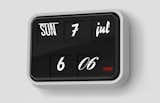
Sebastian Wrong's font clock for Established & Sons symbolizes to a tee the era of design since 2000. We're living in an internet age in which typography has become a part of pop culture no longer relevated to kerning-happy designers. The Font Clock isn't terribly expensive, and it's quirky yet massively appealing.