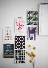
Instead of splurging on expensive framed art, Susanna tapes postcards and images cut from magazines to the wall. They're bright, colorful, and easy to swap out as she likes. Read more about this compact Finnish household here.

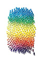
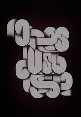
Endless colorful tubular type, part of a "growing collection of projects and experiments centered around typographic illustration."
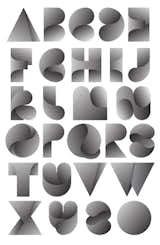
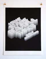
Alphabet and poster design, with wording form the Bowerbirds song 'Bright Future'.
A closer look at the typography.
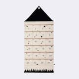
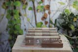
House Christmas Calendar
This modern yet magical countdown calendar allows you the fun of celebrating the anticipation of Christmas in a stylish way. No cardboard and cheap chocolate here folks.
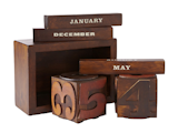
Jonas R. Stokke and Øystein Austad, who work in Oslo, Norway, under the name StokkeAustad, created this Dayboard calendar in order to give people more freedom to arrange the year as they see fit. Each individual date is affixed to the steel base with magnets, allowing users to move the days around.
Typography is an oft-forgotten but effective tool in facilitating creativity and inspiration. Whether the purpose is to enhance a written message with the right font or be used as a message itself, typography has a firm place in modern design. See more typography by clicking here.
Twelve letters get objectified.

The holiday ornaments from font foundry House Industries are defined by their graphic composition. Crafted from anodized aluminum, each ornament in this limited edition series celebrates a treasured typographic symbol, including ampersands, arrows, and the letter X. These ornaments make treasured keepsakes that can be used year after year.
Available in Arrow, Koi Fish, Double-Dagger, Pen Nib, and X models.
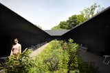
2011: Peter Zumthor
Wrapped in stark, black wood, Swiss architect Peter Zumthor’s Serpentine scheme presented a frame for Piet Oudolf’s lush garden, a use of color and space that manages to create a secret garden in an already outdoor space.
Photograph © 2011 Walter Herfst
StokkeAustad’s Dayboard offers a uniquely personal approach to time-keeping.
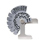
The Timor Perpetual Desk Calendar was designed in 1967 by Enzo Mari, and has remained in production by Danese Milano since its launch. The cleverly designed calendar is designed for tabletop or desk placement, and includes rotating cards that include the date, month, and day of the week.

For their 2012 'Best of Boston' issue, Boston Magazine commissioned the designer to create a toolkit, which included various sub-section headers, opening DPS, and lock-up for the table of contents.

Where does it begin and where does it end?
ISAM with Amon Tobin (2011)
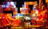
V-Squared Labs and Leviathan created this cutting-edge concert setup, which surrounds the Brazilian-born producer and DJ with real-time projection mapping and generative imagery.
Image courtesy of Calder Wilson
Hundreds attended the kick-off party at New Center Park for the inaugural Detroit Design Festival in 2011. Photo by Noah Stephens.

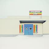
Details, details.
The back of one of the four photography promos sent to us by Toby Burditt
An experimental type design with wording from Bright Eyes' song 'No Lies, Just Love.'
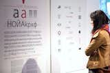
'New Bulgarian Typography' at Vivacom Art Hall highlighted the work of designers Ilya Gruev, Philip Popoff, prominent members of the Art Directors Club of Bulgaria, as well as new typefaces from TypeDept and Ivan Hristov. Photo courtesy of Sofia Design Week.
Composed of walnut, ramin, beech, and maple, this slim Danese Milano Bilanca Perpetual Calendar was designed by Enzo Mari in 1959. Like any good small living accessory, it does double duty: from afar, it looks like an abstract work of art.
Their products, like the calendar seen here, are mostly available in Argentine musuem shops and select stores, though they plan to expand to online sales in February.
Woodblock calendar that Eiland helped create for Fossil, based on vintage woodtype.

Poketo’s Stick-Up Weekly Calendar is both a sticky pad and calendar, in one slim pad. The pad includes seven sections, each for a day of the week and each section includes lines for writing as well as small boxes for checking off completed tasks.
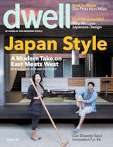
In Japan Style we explore the proliferation of Japanese design and how it's been folded into the story of modernism. Our cover story is actually in San Diego, and we hit a Japanese-inspired home in Edinburgh, Scotland too. Photo by: Daniel Hennessy
Untitled. From series "Funktionsorte," 2011.
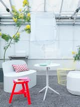
Inspiration for the new season, Garden Furniture 2011, shot by Petra Bindel for Elle Interior.
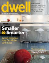
In our 2011 small spaces issue we checked out the home of a pair of design-savvy Portlanders. And in the cover story we check out a small New York spot remade with 36 commercial doors. Photo by: Nicholas Calcott
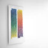
A limited edition Giclée print based on a quote by graphic designer and filmmaker Saul Bass-"I want to make beautiful things, even if nobody cares." The typography was created using just Illustrator and Photoshop.
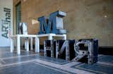
The 'New Bulgarian Typography' exhibition at Vivacom Art Hall featured twenty artists from different generations who employ traditional Cyrillic fonts and schooled methods as well as youthful experimentation with calligraphy and bold contemporary typefaces. Photo courtesy of Sofia Design Week.
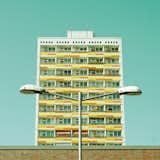
Untitled. From series "Studie Eins," 2011.
Untitled. From series "Snow Blind," 2011.

Untitled. From series "Studie Eins," 2011.
2011, Studio Cerri & Associatti / Pierluigi Cerri and Allessandro Colombo.
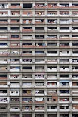
Iwan Baan: Torre David #1 (2011)
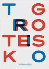
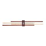
Trio Grotesk's typeface release.
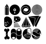
1,670 more photos