Matthew Carter's New Typeface
1 of 7
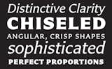
Good things come from failure. Try as he might, after not being able to craft a sans-serif version out of his classic typeface ITC Charter, as originally requested by Allan Halley, director of words and letters at Monotype Imaging, Carter presented an alternative option. It was a typeface that he had entered–and lost–in a competition. He diligently refined and reworked it and, to his relief, Halley was interested. After several years, the final result is Carter Sans – a design inspired by the late Berthold Wolpe’s typeface, Albertus, boldly characterized by uniquely chiseled letterforms, as if carved from stone. Image courtesy Monotype Imaging.