House on Tanguile Street
Project Information
Project Name: House at Tanguile Street
Completion Year: January 2018
Lot Area: 180 square meters
Gross Built Area:
Project Location: Quezon city
Project Credits
Architecture Firm: Dito Architects & Interiors
Firm Address: unit 3710, Congressional Town Center, Congressional ave. QC
Website: infoditoph.wixsite.com/dit...
Contact email: info.ditoph@gmail.com
Lead Architect: Oliver Jundy Caldito
Design Team:
Gian Gratil
Clients (Optional): Atty Jun and Rose Gonzalez
Engineering:
Structural Engr: Renato Dragon
Electrical Engr: Brahma/Allan Timbreza
Master Plumber: Rommel O. Aldaba
Contractor: RMD Construct/ Sky 77
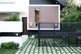
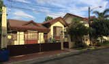
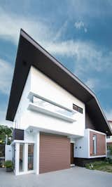
The site of the house is Located in 180 square meter lot with 30% slope at a gated community in Quezon City, Philippines, a modern house that looked like a stack of white, charcoal gray, and wooden boxes capped of with a gambrel roof. The exterior white walls of the house created a starck contrast with the dark colored paint & wooden walls. The roof fascia and the eaves were in the shade of charcoal gray almost black. The mix of vertical in the form of walls, columns and windows had been balanced of with the horizontal elements of the wood cladding and the carefully placed horizontal slit windows. The main door, visible from the road, made of horizontal panels, with a solid vertical panel on the opening side accentuated simply by a long black vertical handle free of the usual knob or levers, is consistent to the overall façade of the house. The combination of pure cubic forms and horizontal and vertical elements in a minimalist approach, typical of dito’s designs, is very evident in this project.
On every Dito’s project, function, form, aesthetics, ambiance, sustainability is always the major consideration but this one, we had to be very careful with the cost.
Considered by Dito as one of their interesting projects. The client has given the space requirements that is almost impossible to achieve from a lot with a existing structure. Add to that the prescribed budget and the 6 month timeline for the design and construction. On the other hand, dito has considered this project a way to show their design skills as the client has awarded them somehow a sense of freedom, this was from the clients words “Bahala ka na ” in Filipino or "you do it your way" after giving their project brief. A trust that was given by a mere office walk-in client.
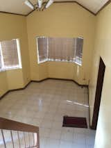
For renovations, dito always make the first site visit on the afternoons to get a feel house internal climate, as afternoons are much warmer than mornings. The house had a west facing facade and the harsh sunset is penetrating the interior spaces. Immediately at that point, we knew that comfortable temperature has to be addressed. The clients reiterated that they are not able to use the living room as it was too hot and very uncomfortable to entertain guest. They had to close the frosted bay window to block the sunlight, therefore also blocking off natural ventilation making the situation worse. It was the same situation with the AV room. The old living room had a modest size, and the traditional trapezoidal bay windows were not helping. The living room was enclosed on all sides, a door on the east leads to a 10 step stair to the kitchen, realizing that the house was on a sloping lot, a good natural site feature that had to be taken advantage of. A combined kitchen and dining area with small windows made it even more claustrophobic. There were two more rooms in the same floor, the helpers room and their sons’ bedroom with small windows that were too gloomy, and its only view is party wall. Back in the living room, there is a half level staircase that eats up by the area by 1 square meter, this leads up to two more rooms, the AV room, w/c was uncomfortably given that it was also facing west and across the hallway the masters bedroom with its own bathroom.
The brief had posed many challenges, to redesigning the house and make the interior spaces bigger, fit 3 SUVs and have space for a garden in a relatively modest lot. The project was to be finished in five months, and last but top of the list was how to fit the budget given and still end up with a beautiful space without sacrificing quality. Stepping back from the design was not an option, the house needed a total transformation and with all the considerations, made to project more exciting.
With a very short timeline, the design had to be done in two weeks, blue printed for building permit and construction and the detailing to be finished two weeks after. Designing the structure was a challenge, working around the existing columns, as some of them would pop in the middle of a space.The process of bidding out was skipped and awarded to a trusted contractor. The preferred structure to support the new floor was steel as it can be delivered and welded on site and would not need the 28 days curing period of reinforced concrete. The wood flooring for the 2nd floor must be prefinished and takes only days to install.
To save on cost, Minimizing the addition of new walls on the existing floors, opting to preserve most, and the rest that was to be demolished will serve as doors or windows to open up the space. 100 percent of the existing structure was preserved, this immediately amounted to 30 to 40% savings as compared to building a new one. The old reinforced concrete columns and half of the existing roof beams were retrofitted with steel wide flanges to support the new bedrooms at the second floor. The other half of the existing roof beam was to be preserved to carry the high pitch side of the new roof, this covers the old rooms and the new stairs, and the roof would bend to 7-degree slope that would cover the new 2nd floor bedroom. By connecting the rafters from the new roof beam to the old roof beam, saved half of the roof framing cost, this design approach ended on a gambrel shaped roof, dictated not merely for aesthetics but also for practicality. The roof was fitted with solar water heater for the bathroom and even for food preparation w/c helps to cook faster using less energy, the cost of which is only equivalent to 4 electric water heater.
Since the house was on its limits in terms of easement and with the condition that 3 SUVs should fit, pushing the walls outward was the least option to grant the clients wish of having a bigger interior space. Resorting to creative spaces to maximize every square centimeter was the solution.
The gate has been resized to easily accommodate 2 cars, now made of expanded mesh, an inexpensive material but sturdy enough to give a sense of security while the transparency a sense of openness. The fence also made of expanded mesh as using a single material to exude that minimalist appeal. The sturdiness of the material gives it a sense of security. Cut in square and rectangles randomly put together and a horizontal metal flat sheet panel breaks the pattern and lines up to the concrete fence wall in polished black giving it sense of continuity and was used to house the carefully positioned door bell and house number. Credit has to be given the design of the gate as it was not merely randomized pattern to make it look interesting, taken into consideration was the available market size, to cut and divide it with the least wastage to meet the projects cost requirements. The rectilinear form is softened by landscape done in minimalist approach, a simple line of bamboo, fern and sephrela. The lawn is covered in frog grass and to be protected by square pavers as it alternates as the third parking. A look that is a total shift from the old, that may be mistaken for completely new house.
Aside from study of spatial organization to come up with a effective floorplan, the Architect studies the way one would journey to reach a specific space, these travel lines creates view axis and focal points, all of which must be connected, by doing this, each direction or line must end to a point of interest, either by vast space, a sculpture or artwork, a tree or landscape or the center of determined space.
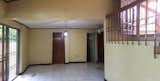
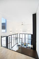
This journey starts upon opening the main door, there is now an immediate feel of well lighted open space, already an achievement from a plot of this size. Gone are the walls that separates it from the old kitchen and now overlooks the dining area. The feel of the old house was completely eradicated. The interior is now in white with the steel structures popping out in dark charcoal gray in contrast. The ubiquitous columns, new and old were used as Architectural features instead of hiding them. A column in the living room was replicated into a series of three asymmetrical colonnades, with full clear glass sandwiched in between, creating a series of vertical slit windows.
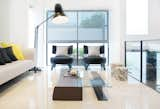
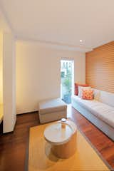
An heirloom painting greets you, a classic work that managed to perfectly blend with the modern interior. As you face the living room on the left, following the natural flow of interior traffic, one is positioned at the center of the living room, a mere 2 square meter bigger than it was before but now feels twice as big. The old trapezoidal bay window was squared off and now walled to block direct sunlight and made a drastic change in temperature that there is not even a need to use air-conditioning. A slit horizontal window broke the usual connection between walls and ceiling that made the upper mass of the house as if it was simply floating above it. The squaring of the bay window was a tricky way of maximizing every square centimeter and now what would become a sofa niche that allowed the fit of a 2.4 meter long sofa, a size even bigger living rooms would find quite challenging to fit. A wall to wall mirror was fitted to this niche doubling the feel of the space, a cliché that never fails to work. The North facing bay window was also squared off and was also replaced with a full height glass window that allows the northern ambient light in and blurrs the boundaries of interior from the exterior. A unique coffee table is composed of raw cut wood that the client wished for was paired with a steel I-beam, a left over from the houses new structure was not put to waste, sits in the middle of the living area and acts as a conversation piece, ties down the design by matching with the houses exposed steel structure
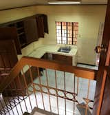
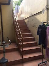
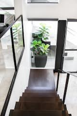
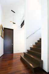
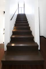
The Old stair leading to it was retained but now with more minimalist appeal. The balustrade were replaced with clear glass framed with welded flat bar railings, The simplicity of it maybe decieving in terms if construction but it was carefully detailed to hide all mounting points, a signature Dito style, the clean look approach. The tiled tread was replaced with rescued wood, made to look like it was simply laid down, cut 50 millimeters shorter than the stair concrete base, a simple but interesting detail, to achieve a sharp termination between different materials. Taking the stairs down, ones line of vision is directed to the perpendicular window framing a Euka tree, an evidence of where the architects principle is applied, where the journey from one space to another is not to merely to move around but a continous visual treat from every directional axis.
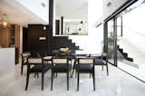
The new dining area now replaces the former kitchen, there was no longer the need for the walls where the old kitchen cabinets and cupbaords were mounted. Two sides of the walls were completely tore down to give way for continuous sliding glass doors, this opens up to the easements and now forms an L-shaped Lanai that embrace the dining area on two sides. The floors in texture but with the same tone and color, that when the glass doors are opened, there is an almost spatial continuity, the lanai becomes an extension of the dining area.
The dining area now replaces the former kitchen and is now designed to be more open. The old roof was taken out to give way for the new floor above resulting to a double volume space. The upper volume was walled up blocking the eastern sun, the lower with continuous large panel of sliding glass opens up to the easements and forms an L-shaped Lanai that embrace the dining area on two sides and gives the al fresco feel. The large sliding glass allows the flow of natural of air. The combination of these approaches resulted in a two tone of white and glass cubic space. The interior floors were finished in polished cross cut look travertine tile, the Lanai with floors in rough texture but with the same tone and color that when the glass doors are slid open, there is an almost spatial continuity, the lanai becomes an extension of the dining area. The interchange of two spaces meant the the double volume space is enjoyed by the dining, and the relatively low ceiling space below the old structure is where the service area starts, the main kitchen.
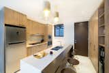
The former maids room was cleared out to give way for the new kitchen making the plan more linear reminiscent of miesian style. The double galley layout was to maximize every available space, The deeper side to house all the built in appliance, and the shallow side as pantry for easy reach. An elongated island counter also serves as breakfast nook or a dining extension when there’s extra guests. On the southern side of the kitchen is the laundry area that is visually tucked away and can be used at any occasion.
Back to the living room, The existing short flight stair was pushed outward to open up more space resulted in taking structural measures, a measly gain, but for the available space, every square meter counts. This leads to the half level upper ground floor, a wall intentionally lined up to the width of stair, where another artwork was to be mounted, another point of vista. On the right is now a bigger AV room. The side wall of the room had to be pushed out to become an inside lot firewall to increase the floor area that left another column in the middle, the new space in between was fitted with an floating effect entertainment console lining up to glass slit window all the way to the back of the column. This column was mounted with a T5 lamp that produces an indirect light and now acts like a fixed floor lamp. The front wall was cantilevered lining up to the old bay window, viewed from the outside, its like a box resting over another box, painted in black to emphasize the cantilever further
Across the hallway is now taken up by a small guest bedroom and a new single flight stairs that leads to the 2nd floor. Complimenting the stairs is a simple steel flat bar mounted to one side of the stairwell, painted in matt black that serves as the handrails and step lights that gives a soft glow just enough to light your path. The stairs ends and extends to become a hallway, and the lines continuous as window then ends as the ceiling, all in a singular width, having all four elements all in the same dimension gave it a sense of continuity.
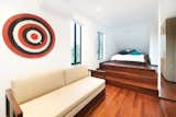
Since the existing house was designed in a series of multi half levels, it was deemeed practical that the additional floors be built with the same approach, the result was a protruding roof beam at the second floor. This must not be removed to ensure the structural entegrity of the house. Three steps were added to run across, the elevated level was used as a bed platform for the son’s bed and mirroring that across the hall, a small walk in closet for the masters bedroom, maximizing every space usable. The three step stairs to reach the closet level is perpendicular to a fixed window again with the same width, the style is consistent to the Architects design ethos of having continuous lines, design elements lining up to each other. The large fixed window is overlooking the stair landing below is an added architectural feature, not common to walk in closets as most would prefer privacy, this we achieved by installing roller black outs.
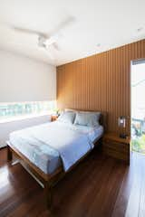
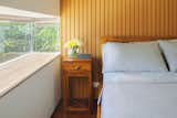
The brief for the Master bedroom was simple, to provide a hotel like space with its own bathroom. To deal with the sunset light of the west facing room, a cantilevered horizontal slit window was built, this reduce the direct sunlight coming into the room and served as a long built-in console, An additional useful furniture without taking the much needed space in the room. The cantilevered window, jutting out of the exterior wall, is made of frameless glass on three sides, or the aquarium as the owners wanted to call it, has an extra panoramic view of the front lawn and road. It has given this room a non-conventional look and that minimalist appeal. The remaining space were left with the basic essentials to put it, a queen size bed with side tables, a wardrobe cabinet that was full height to maximize storage space, and a small entertainment console. The composite wood panel cladding that accentuates as a headboard wall compliments the client’s existing bed.
By the size of plot and floor area, the house would fall under the compact house category and yet, even with a very controlled budget, all the clients’ wishes were granted, more rooms, bigger and aesthetically pleasing spaces. Instead of the targeted 5 month, the house was finished in 8 months due to unexpected drawbacks but as we quoted the clients’ “the wait was totally worth”
9 more saves