Q&A with Sebastian Wrong
Sebastian mentioned that the last time he was in our fair city by the bay was 15 years ago, on an epic cross-country road trip. Whereas that adventure ended when all of his belongings were robbed from the rental car, he’s left behind quite a different collection of goods this time, proudly displayed on the showroom floor; He told me a little more about each of the pieces as we took a walk around.
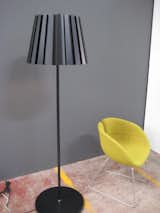
Tank Light by Alex Taylor
SW: "It’s sleek, and references the classic lampshade which would be in fabric or paper. Because it’s metal, though, it’s very controlled."
How did a piece like this make it from concept to reality?
SW: "We were working with Alex because he did the Fold light with us for our first collection five years ago. He made a prototype, maybe four years ago, that was cruder, and we basically took it on, refined it, and industrialized and transformed it from an artisan production into a more commercially viable, price-sensitive product. There’s this idea of reverse engineering, where you start from this idea point, and then you have to figure out how to make it reproducible, and how to make it consistent with high quality standards."
So what’s the difference between this piece and something from the limited edition collection?
SW: "People always say to me, oh, the difference is that it’s ‘design-art.’ Well, design-art is an awful saying; I hate it. It’s not art, it’s still design. The difference is that limited edition pieces are intensely crafted, or made using very expensive materials. You have to start understanding the economy, and the different processes involved to create the product. That’s the difference, purely, between limited edition and open production. Limited edition is not a kind of industrialized process, in its nature. The price of which is always going to be higher. It’s as simple as that really."
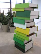
Stack by Shay Alkalay
I had seen a lot of images of this, and could never quite figure out how it worked. It’s pretty remarkable, in scale and function. There's a steel brace that runs parallel down the middle of each side, and then the drawers just slide on fixed runners; They really do just pull out very easily from side to side.
SW: "This was a challenge because it hadn’t been done before. It’s not an easy thing. It’s big, it’s heavy, it’s expensive, it’s complicated, and there were definite risks involved in taking this on. It’s a pain of a product, and quite a few other companies wouldn’t want that hassle factor. We’re not scared away by that."
Do you feel like taking risks like that will be compromised an economy where companies (and consumers) are increasingly unable to afford them?
SW: "Well, I think you can say, actually, I’ve had enough of ‘affordable design,’ which often translates into cheap consumer products that have a short lifespan, the type that you’ll just be prepared to chuck away after you’re sick and bored of them. In that case, you’d rather invest five times the amount of money into something which is going to be there for a long time, and you’ll actually give to your kids, and you’ll feel passionate about, so you have something that lasts, and means something."
It’s a view reflected by many designers these days. People are looking for more from their purchases, and wanton buyer-lust has given way to an expectation, almost prerequisite, that these pieces will be sustainable on a functional, as well as personal, level.
SW: "Society and culture has got to change, really. This sort of disposable attitude about things being just for show, just for the look, and then underneath it’s just a load of garbage that’s going to fall apart and become more landfill. You can look at it either way, and say, there’s an enormous amount of work that goes into this to make it and produce it and that’s reflected in the price."
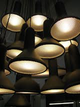
Torch Lights by Sylvain Willenz
These look heavy, but are actually very light to the touch.
SW: "The dip-molded rubber gives these lights a particular texture that is very important. This texture on this material is more expensive, but it doesn’t give you the look, and it’s more important not to compromise on elements that are key to the design."
Designer Sebastian Wrong on affordable design:
“Well, I think you can say, actually, I’ve had enough of ‘affordable design,’ which often translates into cheap consumer products that have a short lifespan, the type that you’ll just be prepared to chuck away after you’re sick and bored of them. In that case, you’d rather invest five times the amount of money into something which is going to be there for a long time, and you’ll actually give to your kids, and you’ll feel passionate about, so you have something that lasts, and means something.
It’s a view reflected by many designers these days. People are looking for more from their purchases, and wanton buyer-lust has given way to an expectation, almost prerequisite, that these pieces will be sustainable on a functional, as well as personal, level.
Society and culture has got to change, really. This sort of disposable attitude about things being just for show, just for the look, and then underneath it’s just a load of garbage that’s going to fall apart and become more landfill. You can look at it either way, and say, there’s an enormous amount of work that goes into this to make it and produce it and that’s reflected in the price.”
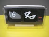
Font Clock (small) by Sebastian Wrong
SW: "I love typography; It’s such a fascinating, complicated art form. I ‘m really interested in how fonts originated, and what they represent to people. There’s certain nostalgic references there, and some curiosity or interest in the font that comes about because you’re remembering something that’s associated with a certain time or a place. So the question for me was, how can I evoke that? How can these different fonts sit together, work together, and not clash? There are twelve fonts on the small clock, 11 of them are twentieth century and one gothic one. "
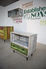
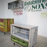
WrongWoods by Sebastian Wrong and Richard Woods
These were a collaboration with Richard Woods, block printed in five different variations. They look amazing in real life; I wanted to take one home with me.
Do you have a favorite?
SW: "I do like the orange, and I actually like the little bedside table."
What do you feel defines Established & Sons as a brand, and you as a designer?
SW "My work is quite referential. I’m almost like a magpie, picking up on bits and maybe twisting them, and doing something with them, just a slight sort of pollution, or invasion of something to make you look at the familiar very differently. A common characteristic runs through the entire collection from Established & Sons. Our pieces are very statement-like, but they’re quite understated as well, refined, and strong. They’re not decorative, and here’s there’s a certain structural formality that runs through. It’s modernism, you know. It’s Modernism with a twist."
DZINE is the only northern California stockist for Established & Sons furniture and lighting, so if you’re in the Bay Area I’d absolutely recommend a trip over to see the pieces in person. E&S will also be launching 14 new products later this month in Milan, so stay tuned to dwell.com for the latest from the greatest in modern British design, and keep an eye out for an exclusive interview with Sebastian in an upcoming issue of Dwell.
(photo credit: top image by Nikki Ritcher)
Published
Last Updated
Get the Dwell Newsletter
Be the first to see our latest home tours, design news, and more.