Collection by Miyoko Ohtake

The Making of Dwell with Chris Gardner

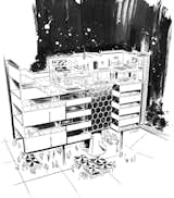
To open our September 2009 apartment-themed issued, we dreamed up Dwell’s ideal apartment. Not content to play mere decorator, we tried on the role of developer and enlisted architect Craig Steely to design our multiunit abode and illustrator Chris Gardner to put the proposal on paper and give the concept some color.

Gardner is a master of illustration and one of the top talents at House Industries. A lifelong East Coaster born in Pennsylvania and now living in Delaware, Gardner got his start in the industry he dreamed of being a part of throughout his entire childhood: comic book illustration. After several years of 18- to 20-hour-long days, he found a home at House. Here, we give you an insight into Gardner’s career, inspirations, and aspirations as well as a behind-the-scenes look at the making of his “Apartment Fancy” illustration.
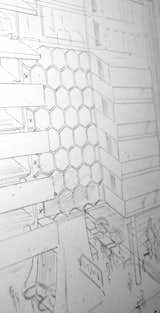
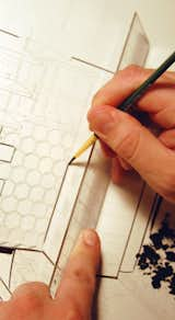
“I always have a big pad of standard tracing paper and do all of my sketches with pencil on paper,” Gardner says. “It’s handy for when someone needs you to change a section of the drawing. Then I just tear off another sheet, lay it on top of the old one, and make the adjustments.”
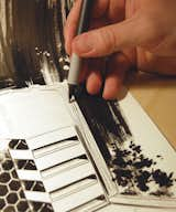
“After I work everything out on tracing paper, I go to the ink,” Gardner says. “I use a Hammermill illustration board. A lot of people use Bristol, but it’s a little too smooth of a surface for me. The ink is black acrylic-based ink, and I use a variety of brushes.”
“Ninety-five percent of everything I do is done with a brush,” Gardner says. “But sometimes little details call for a pen. I use whatever can accomplish the task.”
“When I do the final inking, I have a general idea of the color scheme,” Gardner says. “Sometimes I throw a little rough color on the sketch. Usually I scan the sketch, drop in some color, and send that to the art director to see if they’re into it.”
“To do the color, I separate the sections from the whole,” Gardner says. “I ink the section in black, scan it into the computer, make a bitmap, then add color in Adobe Illustrator. Each part is a separate layer that I can move forward or backward. It makes it easy to change the colors.”
“This illustration took me about seven nights’ worth of work to complete,” Gardner says. “It takes me about twice as long to do it with ink than if I did it digitally with a pen tool, but if I did it digitally, it wouldn’t have the same feel. People ask how I get my edges to look like they do, what Photoshop filter I used. I’m always happy when those questions come along, because I can say, ‘This was drawn with a brush and ink in a traditional fashion.’ You can’t get that digitally.”
“The color scheme I imagined was orange, pink, and magenta, really bright and colorful,” Gardner says. “We toned it back to better convey the message. I’m really happy with the final product.”