
Credits
From StudioAC
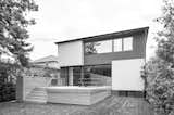
This renovation and addition to a mid-century north Toronto home was designed to toy with the idea of contrast. Both on the interior and exterior elements of contrasting hue are used to create visual interest, depth while also helping to define specific program elements.
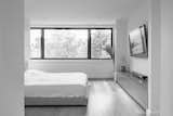
On the exterior light colored projecting forms ironically represent the interior programs that are more closed off. The black surfaces present the more open spaces like living room, kitchens and bedrooms which seamlessly allow for windows while maintaining the articulation.
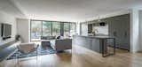
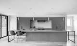
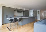
This theme is furthered on the interior with the kitchen design where a 17' long island acts as the central element in the space. Its use transitions along its length from a cooking surface, bar area to a duel sided table surface.