Collection by Diana Budds

How New York City Developed its Wayfinding Signage

Our City Living issue, due out on newsstands September 10, focuses on design and architecture in urban locales. Here we turn our eye to the challenges of navigating a city and how graphic design can improve the experience, especially when it comes to walkability. As more cities seek to encourage multi-modal transportation—walking, biking, public transit, etc.—the need for good signage to make those activities easier becomes more and more apparent. At its simplest, wayfinding is defined as spatial problem solving—knowing where you are, where you want to go, and the best route to get there. Cartography, or mapmaking, has existed for thousands of years, tracing its roots to cave paintings, but the demands of modern cities and diverse populations call for more than a sign emblazoned with compass rose and a few street names. Today, effective urban maps require layers of information relayed in a clear, consistent, and concise manner so that anyone can quickly assess how to get from point A to point B.

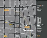
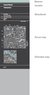
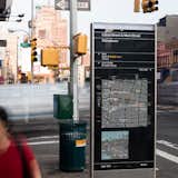
The New York Department of Transportation launched its WalkNYC program in the summer of 2013 to "provide a clear visual language and graphic standards that can be universally understood, encourage walking and transit usage by offering quality multi-modal information, and provide consistent information across a broad range of environments in the city." Lauded design firm Pentagram's PentaCityGroup developed the identity. We sent a few queries to Michael Bierut, a graphic designer and partner at the firm, to lean more about the program, what it means for the city's identity, and how technology does and doesn't factor into the program. "I feel strongly that one of the best things about the signs are that you don't need a smart phone to access them: they're right there on the street, as democratic as can be," he says. Read on for more.
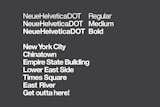
Dwell: Can you tell us about some of the components of the signs? How did you pick the landmarks to feature? What was the editing process like in terms of deciding what information to relay and what to skip? 

Bierut: We had a "more is more" attitude about the signs. As opposed to a reductive diagram meant to be taken in at a glance, we wanted the maps to be comprehensive: people need to feel reassured that if they're looking for something, they'll find it on he map.

Of course, there is always editing. We picked landmarks from a list of the obvious suspects—destinations that people might be looking for—but we also added some more obscure buildings that may not be well known, but that function as wayfinding aids. As the senior designer on the project here at Pentagram, Hamish Smyth, has pointed out, most people, even New Yorkers, don't know what the Newtown Creek Digester Eggs Sewage Treatment Plant is. It's not on many tourist must see lists. But these big shiny egg-shaped orbs—a beautiful design by Ennead Architects—are visual landmarks in Brooklyn.
Dwell: Can you tell us about some of the components of the signs? How did you pick the landmarks to feature? What was the editing process like in terms of deciding what information to relay and what to skip? Bierut: We had a "more is more" attitude about the signs. As opposed to a reductive diagram meant to be taken in at a glance, we wanted the maps to be comprehensive: people need to feel reassured that if they're looking for something, they'll find it on he map. Of course, there is always editing. We picked landmarks from a list of the obvious suspects—destinations that people might be looking for—but we also added some more obscure buildings that may not be well known, but that function as wayfinding aids. As the senior designer on the project here at Pentagram, Hamish Smyth, has pointed out, most people, even New Yorkers, don't know what the Newtown Creek Digester Eggs Sewage Treatment Plant is. It's not on many tourist must see lists. But these big shiny egg-shaped orbs—a beautiful design by Ennead Architects—are visual landmarks in Brooklyn.
Dwell: How many icons did you design for the map? How did you adapt the standard AIGA Symbol Signs for this project? 

Bierut: There are about two dozen icons on the map overall. All of them were redrawn from scratch. We started with the symbols that Cook & Shanosky design for the AIGA back in the '70s and adjusted their weights so they fit better with the weight of the customized Helvetica font we used. With so much information packed in such a limited area, it was important keep the dissonance between the visual elements on the sign as low as possible.
Dwell: How many icons did you design for the map? How did you adapt the standard AIGA Symbol Signs for this project? Bierut: There are about two dozen icons on the map overall. All of them were redrawn from scratch. We started with the symbols that Cook & Shanosky design for the AIGA back in the '70s and adjusted their weights so they fit better with the weight of the customized Helvetica font we used. With so much information packed in such a limited area, it was important keep the dissonance between the visual elements on the sign as low as possible.
Bierut (continued): We created some new icons and modified others, for instance changing a generic "gift shop" icon to a shopping bag with Milton Glaser's familiar "I Love New York" logo on it. We also did a bike icon that reflects the unique frame (and bag holder) on the official CitiBike used in the city's bike share program.
Dwell: How have smartphones changed the ways people navigate cities? Did that impact the WalkNYC program?

Bierut: Smartphones, GPS systems, and digital technology in general probably had the most dramatic impact on the WalkNYC program.

Modern GPS has created the expectation that the top of the map you're looking it is the direction you're facing. Our team's wayfinding specialists at CityID did tons of research showing that people found this kind of "heads up" mapping easier to read. At the same time, the cartographers we work with at T-Kartor created a digital system where the data can be rotated into any position and the type and icons all rotate with the map.

This seems like a simple thing but it's really a miracle. When we did the downtown system in the late nineties, we basically had a single overall map with north at the top and we stuck that everywhere and we thought we were doing fine. The mapping systems in WalkNYC are so much more advanced.
Dwell: How have smartphones changed the ways people navigate cities? Did that impact the WalkNYC program? Bierut: Smartphones, GPS systems, and digital technology in general probably had the most dramatic impact on the WalkNYC program. Modern GPS has created the expectation that the top of the map you're looking it is the direction you're facing. Our team's wayfinding specialists at CityID did tons of research showing that people found this kind of "heads up" mapping easier to read. At the same time, the cartographers we work with at T-Kartor created a digital system where the data can be rotated into any position and the type and icons all rotate with the map. This seems like a simple thing but it's really a miracle. When we did the downtown system in the late nineties, we basically had a single overall map with north at the top and we stuck that everywhere and we thought we were doing fine. The mapping systems in WalkNYC are so much more advanced.
Dwell: How did Universal Design factor into WalkNYC?

Bierut: We did a lot of readability tests when we were picking the type sizes and color combinations [the color palette is shown in this slide] to make sure the information was as legible as possible. And I feel strongly that one of the best things about the signs are that you don't need a smart phone to access them: they're right there on the street, as democratic as can be.
Dwell: How did Universal Design factor into WalkNYC? Bierut: We did a lot of readability tests when we were picking the type sizes and color combinations [the color palette is shown in this slide] to make sure the information was as legible as possible. And I feel strongly that one of the best things about the signs are that you don't need a smart phone to access them: they're right there on the street, as democratic as can be.
Dwell: In addition to spatial distances, you've also depicted walking times. Is that standard practice?

Bierut: One of the many goals of the system is to encourage people to walk more. It's healthier, it's better for the environment, and it's good for business. Using walking times isn't standard, but I think it shows people, particularly New Yorkers, that sometimes destinations are closer than they think they are. Walking can be faster than a bus or subway, or—especially in New York traffic—a taxi or a car.
Dwell: In addition to spatial distances, you've also depicted walking times. Is that standard practice? Bierut: One of the many goals of the system is to encourage people to walk more. It's healthier, it's better for the environment, and it's good for business. Using walking times isn't standard, but I think it shows people, particularly New Yorkers, that sometimes destinations are closer than they think they are. Walking can be faster than a bus or subway, or—especially in New York traffic—a taxi or a car.
Dwell: The PentaCityGroup will eventually expand the system to include new print, mobile, and digital media applications. In a way, you've designed a new user interface and experience for New York through the system. How has the cross-over between print and digital impacted the WalkNYC graphic language? What does the language "say" about New York? 

Bierut: In general we tried to make the system seem clean and logical and authoritative. It looks "New York" to people, I think, because of the very intentional visual connections we tried to make to the subway graphics. It's possible to do an information system that has lots of personality: up at Wave Hill park in the Bronx, for instance, we had artist Maira Kalman paint a map that's completely fanciful and perfectly suited to that place. But here we wanted something that almost felt like part of the city's infrastructure. Already the map's been adapted for CitiBike, and we're in conversations to adapt them for the neighborhood maps in subway stations. Eventually it may be that this map is simply "the way New York looks," which would be great.
Dwell: The PentaCityGroup will eventually expand the system to include new print, mobile, and digital media applications. In a way, you've designed a new user interface and experience for New York through the system. How has the cross-over between print and digital impacted the WalkNYC graphic language? What does the language "say" about New York? Bierut: In general we tried to make the system seem clean and logical and authoritative. It looks "New York" to people, I think, because of the very intentional visual connections we tried to make to the subway graphics. It's possible to do an information system that has lots of personality: up at Wave Hill park in the Bronx, for instance, we had artist Maira Kalman paint a map that's completely fanciful and perfectly suited to that place. But here we wanted something that almost felt like part of the city's infrastructure. Already the map's been adapted for CitiBike, and we're in conversations to adapt them for the neighborhood maps in subway stations. Eventually it may be that this map is simply "the way New York looks," which would be great.
Bierut is part of an interdisciplinary team called the PentaCityGroup, which is comprised of the following design firms and organization, all of whom contributed the the look and feel of the signs.

Pentagram (graphic designers): Michael Bierut, partner-in-charge and designer; Tracey Cameron and Hamish Smyth, designers; Jesse Reed, icon designer; Tamara McKenna, project manager.

City ID (lead designers and wayfinding specialists): Mike Rawlinson, Harriet Hand, David Gillam, Sam Coultrip, Rachel Abrams, Matt Jephcote, Jason Smith and Jenny Janssen.

T-Kartor (GIS database developers and cartographers): David Figueroa, Charu Kukreja, Wendy Bell, Kathryn Green, Rich Perkins, Jeff Vonderheide, Hanna Lindahl, Thilda Garö and Matthew Archer.

RBA Group (engineers, urban designers, project managers): Jackson Wandres, Chris Lucas, Klaus Weidemann and Kevin Ballantyne.

Billings Jackson Design (industrial designers): Duncan Jackson, Eoin Billings, Paul Leonard, Aidan Jamison, Dale Newton and Simon Kristak.
Bierut is part of an interdisciplinary team called the PentaCityGroup, which is comprised of the following design firms and organization, all of whom contributed the the look and feel of the signs. Pentagram (graphic designers): Michael Bierut, partner-in-charge and designer; Tracey Cameron and Hamish Smyth, designers; Jesse Reed, icon designer; Tamara McKenna, project manager. City ID (lead designers and wayfinding specialists): Mike Rawlinson, Harriet Hand, David Gillam, Sam Coultrip, Rachel Abrams, Matt Jephcote, Jason Smith and Jenny Janssen. T-Kartor (GIS database developers and cartographers): David Figueroa, Charu Kukreja, Wendy Bell, Kathryn Green, Rich Perkins, Jeff Vonderheide, Hanna Lindahl, Thilda Garö and Matthew Archer. RBA Group (engineers, urban designers, project managers): Jackson Wandres, Chris Lucas, Klaus Weidemann and Kevin Ballantyne. Billings Jackson Design (industrial designers): Duncan Jackson, Eoin Billings, Paul Leonard, Aidan Jamison, Dale Newton and Simon Kristak.