"Postmodernism: Style and Subversion 1970-1990," on view at London’s Victoria & Albert Museum through January 15th 2012, is the first major exhibition to take a long, hard look at the most transformative—and contentious—aesthetic movement of the late twentieth century, one that continues to resonate (for better and for worse) throughout architecture, design, fine art, and popular culture. With over 250 objects tracing the movement from its tentative beginnings through its explosive heyday to its decline (at the hands of commercialization), the exhibition makes a powerful case for the postmodernism's game-changing significance. On a recent afternoon, Glenn Adamson, the show’s co-curator (with Jane Pavitt), gave Dwell a tour, and discussed some of "Postmodernism’s" highlights and the thinking behind their inclusion.
We have done a series of big style shows—Art Nouveau, Art Deco, Modernism—and so in some ways it’s the end of that series. It’s something we’ve intended to do for years.
We’ve chosen not to obsess over the definition, because there’s a long history of doing just that—you can find as many definitions of postmodernism as there are writers about it.
But it’s a movement—it comes out of architecture, in America especially, and Italian radical design. Those are the two biggest sources. And it’s a reaction to modernism, obviously, and quite an antagonistic one at first—a self-conscious rupture. The modernist narrative is very much about truth and objective values in art and design. Postmodernism says, who gets to decide what good design is? It’s about an embrace of difference, and a lack of certainty, and once that objection has been mounted as successfully as it was by postmodernism, it does invalidate the modernist position for good. The fact that you still have a popular critical discourse that’s based on modernism is a big problem. I think this exhibition is kicking up a lot of that problem.
The other thing is, we’ve not tried to do "the postmodern condition"—we haven’t tried to tell a story that would include things like Chicken McNuggets and the Internet, which you could see as very postmodern.Why have you chosen the period between 1970 and 1990?That’s what I would consider to be the hot spot, when the ideas are emerging. And I think it’s also a period that has its own shape, so you get to tell a story from emergence to apex to decline. Which any show needs. In our case, it’s a movement from radical and sometimes rather academic practices into subcultural and commercialization practices, like Memphis, and then finally the fatal encounter that postmodernism has with money—the mainstream embrace of true commercialization and corporatization. That of course is the means by which postmodernism actually makes it to a lot of people. But it’s also a de-fanging, and takes the wind out of the sails of the movement.Let’s look at some of the show’s more significant objects. The first thing you see is a slideshow of Alessandro Mendini’s performance piece from 1974, which involves the ceremonial burning of a miniature chair of his own design, in a quarry in Milan. Why did you start with this?
We like the idea of the burning of the perfect chair for a few reasons. One is that it situates postmodernism as coming out of Italy, which is its point of origin for design narratives. Also, it was staged as an art direction project, so Mendini could take a photo and put it on the cover of Casa Bella magazine, which he was editing at the time. So it introduces the idea of postmodernism as something that’s always about its own mediation—it’s not just the object, it’s the object in performance
And the last reason is the idea of conflagration. We had this notion of postmodernism as like a phoenix rising from the ashes of modernism. The initial reaction to modernist rationality at this stage is basically, it’s boring, we need to get rid of it. But then what? In a way this is a show about the "then what?" moment that follows.
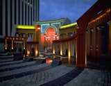
I should add that it’s also a great example of postmodern objects not being for sitting on. Postmodern design is not functionalist. Here we have the Piazza d’Italia in New Orleans, completed in 1979, by the architect Charles Moore. It seems like the height of kitsch.
Charles Moore & Urban Innovations Group (with Perez Associates), Piazza d’Italia, 1976–9, New Orleans, Louisiana
Yes, it’s normally thought of as this ultra-kitsch, Las Vegas-style scenography. But postmodernism is the great moment for remembrance. One thing we really wanted to get across in this section of the show is the elegiac quality of postmodern historicism. This is a public space meant to celebrate the Italian immigrant’s contribution to the city, a displaced community that lacked a stable identity in New Orleans—it’s a memory of Italy.
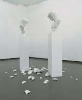
This idea of layering the past on the present has a memory-based quality to it. You see the same quality in James Stirling’s Staatsgalerie in Stuttgart [also in the exhibition].L’altra Figura by Giulio Paolini—two classical busts on pedestals that seem to be pondering the smashed shards of a third—has something of the same effect.
L’ altra Figura (The Other Figure), 1984. Photograph by Paul Maenz, Courtesy Archivio Giulio Paolini Turin
That sculpture said it all for us. Paolini’s an Arte Povera artist, who started doing this plaster cast work in the seventies. This is just so emblematic, this idea of three busts, one smashed. You get mass production and simulacra, which is a big postmodern idea—the copy with no original. And you get the sense of an elegiac mode—you’re looking at the past as something you’re fundamentally ruptured from. And it’s smashed at your feet and can’t be put back together again—it’s like the Humpty Dumpty version of the past. Pieces like these are all about a narrative that’s not absolutely readable but still perceptible. Yes, it’s a feeling—not didactic at all. And that’s what postmodernism eventually becomes—much more message- and brand-oriented. In its early stages, it’s very open and suggestive. Especially in architecture.Postmodernism could also be quite witty, as we see in these columns by Hans Hollein.
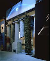
Hans Hollein, façade from Strada Novissima, The Presence of the Past, 1980.
This was a façade he did for the 1980 Venice Biennale [the Strada Novissima exhibition at the Arsenale]. What he was trying to do was capture the history of architecture in one façade. The four central columns represent the Garden of Eden; the primitive hut or most basic state of nature, made from a stripped tree; the ruins of antiquity; and modernity, in the shape of Adolf Loos's proposal for the Chicago Tribune newspaper headquarters. This is a bit of a joke atop a joke, because Loos used the image to refer to the Latin use of the word "tribune" for column.It’s very cool, to use a good critical term.
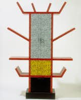
It is. It works really well for us in the space. Alessandro Mendini reappears at the start of the "new wave" section, with his Proust chair from 1978.Mendini provides a spine through the whole show. That chair is a really fantastic thing. This is him working with Studio Alchimia, which is just before Memphis starts—it’s a more avant-garde, nihilistic design collective than Memphis, but provides some of the inspiration for it. And that particular chair is typical of his practice at this time. Mendini called it "redesign"—he was making new objects from quoted material from lots of different sources. It’s a wood-frame chair with white upholstery, and Mendini projected a slide onto it and painted it to match. The title is a reference to this idea of memory – Baroque furniture, pointillism. It’s very layered and quite witty but not particularly functional.It’s witty in a slightly aggressive way.Which is the opposite of Ettore Sottsass, who is the other great figure from Italian postmodernism. Mendini is the nihilistic, cynical conceptualist, and Sottsass is the generative, open-minded, celebratory creator. So that they’re like chalk and cheese, but they produce the energy of radical design between them.Here is Sottsass’ famous Casablanca sideboard [1981], which has to be one of the more iconic postmodern objects, in the section devoted to Memphis Group, the design studio he helped found.
This is the moment when it turns into a popular style—suddenly everything looks like this. That’s a real turning point, so we went and acquired all this stuff—you need to see it together to get the effect.Do people collect it in bulk?The only person I know who completely decorated his flat in Memphis was Karl Lagerfeld—he bought out the first collection. A lot of it went straight into museums, and some is still in production. Next you have a section devoted to performance.
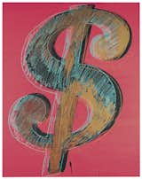
Yes, it’s basically dance, film and music. How does that fit in?It’s the means by which postmodernism gets to the rest of the world. The exaggeration and stylization you see in these costumes, especially Grace Jones’ maternity dress from 1979, by Jean-Paul Goude and Antonio Lopez, obviously relates to Memphis—she looks like a Memphis object.Let me take you to the third room, the section on graphics. People love this all the different record covers and magazines and posters. It’s definitely the room where people come up with their private narrative of this moment in time. What do you mean?It depends on who you were into—which band. It’s various levels of esoteric. Everybody knows New Order from that period. But who knows Color Box? We also do avant-garde typography from that period.Why did you choose to begin the "money" section with Andy Warhol’s 1981 painting of a dollar sign?
It’s the big sellout. It’s the prophesy coming true, in a way, because postmodernism is always about complicity—the very first gesture in the show, the Mendini flaming chair, was meant to be put on the cover of a magazine. So here we are only a few years on and we have Warhol’s dollar sign telling you what it is—this commodity that declares itself unapologetically as such. Philip Johnson’s AT&T building, with its Chippendale top, is a very appropriate object in that regard.
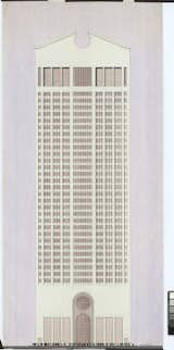
Judith Grinberg (for the studio of Johnson and Burgee Associates), Presentation drawing of the AT&T Building, 1978. Ink, graphite and ink wash on tracing paper.
The AT&T presentation drawing is the most important thing we acquired for the show. We got to know the woman who drew it—Judith Grinberg, who’d been a staff architect for Johnson. She hadn’t seen the drawing for 33 years before she came to the opening. It’s amazing when you look at it—all by hand.It’s been observed that the difference between postmodern and Mannerist [post-Renaissance] architecture—which also played with historical references—is that while the audience for Mannerism understood the history that was being referenced, most of postmodernism’s audience did not.That’s true of cheap bad corporate postmodern architecture, though you certainly couldn’t say that about the first-generation postmodernists. I think when people looked at the AT&T building, they obviously didn’t see its references—the references were kind of an in-joke by that time, and didn’t mean anything to the public. That’s a big problem with postmodern historicism—whose history are we talking about?As a New Yorker who’s lived with that building for decades, I think it’s worn poorly, in large measure because it’s, as you say, an in-joke.We had Rem Koolhaas here on Friday, and I went to dinner with him Charles Jencks, and Denise Scott Brown, and the three of them spent almost the entire dinner arguing about Philip Johnson. All of them had mixed feelings—there was some disagreement about whether he was a good architect—Rem saying yes, Denise saying no—but there was no question about his provocativeness. And I was thinking, how can this guy still have so much power?How has the exhibition been received?The reviews we’ve been getting have been absolutely divergent, between people who think it’s the best thing ever—people who were living with it at the time, and going to clubs in the eighties—and then these either old or young fogies who are clinging to a disenfranchised modernist-progressive narrative and detest it. They recognize the show, rightly, as something that’s trying to get them to change the way that they think, or make them irrelevant—successfully, in most cases.
New York contributing editor Marc Kristal found himself overwhelmed not only by the urbanistic pleasures of Bordeaux, France- which dueled for his attention with the city's historic architectural legacy- but by what architect ...
Published
Last Updated
Get the Dwell Newsletter
Be the first to see our latest home tours, design news, and more.