Sherwin Williams
A compelling thing about this project was the client´s invitation to work again with them in a proposal that will allow to consolidate the task teams -operating from different locations- into the same space that was going to be developed in three stages. It seemed complex, but the correct planning and identity, which we defined as a team in the previous project, laid the groundwork to carry out this new challenge achieving the client´s intended purpose.
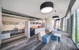
Being a company well known for its logo, a world globe covered with paint, the immediate answer might be overusing color and to paint each wall in a different shade and turn the office into a sample book, but we decided not to follow that path. In our experience a workspace doesn’t have to be all the same, it must have different ambiances to include the diverse activities that occur in each one of them, for which we gave a chromatic response with 14 different shades of gray (warm, cold, neutral and one lightly green) that we use as guiding thread between the different spaces and transition zones, with 10 darker shades as main characters.
Color palettes in our projects are large, and for obvious reasons in this project we broke our own record with a larger and darker one. The furniture was selected in neutral shades not to compete with the color on the walls and carpet, that was also chosen in dark ranges with bright accents to identify each of the areas.