Marc Kristal on Immaterial World
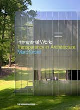
One of my favorite writers in Dwell is our contributing editor Marc Kristal. His latest story for us—the centerpiece of the issue, if you ask me—is a mad dash around New York City finding high design in all five boroughs. When he's not searching his coat pockets for his Metrocard, Kristal works penning books in addition to magazine stories. I had a chat with him about his latest, Immaterial World: Transparency in Architecture out later this month from Monacelli Press.
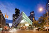
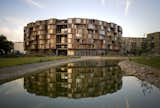
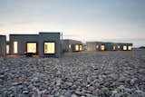
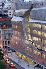
Immateriality is something of a heady concept. What's the aim with the book?The driving idea behind the book is that when people look at architecture they tend to see just a form. The problem we have, and I have it too, is that we we look at a building the first thing we think is either I love it or I hate it. It's pretty or it's ugly. And that's not a very productive way to think about architecture because it reduces the discipline to mere form-making. It's usually better to also understand the motivations of the client, the architect, how the building is meant to be used etc. And a very useful way for me to get into a building to see to what degree it's transparent, to understand the materiality and the immateriality and that usually helps me grasp how it came to be. How did you choose which projects to include?Some of the projects I was already familiar with. For example, Alice Tully Hall in New York is a great example of what I wanted the book to be about. I'd also seen the reworking of Paul Rudolph's house and to me that was a very interesting problem in how you update this classic and make it feel both reverential and contemporary. So those two projects were in the back of my mind and some of the ideas I had about transparency and opacity I had came from those. Others were of interest to me for various reasons, like Thom Mayne because he often uses metal screens on the facades of his buildings and that has a nice materiality and immateriality. Another is Thomas Pfifer, whose Salt Point House is on the cover. In a certain light you really see that house and it become quite reflective and in other light it seems to disappear, to feather away. And then of course I asked a lot of people too. You have all different kinds of buildings in the book. How important was it to vary the typologies as you explored your subject?It was very important that the book not be all just one kind of building. It would be easy to just do this book on skyscrapers, but I wanted to focus on small spaces as well. Mixing up typologies you see how opacity in architecture plays out for different needs. Transparency means something very different for a private house than it does for a dorm, much less a shop. I was in Copenhagen with I came across this amazing building and I thought, Wow, that's the most beautiful thing I've ever seen, what is it. And it turned out to be a dorm that's essentially like cubism meets a wheel. The outer ring facing outward has all these little boxes that are students' rooms, and they're all about privacy. But on the inside, on the courtyard, it's totally transparent. Everyone sees everything. You feel like you're a student yourself, that you're just exploding out into the world. How many of the projects in the book have you see in person?I saw 11 of the 25 projects in the book in person, which is of course less than ideal—writing about architecture that you haven't visited is like writing about art that you've only seen in photographs. Regarding those that I haven't seen, I interviewed (either in person, by phone or via e-mail) all of the architects whose work appears in the book extensively, about the buildings in general and issues of transparency and opacity in particular, so as to ascertain whether or not the approach the architects took was germane to the topic. I also looked at large numbers of photographs of all the projects as well as plans, elevations and other visual materials.As for those you didn't get to see in person—I expect your travel budget was limited—how do you read a building you've not experienced?While I wasn't able to read the buildings I didn't experience in the strict sense, what I was able to do is understand why they looked the way they did. The Svalbard Science Center in Norway is a good example. It's a very peculiar looking building - few windows, odd angles, and a copper cladding, all of which make it look like a kind of reptilian monster. When I spoke the the architect, Einar Jarmund, he explained that the physical appearance of the building was a response to the particular climatic conditions in which it exists and the paucity of fenestration grew out of the need to insulate the structure from the Arctic cold—a 'reading' I derived from conversation and studying the images. Of course, I didn't get the kind of pleasure I derived from visiting the Tietgenkollegiet dormitory in Copenhagen, which fills you with joy the moment you walk in.Were there moments in researching and writing the book where you saw projects that somehow struck you as too opaque, or too transparent? Is it a kind of balance between the two that you ultimately find successful?I don't think there is a one-size-fits-all response to the transparency/opacity balance - the ideal depends on the needs of the situation and the ingenuity of the architect's solution. The first project in the book, Alejandro Aravena's Siamese Towers in Santiago, is a fantastic example of this, because it is both almost completely transparent and almost completely opaque—a glass skin enclosing a concrete box—and there are excellent reasons for the architect's choices. If I rejected a building, it wasn't generally because it was too much of one or another, but because I didn't think its handling of the issue was as successful or as complex. For example, I chose Morphosis' 41 Cooper Square in New York over the firm's Federal Building in San Francisco—though they're somewhat similar—because I felt that the former dealt more interestingly with urbanistic issues both in terms of the way it related to the surrounding community and its creation of a 'vertical piazza' within.Why leave out the Glass House as extreme transparency or some bunker as extreme opacity?As for the Glass House—which in fact has an outbuilding a few yards away that is indeed bunkerlike, so you get both in proximity to one another—I don't think either building speaks to the issue in an especially unusual way, plus I limited myself to projects completed within the last ten years. Also, I wanted to show projects that were less familiar.